

You shipped the onboarding redesign. Activation didn't move. CS is still getting the same "how do I set this up?" tickets they were getting three months ago.
The features are there. The product is solid. But somewhere between signup and first value, users get lost, confused, or distracted. According to industry benchmarks, 40 to 60% of new SaaS signups drop off before reaching their first activation event. That's not a product problem. It's a product experience problem.
The gap between "we built it" and "users actually adopted it" is where product experience tools live. These are the platforms that handle onboarding flows, interactive demos, product analytics, user feedback, and experimentation, the operational layer that determines whether users reach value or churn trying.
This guide evaluates each tool through a PM's priority stack: impact on activation metrics, engineering cost, segmentation depth, maintenance overhead, and integration with your existing analytics.
What's inside
This guide covers 15 best product experience tools across five categories: interactive demos, in-app onboarding, product analytics, user feedback, and experimentation. Each tool is evaluated through a PM lens: what it does for activation, how much engineering time it requires, and where it fits in your stack.
Tools were selected based on hands-on evaluation, G2 ratings, PM community feedback, and real-world adoption patterns across B2B SaaS teams.
TL;DR
- Product experience tools span five categories: interactive demos, in-app guidance, analytics, feedback, and experimentation. Most PMs need at least two.
- Guideflow is the top pick for interactive product experiences that improve activation without engineering overhead.
- Pendo and Amplitude remain the strongest options for combining in-app guidance with product analytics.
- The biggest selection mistake: choosing a tool that requires a ticket for every onboarding change. Look for no-code editing and event-based triggering.
- Free tiers exist on most platforms. Test before committing budget.
What is product experience software
Product experience software is a category of tools that shape how users and buyers interact with a product across the entire lifecycle, from first exposure through activation, adoption, and expansion. Unlike product management tools that manage what gets built, product experience software manages how users experience what was built.
The category is often confused with adjacent concepts. Here's how they differ:
| Category | What it covers |
|---|---|
| Product experience (PX) | The operational layer: tools, flows, and content that guide users through the product |
| User experience (UX) | The design discipline: usability, information architecture, and interface design |
| Customer experience (CX) | Every touchpoint: support, billing, marketing, and product combined |
| Product management (PM) | What gets built: roadmaps, backlogs, prioritization, and delivery |
If you're searching for product experience management software, you're looking for tools in the PX category, not Jira or Linear. The distinction matters because many "best product management tools" lists mix in project management platforms that have nothing to do with the experience layer.
Core capabilities that define a product experience platform include:
- In-app guidance and user onboarding tools: Tooltips, modals, checklists, and walkthroughs that guide users to activation
- Interactive product demos: Clickable, guided product experiences for onboarding, education, and buyer evaluation
- Product analytics tools: Activation tracking, funnel analysis, and cohort retention measurement
- User feedback and sentiment capture: In-product surveys, NPS, and event-triggered research
- Experimentation and A/B testing: Testing product experience changes with statistical rigor before full rollout
When to use product experience tools
Activation is flat despite feature improvements. You've shipped features but users aren't reaching the activation event. Product experience tools help you guide users to value faster through in-app onboarding, interactive demos, and targeted nudges.
Onboarding is owned by everyone and no one. Product, CS, marketing, and docs all touch the first-run experience. PX tools centralize the experience layer so one team can own it and measure it.
You need to show, not just ship. For prospects evaluating the product or new users onboarding, interactive demos and product tours communicate value faster than documentation. This is where buyer experience software and product-led growth tools overlap.
Multi-persona products need different paths. Admin setup is not the right first experience for an end user. Product experience tools with segmentation let you build persona-specific activation paths tied to real user properties.
Support tickets are a proxy for broken onboarding. If CS keeps answering "how do I...?" questions, the product experience layer has gaps that no amount of documentation will fix.
Best product experience tools comparison table
Here's how the 15 tools compare across intent, key use case, pricing, and G2 ratings.
| # | Product | Intent | Key use case | Pricing | G2 rating |
|---|---|---|---|---|---|
| 1 | Guideflow | Interactive product demos | Self-serve onboarding and product education | Free tier; from $35/mo | 4.7/5 |
| 2 | Pendo | In-app guidance + analytics | User onboarding and feature adoption tracking | Free tier; custom pricing | 4.4/5 |
| 3 | Amplitude | Product analytics | Activation and retention measurement by cohort | Free tier; from $49/mo | 4.5/5 |
| 4 | Appcues | No-code in-app onboarding | Building onboarding flows without engineering | From $249/mo | 4.6/5 |
| 5 | Chameleon | Targeted in-app experiences | Contextual tooltips and surveys by segment | From $279/mo | 4.3/5 |
| 6 | UserGuiding | Budget-friendly onboarding | Onboarding for early-stage SaaS teams | From $69/mo | 4.7/5 |
| 7 | WalkMe | Enterprise digital adoption | Large-scale enterprise onboarding and training | Custom pricing | 4.5/5 |
| 8 | Mixpanel | Event-based product analytics | Funnel analysis and activation instrumentation | Free tier; from $28/mo | 4.6/5 |
| 9 | PostHog | Open-source product analytics | Self-hosted analytics with session replay | Free tier; usage-based | 4.4/5 |
| 10 | Hotjar | Behavioral analytics | Heatmaps and session recordings for UX insight | Free tier; from $32/mo | 4.3/5 |
| 11 | Sprig | In-product user research | Targeted surveys triggered by product events | Custom pricing | 4.6/5 |
| 12 | Optimizely | Experimentation platform | A/B testing product experiences at scale | Custom pricing | 4.2/5 |
| 13 | LaunchDarkly | Feature management | Feature flags and progressive rollouts | Free tier; from $10/mo per seat | 4.5/5 |
| 14 | Product Fruits | Lightweight onboarding | Quick-setup onboarding for small teams | From $79/mo | 4.7/5 |
| 15 | FullStory | Digital experience intelligence | Session replay and frustration signal detection | Custom pricing | 4.5/5 |
1. Guideflow

Guideflow turns static product documentation and onboarding into clickable, guided experiences. Instead of explaining how the product works in a help article or a tooltip tour, you capture the actual product flow and let users click through it at their own pace.
For PMs focused on activation, Guideflow addresses a specific gap: the moment between "user signed up" and "user reached value." Interactive product demos let you show the path to activation without requiring engineering to build custom onboarding flows. You capture your product in a few clicks, edit with a no-code builder, personalize by segment, and embed wherever users need guidance: help center, in-app, email, or landing page.
The analytics layer tracks completion rates, drop-offs, and engagement at the step level, so you can instrument the experience and tie it back to activation metrics. When your UI changes, you update the demo in the builder. No ticket required.
Best for: PMs who need to reduce TTFV and build segment-specific activation paths without engineering tickets.
Key strengths
- No-code capture and editing: build interactive demos in minutes, update when the UI changes
- Persona-level personalization with CRM variables, dynamic text, and branching paths
- AI-powered content generation: auto-generated steps, translations, voiceovers
- Step-level analytics: completion rate, drop-off points, time per step
- Multi-channel distribution: embed in-app, in help centers, in emails, on landing pages
- Integrates with CRM, analytics, and support tools
Pricing: Free tier available. Paid plans from $35/month. See full pricing details.
Start your journey with Guideflow today!
2. Pendo
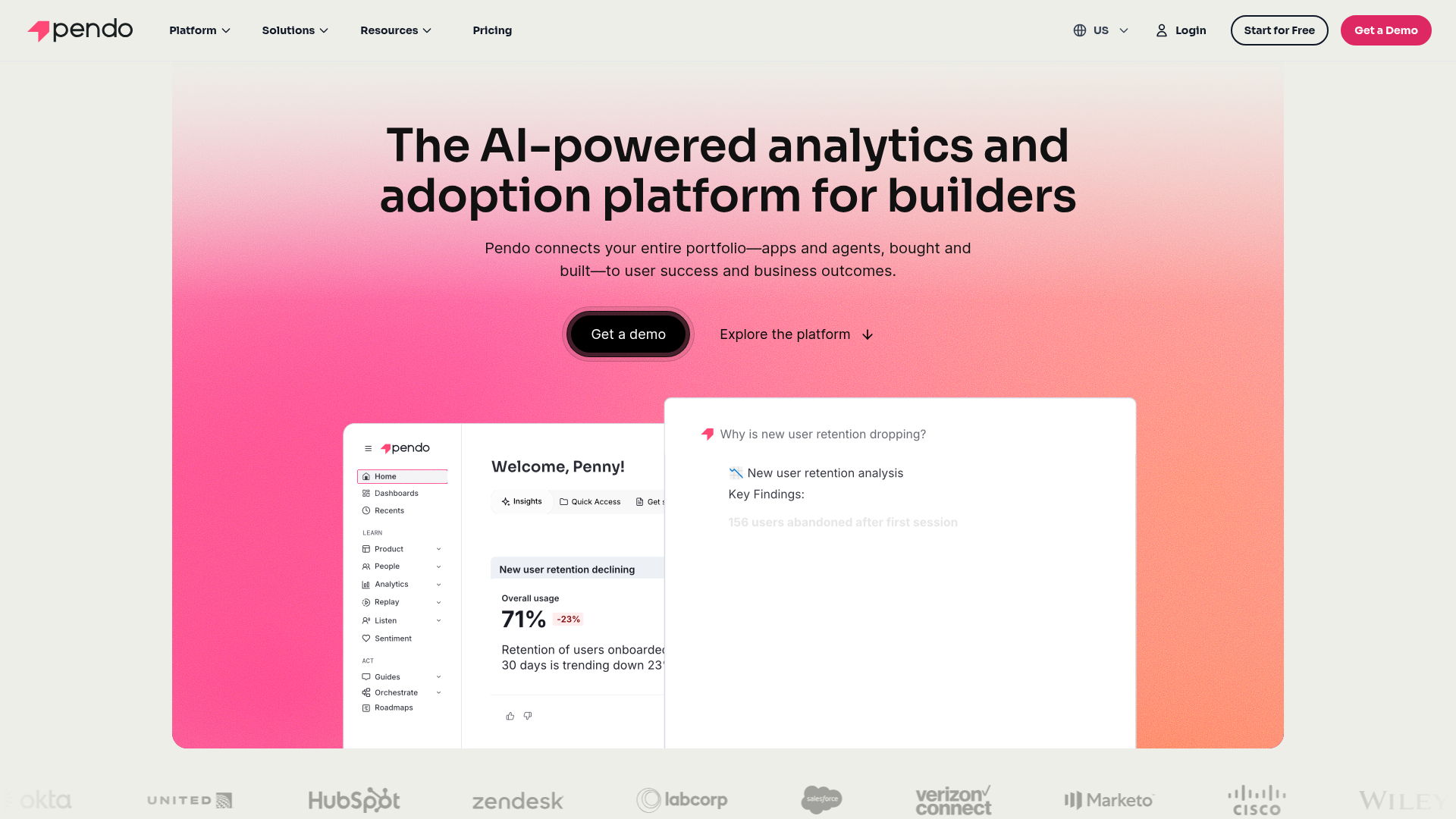
Pendo combines in-app guidance with product analytics, making it a strong fit for PMs who want onboarding flows and usage data in one product adoption platform. The guide builder lets you create tooltips, walkthroughs, and modals without code. The analytics dashboard tracks feature adoption, retention, and NPS, all segmented by user properties.
The real value for PMs: Pendo lets you see which features correlate with activation, then build in-app guides that push users toward those features. Retroactive analytics means you capture data without pre-defined events, so you can analyze behavior patterns you didn't think to instrument in advance.
The trade-off is complexity. Pendo's depth means a longer setup and learning curve compared to lighter onboarding tools. For teams that need both analytics and guidance in one place and have the bandwidth to configure it properly, it's a strong choice. For teams that only need one of those functions, a more focused tool may be a better fit.
Best for: PMs who want in-app onboarding and product analytics in a single platform.
Key strengths
- Combined analytics and in-app guidance in one tool
- Feature adoption tracking by segment
- No-code guide builder with event-based triggering
- NPS and in-app feedback surveys
- Retroactive analytics (captures data without pre-defined events)
- Strong enterprise security and compliance
Pricing: Free tier (Pendo Free, up to 500 MAU) available. Custom pricing for paid plans.
3. Amplitude
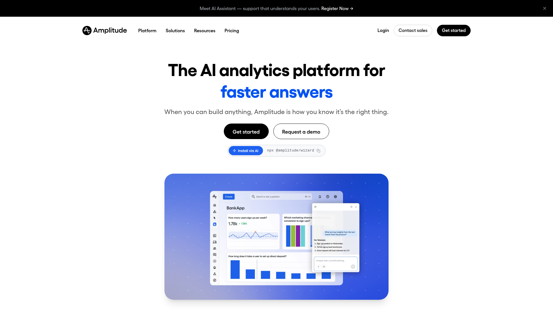
Amplitude is a product analytics platform built for understanding user behavior at the cohort level. If you need to define what activation looks like for different personas, measure TTFV by segment, and run cohort retention analysis, Amplitude is the instrumentation backbone.
It doesn't build onboarding flows. It tells you whether your onboarding is working. For PMs, this distinction matters: Amplitude answers "what's happening?" while tools like Appcues or Guideflow answer "what should we do about it?" The two pair well together.
Amplitude's behavioral segmentation is where it stands out from simpler analytics tools. You can break down activation funnels by role, plan, acquisition channel, or any custom property, then compare cohort retention curves side by side. The experimentation module lets you analyze A/B test results with statistical rigor.
The free tier is generous enough for most early-stage teams. The learning curve is moderate: setting up meaningful charts requires understanding event taxonomies and property structures.
Best for: PMs who need deep activation and retention analytics with segment-level instrumentation.
Key strengths
- Cohort analysis and retention curves
- Funnel analysis with segment breakdowns
- Behavioral segmentation by role, plan, channel, or use case
- Experimentation and A/B test analysis
- Strong integrations with CDPs, CRMs, and data warehouses
- Free tier with generous event limits
Pricing: Free tier available. Paid plans from $49/month.
4. Appcues
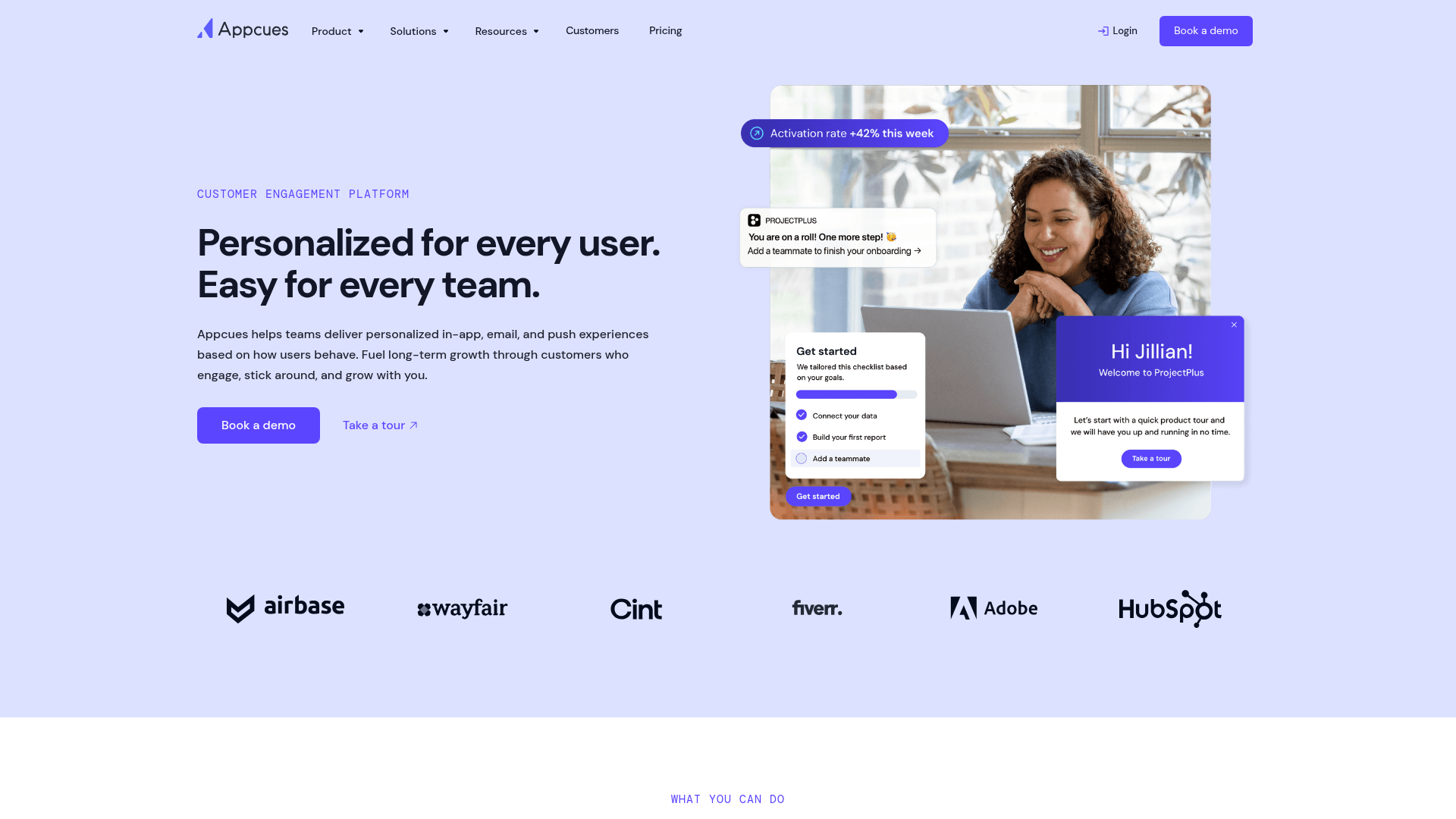
Appcues is a no-code onboarding platform that lets PMs build in-app flows (modals, tooltips, checklists, hotspots) without writing code. When you need to ship an onboarding experiment this sprint and can't wait for engineering, Appcues lets you build and iterate on flows tied to user segments and events.
The checklist pattern is particularly useful for multi-step activation sequences. You define the activation milestones, build a checklist that guides users through them, and measure completion rates by segment. A/B testing is built in, so you can compare two onboarding variants and pick the winner based on data, not opinion.
Where Appcues fits less well: if you need deep product analytics alongside onboarding, you'll need a separate tool (Amplitude, Mixpanel, or PostHog). Appcues focuses on the guidance layer, not the measurement layer. It integrates with those analytics tools, but it's not a replacement.
Best for: PMs who need to ship onboarding experiments fast without engineering dependencies.
Key strengths
- No-code flow builder with event-based targeting
- Onboarding checklists tied to activation milestones
- Segmentation by user properties and behavior
- A/B testing on onboarding flows
- Integrations with Amplitude, Mixpanel, Segment, HubSpot
- Clean UI that respects the product's design
Pricing: From $249/month (Essentials plan).
5. Chameleon
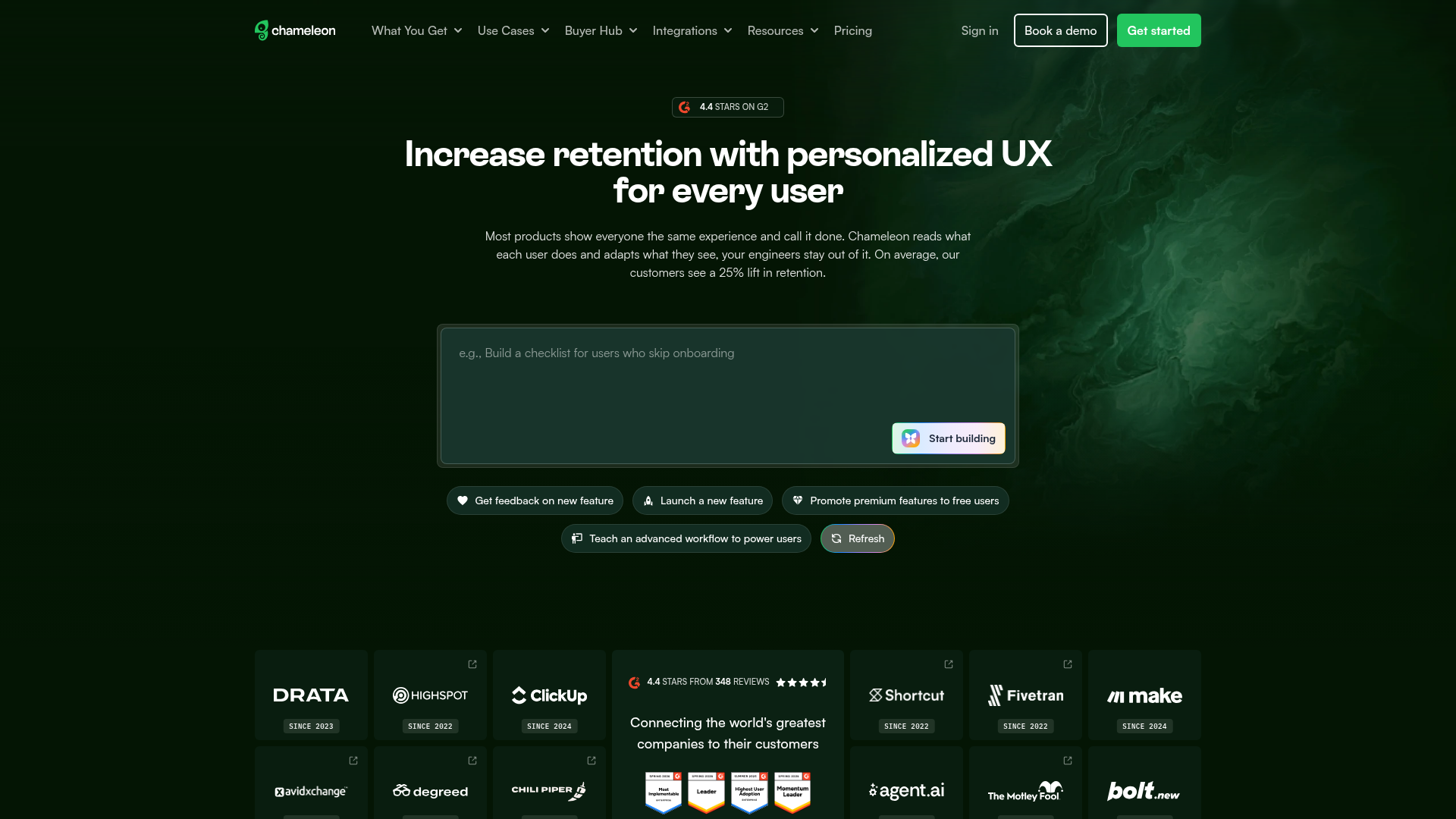
Chameleon focuses on targeted, contextual in-app experiences. Chameleon's strength is precision targeting. You can trigger tooltips, modals, or micro-surveys based on specific user actions, properties, or lifecycle stage. This makes it a strong fit for multi-persona products where different users need different nudges at different moments.
The rate-limiting feature is worth calling out: it prevents "tour spam" by controlling how many in-app messages a user sees within a given window. This matters because over-messaging is one of the fastest ways to train users to dismiss every tooltip. Chameleon lets you set frequency caps so guidance shows up when it's relevant, not when it's annoying.
The Launchers feature (in-app resource centers) gives users a self-serve way to access guides, announcements, and help content without waiting for a tooltip to appear. For PMs managing complex products with multiple user onboarding tools, this reduces dependency on perfectly timed triggers.
Best for: PMs with multi-persona products who need highly targeted, context-aware in-app experiences.
Key strengths
- Deep targeting by user properties, events, and URL
- Micro-surveys for in-context feedback collection
- Launchers (in-app resource centers) for self-serve help
- CSS customization for design consistency
- Integrations with Segment, Amplitude, Salesforce, HubSpot
- Rate-limiting to prevent tour spam
Pricing: From $279/month (Growth plan).
6. UserGuiding
UserGuiding is a budget-friendly onboarding tool that covers the basics well: product tours, onboarding checklists, resource centers, and in-app surveys. If you're at an early-stage SaaS company and need user onboarding tools without a $300+/month commitment, UserGuiding delivers the core capabilities at a fraction of the price.
The Chrome extension makes setup fast. You install it, navigate your product, and point-and-click to create tours and checklists. The segmentation and event-based triggering are functional, though less granular than what you'd get from Chameleon or Pendo.
The trade-off is depth. Analytics and targeting are more basic. If you're running a multi-persona product with complex segmentation needs, you'll outgrow UserGuiding. But for a team that needs to get onboarding live this week with a $100/month budget, it's a practical starting point.
Best for: Early-stage SaaS PMs who need onboarding fundamentals at a lower price point.
Key strengths
- Product tours, checklists, and resource centers
- No-code setup with Chrome extension
- User segmentation and event-based triggering
- In-app NPS and survey tools
- Affordable entry point for small teams
- Multi-language support
Pricing: From $69/month (Basic plan).
7. WalkMe
WalkMe is an enterprise digital adoption platform designed for complex, large-scale product experiences. WalkMe is built for organizations with thousands of users, complex workflows, and multiple internal applications. It's more than onboarding: it's a system for guiding users through enterprise software at scale.
The cross-application guidance is the key differentiator. WalkMe can guide a user through a workflow that spans Salesforce, an internal tool, and a third-party integration, all in one flow. For enterprise PMs managing product adoption across a suite of applications, this is the capability that justifies the price.
The implementation and maintenance overhead is higher than lighter tools. WalkMe typically requires a dedicated admin or implementation partner, and the configuration is more complex than point-and-click builders. If your product is a single SaaS application with a straightforward onboarding path, WalkMe is overkill. If you're managing digital adoption across an enterprise application stack, it's purpose-built for that problem.
Best for: Enterprise PMs managing digital adoption across complex, multi-application environments.
Key strengths
- Enterprise-grade digital adoption platform
- Cross-application guidance (works across multiple tools)
- Advanced analytics on user behavior and workflow completion
- AI-driven automation and task completion
- Strong compliance and security features (SOC 2, GDPR)
- Dedicated implementation and support
Pricing: Custom pricing (enterprise contracts).
8. Mixpanel
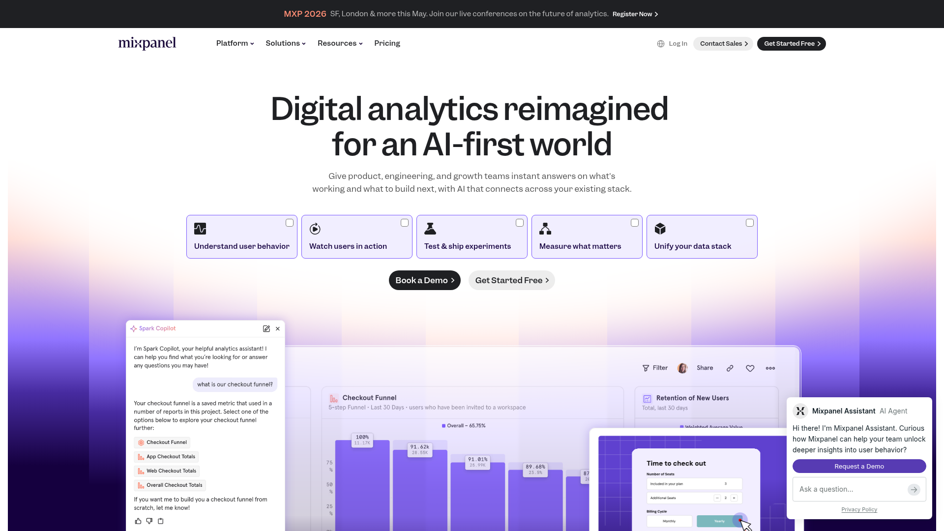
Mixpanel is an event-based product analytics platform that excels at funnel analysis and user flow visualization. If Amplitude is the cohort retention tool, Mixpanel is the funnel and conversion tool. It's particularly strong for PMs who need to instrument specific activation funnels, identify where users drop off, and measure the impact of onboarding changes on conversion rates.
The interactive report builder lets you build funnels, flows, and retention charts without SQL. You define the events, set the segments, and Mixpanel shows you where users convert or abandon. The real-time data means you can ship an onboarding change in the morning and see its impact by afternoon.
Mixpanel's free tier is generous: 20 million events per month. For most early and mid-stage SaaS companies, that's enough to instrument the full activation funnel without paying anything. The paid tiers add features like group analytics and data governance, but the core product analytics capabilities are available on the free plan.
Best for: PMs who need detailed funnel analysis and conversion tracking for activation flows.
Key strengths
- Event-based analytics with flexible querying
- Funnel and flow analysis with drop-off identification
- Real-time data and interactive reports
- Segmentation by any user property or event
- Integrations with CDPs, data warehouses, and in-app tools
- Generous free tier (20M events/month)
Pricing: Free tier available. Paid plans from $28/month.
9. PostHog
PostHog is an open-source product analytics suite that bundles analytics, session replay, feature flags, and A/B testing in one platform. PostHog appeals to product teams that want full control over their data and prefer a self-hosted or privacy-first approach.
The all-in-one nature reduces tool sprawl. Instead of paying for separate analytics, session replay, feature flag, and experimentation tools, PostHog covers all four. For PMs at engineering-led organizations, this consolidation is a real advantage: fewer vendor contracts, fewer integrations to maintain, and one data layer instead of four.
The event autocapture feature reduces instrumentation overhead. PostHog captures clicks, pageviews, and form submissions automatically, so you can analyze user behavior retroactively without having instrumented every event in advance. The trade-off: autocaptured events can be noisy, and you'll still want to define custom events for your activation milestones.
The self-hosted option gives you full data control, which matters for companies with strict data residency requirements. The EU-hosted cloud option is available for teams that want managed infrastructure with European data residency.
Best for: PMs at privacy-conscious or engineering-led organizations who want analytics, session replay, and feature flags in one open-source platform.
Key strengths
- All-in-one: analytics, session replay, feature flags, A/B testing, surveys
- Open-source with self-hosted option
- Event autocapture reduces instrumentation overhead
- Generous free tier (1M events/month on cloud)
- Strong developer community and documentation
- EU-hosted cloud option for data residency
Pricing: Free tier available. Usage-based pricing on cloud.
10. Hotjar
Hotjar provides behavioral analytics through heatmaps, session recordings, and on-site surveys. Hotjar is the discovery tool. When you know activation is broken but don't know why, heatmaps and session recordings show you exactly where users get confused, rage-click, or abandon the flow.
It's not an onboarding tool. It doesn't build guides or tooltips. But it tells you what your onboarding tool should fix.
For PMs in the discovery phase, Hotjar answers the "where do users get stuck?" question visually. You watch five session recordings of users going through onboarding, and the pattern becomes obvious: they're clicking on a non-clickable element, they're scrolling past the CTA, or they're abandoning at the integration setup step. That specificity is what makes Hotjar useful. You go from "activation is 34%" to "users are dropping off at step 3 because they don't understand the integration prompt."
The limitation: Hotjar is not a full product analytics tool. It doesn't do cohort retention, funnel analysis by segment, or event-based instrumentation. Pair it with Amplitude or Mixpanel for the quantitative layer.
Best for: PMs in the discovery phase who need to see exactly where users struggle in the product experience.
Key strengths
- Heatmaps (click, scroll, move) for visual behavior analysis
- Session recordings with frustration signal detection
- On-site surveys and feedback widgets
- Funnel and form analysis
- Easy setup (single script tag)
- Integrations with Slack, HubSpot, Segment, Google Analytics
Pricing: Free tier available. Paid plans from $32/month.
11. Sprig
Sprig is an in-product user research platform that lets PMs trigger targeted surveys based on specific user actions. Instead of running quarterly NPS surveys to everyone, Sprig lets you ask the right question at the right moment. A user just completed onboarding? Ask "what almost stopped you from finishing?" A user just churned? Ask why.
This event-triggered approach produces higher-quality signal than batch surveys. The response rates are higher because the question is contextually relevant, and the answers are more specific because the experience is fresh.
The AI-powered analysis of open-text responses is where Sprig saves PM time. Instead of reading hundreds of survey responses and manually tagging themes, the AI surfaces patterns and sentiment across responses. For PMs who need to turn qualitative feedback into prioritization decisions, this reduces the analysis cycle from days to hours.
The session replay paired with survey responses lets you see what a user did before and after answering. This context turns a survey answer from "I was confused" into "I was confused because I clicked the wrong button on step 4," which is actionable.
Best for: PMs who need actionable in-product feedback tied to specific user behaviors and lifecycle moments.
Key strengths
- Event-triggered in-product surveys
- AI-powered analysis of open-text responses
- Concept testing and prototype feedback
- Session replay paired with survey responses
- Targeting by user segment, behavior, or lifecycle stage
- Integrations with Segment, Amplitude, Mixpanel
Pricing: Custom pricing.
12. Optimizely

Optimizely is an experimentation platform for running A/B tests and multivariate experiments on product experiences. When you need to validate whether a new onboarding flow actually improves activation before rolling it out to everyone, Optimizely provides the statistical rigor.
For PMs, the value is in de-risking product experience changes. Instead of shipping a new onboarding flow to 100% of users and hoping activation goes up, you run it against the current version with a controlled sample, measure the difference with statistical significance, and then make the call. This is particularly important for PMs who fear harming conversion with the wrong onboarding change, because even a small dip is visible to leadership.
The full-stack experimentation supports both client-side and server-side tests. Client-side is faster to set up (useful for UI changes). Server-side gives you more control (useful for backend logic changes that affect the product experience).
The trade-off: Optimizely is an enterprise tool with enterprise pricing. If you're running fewer than five experiments per quarter, the cost may not justify the investment. PostHog and LaunchDarkly both offer experimentation capabilities at lower price points, though with less statistical sophistication.
Best for: PMs who need statistically rigorous experimentation on product experience changes.
Key strengths
- Full-stack and web experimentation
- Server-side and client-side A/B testing
- Feature experimentation with progressive rollouts
- Statistical engine with multi-armed bandit support
- Audience targeting and segmentation
- Enterprise-grade governance and compliance
Pricing: Custom pricing.
13. LaunchDarkly
LaunchDarkly is a feature management platform that gives PMs control over feature rollouts through feature flags and progressive rollouts. LaunchDarkly isn't a traditional "product experience" tool, but it directly impacts PX by letting you control who sees what, when.
Progressive rollouts, beta access by segment, and instant kill switches mean you can ship onboarding changes to specific cohorts without an all-or-nothing deploy. Want to test a new activation flow with users from a specific acquisition channel? Flag it. Want to roll back a change that's hurting conversion? Kill the flag. No deploy required.
For PMs, the operational value is speed and safety. You can iterate on product experience changes without waiting for a release cycle, and you can reverse a bad change in seconds instead of hours. The experimentation module lets you run A/B tests through flags, though it's less statistically sophisticated than Optimizely.
The free tier covers basic flag management. Paid tiers add targeting, experimentation, and audit logs. The per-seat pricing scales with team size, so it's more cost-effective for small teams than large ones.
Best for: PMs who need granular control over feature rollouts and want to test product experience changes by segment before full release.
Key strengths
- Feature flags with targeting by user segment
- Progressive rollouts and percentage-based releases
- Instant kill switches for risky changes
- Experimentation and A/B testing via flags
- Audit logs and governance controls
- SDKs for every major language and framework
Pricing: Free tier available. Paid plans from $10/seat/month.
14. Product Fruits
Product Fruits is a lightweight onboarding and adoption tool designed for quick setup and minimal configuration. Product Fruits covers the essentials (tours, hints, checklists, announcements, feedback widgets, knowledge base) without the complexity or price of enterprise platforms.
The built-in knowledge base and "life ring" button are worth noting. The life ring is a persistent in-app widget that gives users access to help articles, tours, and announcements without leaving the product. For PMs who don't want to build a separate help center but need a self-serve support layer, this covers the basics.
The visual editor is straightforward: point and click to place hints, build checklists, and create announcements. Custom CSS support means you can match your product's design system. The setup time is measured in hours, not weeks.
Where Product Fruits fits less well: advanced segmentation and analytics. If you need to target onboarding flows based on complex behavioral triggers or analyze activation funnels at the cohort level, you'll need a more specialized tool. Product Fruits is built for teams that need to get onboarding live quickly and iterate from there.
Best for: Small to mid-size SaaS teams that need a quick-to-deploy onboarding tool with broad feature coverage.
Key strengths
- Product tours, hints, checklists, and announcements
- Built-in knowledge base and life ring button
- User feedback collection widgets
- No-code setup with visual editor
- Custom CSS for brand consistency
- Affordable pricing for small teams
Pricing: From $79/month.
15. FullStory
FullStory is a digital experience intelligence platform that captures every user interaction and surfaces frustration signals automatically. FullStory goes beyond session replay by using AI to detect rage clicks, dead clicks, error clicks, and thrashed cursors.
This means you don't have to watch hundreds of sessions to find the problem. The platform highlights where the product experience breaks down so you can prioritize fixes. For PMs managing a large product surface, this automated frustration detection saves hours of manual session review.
The autocapture approach means FullStory records every interaction without requiring you to pre-define events. You can search sessions by any element, any action, or any frustration signal retroactively. A user reported a bug? Search for their session and see exactly what happened. Activation dropped for a segment? Filter sessions by that segment and watch the drop-off point.
The conversion funnel analysis pairs well with the session-level data. You see where users drop off quantitatively, then watch the sessions of users who dropped off to understand why. This quantitative-to-qualitative workflow is where FullStory adds the most value for PMs diagnosing experience problems.
Best for: PMs who need automated frustration detection and deep session-level insight into where the product experience fails.
Key strengths
- Autocapture of every user interaction (no manual instrumentation)
- AI-powered frustration signal detection (rage clicks, dead clicks, error clicks)
- Session replay with indexed, searchable events
- Conversion funnel analysis with drop-off insights
- Integrations with Slack, Jira, Segment, Amplitude
- Privacy controls and data governance
Pricing: Custom pricing.
How to choose the right product experience tool
Choosing the right tool starts with the metric you're trying to move, not the feature list you're comparing.
- Start with the metric. Activation rate? TTFV? Onboarding completion? Feature adoption? The tool category follows the metric. If activation is the problem, start with guidance or interactive demos. If you can't measure activation, start with analytics.
- Assess engineering cost honestly. No-code tools save sprint capacity. But if the visual selectors break on every deploy, the maintenance cost eats the savings. Ask vendors: "What happens when we redesign the settings page?"
- Check segmentation depth. Can you target by persona, plan, lifecycle stage, and acquisition channel? One-size onboarding fails multi-persona products. If your product serves admins and end users, you need at least two activation paths.
- Evaluate the analytics integration story. The tool should send data to your existing analytics stack (Amplitude, Mixpanel, PostHog), not create a separate silo. If the onboarding tool can't push events to your analytics platform, you'll never measure its impact properly.
- Test maintenance overhead. Ask: what happens when we redesign the settings page? Does the onboarding flow break? How fast can we update it? "Onboarding rot" is the silent killer of product experience investments.
- Confirm security and compliance. SSO, SOC 2, data residency. If the tool can't pass your security review, the rest doesn't matter.
Conclusion
Product experience is not a single tool. It's a system. Most PMs need at least two tools from different categories: one for guidance or interactive demos, one for analytics, and possibly one for experimentation or feedback.
The best stack is the one you can maintain without burning sprint capacity. A tool that requires an engineering ticket for every onboarding update will decay faster than it improves activation.
Start with one tool that addresses the biggest gap in your current experience. Measure its impact for one cycle of data. Then expand the stack based on what the data tells you.
The goal is not "more tours" or "more tooltips." It's measurable improvement in activation rate, TTFV, and cohort retention.
Start your journey with Guideflow today!
FAQs
A product experience tool is software that shapes how users and buyers interact with a product. This includes in-app onboarding, interactive demos, product analytics, user feedback, and experimentation platforms. The category covers everything from guided product tours to activation analytics.
User experience (UX) is a design discipline focused on usability, information architecture, and interface design. Product experience (PX) is the operational layer: the tools, flows, and content that guide users through the product. UX is how the product is designed. PX is how users actually experience it in practice.
Product experience tools improve activation by guiding users to their first meaningful success faster. In-app onboarding tools reduce confusion during setup. Interactive demos show users what value looks like before they invest effort. Product analytics tools identify where users drop off so PMs can fix the specific friction points.
Most modern PX tools are no-code or low-code, meaning PMs can build and iterate on flows without filing engineering tickets. However, initial setup (SDK installation, event instrumentation) often requires engineering involvement. The ongoing maintenance burden varies significantly by tool.
Track the metrics the tool is designed to improve: activation rate, TTFV, onboarding completion rate, day-7 retention, and trial-to-paid conversion. Compare cohorts before and after implementation. The clearest signal is a measurable change in activation rate within one or two sprint cycles.
Yes, and most PMs do. A common stack combines an in-app onboarding tool (for guidance), a product analytics platform (for measurement), and an interactive demo tool (for self-serve education). The key is ensuring they integrate cleanly so data flows into one analytics layer.
Product management tools (Jira, Linear, Productboard) manage what gets built: roadmaps, backlogs, priorities. Product experience tools manage how users experience what was built: onboarding, guided tours, analytics, feedback, and experimentation.
Interactive demos let users click through a simulated version of the product without a live login or sandbox. They're used for onboarding (showing users what to do first), product education (teaching complex workflows), and buyer evaluation (letting prospects experience the product before a sales call). They address the "show, don't tell" gap that static documentation leaves open. Explore how interactive demos boost product adoption to see this in practice.