

A customer reports that onboarding "doesn't work." Product analytics shows a drop-off at step three. Engineering checks the dashboards and sees healthy uptime. Support has three conflicting tickets describing different symptoms. Everyone has data, and nobody can explain the actual digital experience.
This is the gap that digital experience monitoring tools exist to close. DEM platforms combine signals from real user sessions, synthetic transaction checks, application traces, network paths, and endpoint conditions to give product and operations teams a shared picture of what users actually encountered. According to Mordor Intelligence (2026), the global DEM market is projected to reach $4.15 billion in 2026, which reflects how seriously organizations are taking the instrumentation of user-facing experiences.
For a Product Manager, the practical question is more specific: When activation drops, did a workflow break, did latency spike on a dependency, or did a segment of users hit a device or network condition the engineering dashboard never captured? The right DEM platform turns that question into an answerable one. This guide covers the 10 strongest options available, with verified pricing and G2 ratings, to help you shortlist before involving engineering, SRE, and IT operations.
What's inside
This guide is for product managers, SRE leads, and IT operations teams evaluating DEM platforms in 2026. Tools were selected based on four criteria:
- Coverage across real user monitoring (RUM), synthetic monitoring, application performance monitoring, network visibility, and endpoint data
- Ability to correlate frontend experience with backend and infrastructure signals
- Fit for customer-facing SaaS, employee digital experience, or hybrid monitoring needs
- Pricing transparency and verified G2 ratings
TL;DR
- Best for internet and SaaS dependency visibility: ThousandEyes, especially when user complaints correlate with geography, ISP, or third-party service conditions
- Best for enterprise full-stack DEM: Dynatrace, with automated causation analysis across complex multi-service environments
- Best for cloud-native observability with DEM signals: Datadog, combining RUM, session replay, synthetics, and backend correlation in one platform
- Best flexible observability platform: New Relic, with a strong browser monitoring foundation and a generous free tier
- Best for employee and endpoint experience: Riverbed Aternity or ControlUp ONE, depending on whether endpoint telemetry or remediation workflows matter more
- Note: Customer-facing RUM and employee digital experience (DEX) are different jobs. Confirm which experience layer you need to monitor before shortlisting
What is digital experience monitoring?
Digital experience monitoring is the practice of measuring how people experience digital services by combining user-journey, browser, application, network, endpoint, and infrastructure signals into a correlated view.
Where product analytics answers "what did users do," DEM answers "what did users experience." The distinction matters when you're investigating a drop in activation, onboarding completion, or trial conversion and you can't tell whether the cause is a product design issue or a technical failure.
The five core data sources in digital experience monitoring
- Real user monitoring (RUM): Captures real browser and mobile sessions to reveal page load times, JavaScript errors, interaction delays, geography-based performance, and cohort-level experience differences
- Synthetic monitoring: Runs scripted checks on a schedule to test uptime, transaction flows, API responses, and critical workflows before users report a problem
- Application performance monitoring (APM): Connects frontend symptoms to backend transactions, service traces, database queries, and external dependencies
- Network performance monitoring and diagnostics (NPMD): Isolates internet path issues, DNS failures, ISP degradation, SaaS dependency outages, VPN latency, and WiFi conditions
- Endpoint and digital employee experience (DEX) monitoring: Measures device health, browser performance, collaboration tool responsiveness, and workplace application behavior for employees
How digital experience monitoring differs from adjacent categories
| Category | Main question answered | Typical owner | Example outcome |
|---|---|---|---|
| Product analytics | What did users do? | Product and growth | Identify a funnel drop-off by segment |
| DEM | What did users experience technically? | Product, SRE, IT | Connect drop-off to latency or errors |
| APM | Why is the application slow or failing? | Engineering and SRE | Isolate a service or database dependency |
| Network monitoring | Is the network path causing the issue? | IT and network operations | Find DNS or routing degradation |
| DEX | Can employees use their tools effectively? | IT and digital workplace | Diagnose endpoint friction in a SaaS tool |
Mature teams often combine these disciplines. DEM earns its place when teams need to move from "users are complaining" to a specific, ownable cause.
When to use digital experience monitoring tools
Investigate activation or conversion drops after a release
Product analytics can tell you where the drop happened and which segment was affected. RUM tells you which browsers, locations, or device types experienced errors during that period. APM traces the symptom back to a service, query, or external dependency. Together they answer whether a conversion change was a product design regression or a technical incident.
Protect critical customer journeys before they fail
Synthetic monitoring runs scripted tests against signup, login, checkout, dashboard load, and API-dependent workflows on a schedule. This catches availability problems before users report them, which is especially useful when real-user volume is too low for RUM alone to detect an intermittent failure.
Separate product defects from network or endpoint problems
Remote users, VPN conditions, ISP routing changes, and SaaS dependency outages can produce symptoms that look exactly like application bugs. A DEM platform with network visibility reduces the number of engineering escalations that spend two days investigating something the network team could resolve in an hour.
Digital experience monitoring tools comparison
The ten platforms below were evaluated for coverage depth, correlation capability, pricing transparency, and fit across customer-facing and employee-facing monitoring scenarios. Guideflow is the publisher of this guide and does not appear as a monitored category.
| # | Product | Best for | Key differentiator | Pricing | G2 rating |
|---|---|---|---|---|---|
| 1 | ThousandEyes | Internet and SaaS path visibility | Internet and SaaS dependency intelligence | Quote-based | 4.5/5 |
| 2 | Dynatrace | Enterprise full-stack DEM | Automated topology and causation analysis | From $7/mo per host | 4.5/5 |
| 3 | Datadog | Cloud-native observability with DEM | RUM, synthetics, session replay, and backend correlation | Free tier; from $15/host/mo (Pro) | 4.5/5 |
| 4 | New Relic | Flexible browser and application monitoring | Broad telemetry platform with strong browser monitoring | Free tier; paid plans consumption-based | 4.4/5 |
| 5 | Catchpoint | External digital experience assurance | Global synthetic testing and internet performance intelligence | From $37,950/year (AppAssure) | 4.5/5 |
| 6 | Riverbed Aternity | Employee digital experience and endpoint visibility | Endpoint telemetry tied to application experience | Quote-based (Essentials/Enterprise) | N/A |
| 7 | SolarWinds Observability | Hybrid infrastructure and application monitoring | Modular full-stack observability for hybrid estates | From $5/GB/mo (Log Observability) | 4.3/5 |
| 8 | ManageEngine Site24x7 | Budget-conscious cloud and infrastructure monitoring | Broad monitoring coverage with accessible packaging | From $9/mo (Lite, billed annually) | 4.6/5 |
| 9 | ControlUp ONE | Digital employee experience operations | Endpoint analytics and remediation workflows | Quote-based | 4.7/5 |
| 10 | 7SIGNAL Platform | WiFi and wireless employee experience | Wireless experience intelligence and diagnostics | Quote-based | N/A |
Pricing and G2 ratings verified October 2026 from each vendor's pricing page and G2 listing.
Best 10 digital experience monitoring tools for 2026
1. ThousandEyes
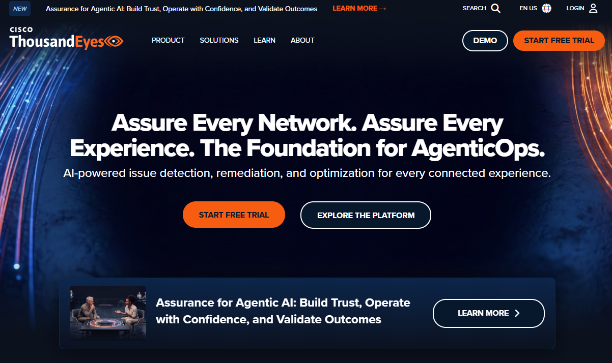
ThousandEyes, part of Cisco, provides end-to-end visibility across networks, cloud services, SaaS applications, endpoints, and the public internet. It is built around the idea that the experience users have often depends on infrastructure the engineering team doesn't control, including ISPs, CDNs, DNS providers, and third-party SaaS services. ThousandEyes maps these dependencies and shows where failures originate across the full path from user to application.
Best for: Product and IT teams investigating whether customer or employee experience problems originate outside the application stack.
Key features
- Internet path visualization with BGP and routing analysis
- SaaS dependency monitoring for cloud application performance
- Synthetic transaction tests across global vantage points
- Endpoint agent telemetry for device and network conditions
- Network outage intelligence with cross-customer correlation
Why choose ThousandEyes: It's the right tool when backend services look healthy but users in specific geographies, on specific ISPs, or accessing a particular SaaS dependency still report problems. For product managers, this matters during post-release investigations where the symptom is real but engineering can't reproduce it internally.
ThousandEyes pricing: ThousandEyes sells annual subscriptions across four monitoring areas: Network and App Synthetics, Endpoint Experience, Traffic Insights, and WAN Insights. Contact their sales team for a quote, as the price varies by the combination of visibility layers and deployment scale.
G2 rating: 4.5/5 (verified October 2026).
2. Dynatrace
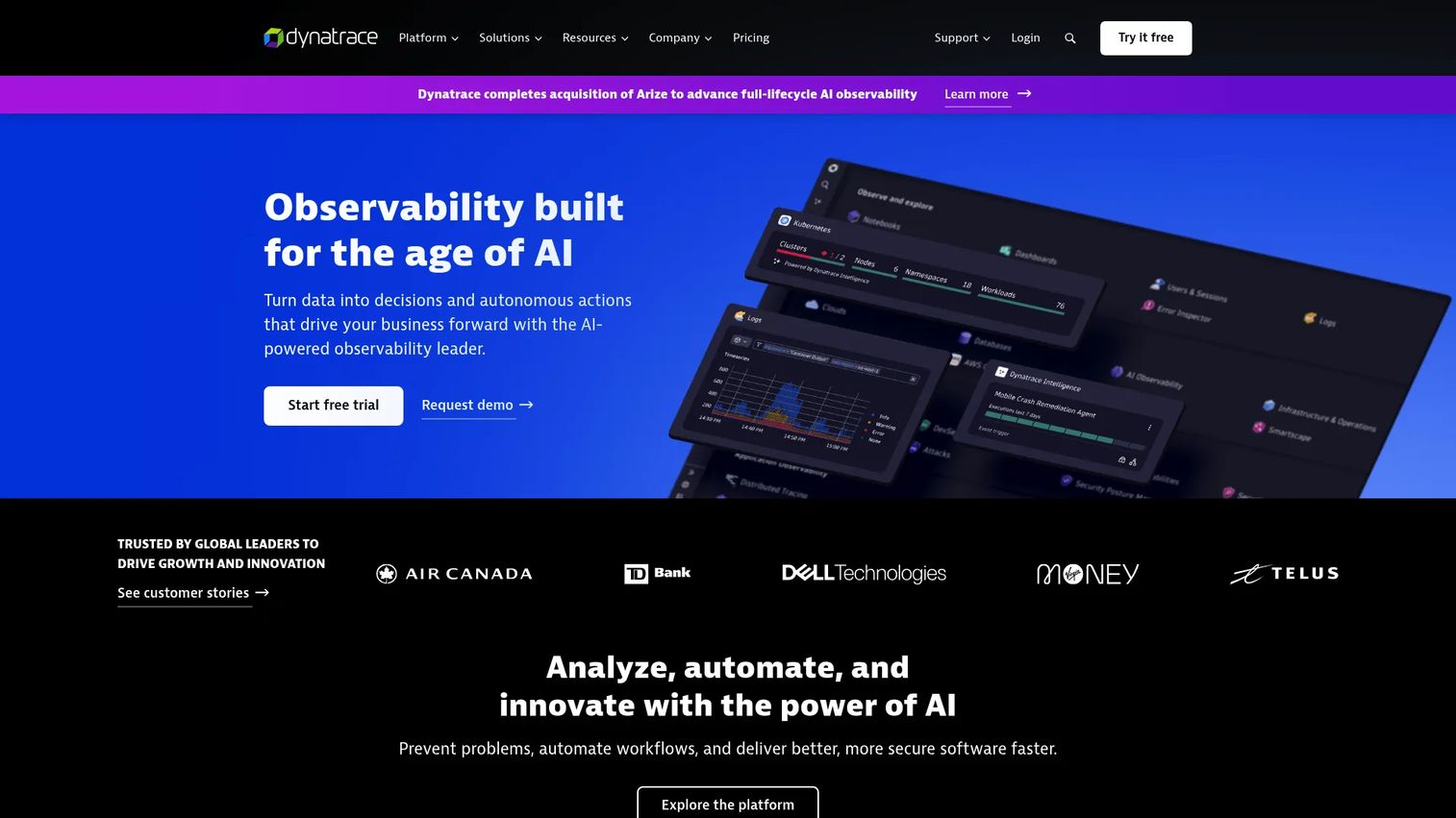
Dynatrace is an enterprise observability platform combining application monitoring, infrastructure visibility, log analytics, security monitoring, and AI-assisted root-cause analysis. Its Smartscape topology maps automatically update as services change, which removes a significant instrumentation maintenance burden for teams managing many microservices across multiple regions. The platform's Davis AI engine performs causation analysis, linking a user-visible symptom to the specific service, dependency, or infrastructure component responsible.
Best for: Large SaaS and enterprise teams that need automated correlation across complex, multi-service environments with strong governance requirements.
Key features
- Real user monitoring with session replay and journey analytics
- Synthetic monitoring for transaction, API, and browser tests
- Distributed tracing with code-level diagnostics
- Topology mapping via Smartscape, updated automatically
- AI-driven causation analysis with Davis AI
Why choose Dynatrace: Product managers working with multiple engineering teams across multiple release trains benefit most here. When an incident occurs, the platform shortens the time from "users are affected" to "this service owned by this team is the cause." That directly reduces the mean time to resolution and the number of unproductive cross-team escalations.
Dynatrace pricing: Consumption-based billing with annual commitment. Infrastructure monitoring starts at $7/mo per host (billed at $0.01/hour). Full-stack monitoring runs $58/mo per 8 GiB host. A 15-day free trial is available.
G2 rating: 4.5/5 (verified October 2026).
3. Datadog
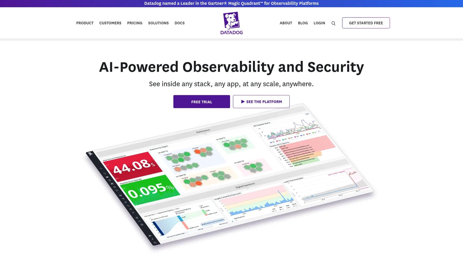
Datadog is a broad observability platform that combines infrastructure monitoring, APM, log management, RUM, synthetics, session replay, and error tracking. For cloud-native product teams, the appeal is having frontend and backend signals in the same environment: A slow page-load event in RUM can link directly to a database query trace in APM without switching tools. Datadog also includes product analytics capabilities, which makes the boundary between behavioral data and technical experience data more navigable.
Best for: Cloud-native product and engineering teams that already use Datadog for infrastructure monitoring and want to add frontend experience visibility without introducing another platform.
Key features
- RUM with session replay, Core Web Vitals, and user journey analysis
- Synthetic browser tests and API monitors
- Error tracking with source maps and grouping
- APM with distributed tracing and service dependency maps
- Product analytics for funnel and retention analysis
Why choose Datadog: The platform is best suited to teams that need to distinguish user friction caused by product design from friction caused by technical failures. Datadog can show whether a cohort's low activation rate correlates with frontend JavaScript errors, slow API responses, or simply a confusing UI, which changes the prioritization decision significantly.
Datadog pricing: A free tier covers basic infrastructure monitoring. The Pro plan runs $15 per host per month (billed annually; $18 on-demand). The Enterprise plan runs $23 per host per month (billed annually). RUM, synthetics, and session replay carry separate usage-based charges by sessions, test runs, and retained events.
G2 rating: 4.5/5 (verified October 2026).
4. New Relic
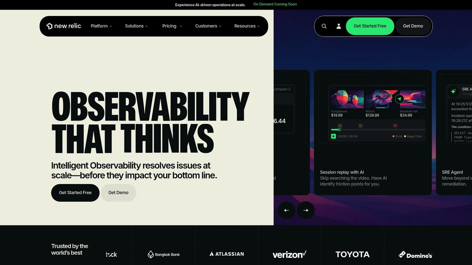
New Relic is a full-stack observability platform with strong browser monitoring, APM, distributed tracing, synthetic monitors, log management, and infrastructure visibility. Its consumption-based pricing model, paired with a perpetual free tier, makes it an accessible entry point for product teams that want to start monitoring specific user journeys without committing to a large enterprise contract from day one.
Best for: Product and engineering teams that need to connect user-side browser performance to application-level telemetry, with flexible instrumentation options and a low barrier to entry.
Key features
- Browser monitoring with Core Web Vitals, JS errors, and session tracing
- Synthetic monitors for scripted transaction and API tests
- APM with distributed tracing and service maps
- Error analysis with errors inbox and grouping
- Log management with logs-in-context
Why choose New Relic: Teams starting to instrument a few priority customer journeys will find the free tier useful for establishing baselines before committing to broader coverage. The platform also suits engineering organizations that want flexibility in how they send telemetry, as New Relic accepts OpenTelemetry data alongside its own agents.
New Relic pricing: The free tier includes 100 GB of data ingest per month, unlimited basic users, and one full-platform user. Paid plans (Standard, Pro, Enterprise) are consumption-based, with charges varying by data ingest volume and full-platform user count. Contact New Relic for Pro and Enterprise pricing.
G2 rating: 4.4/5 (verified October 2026).
5. Catchpoint
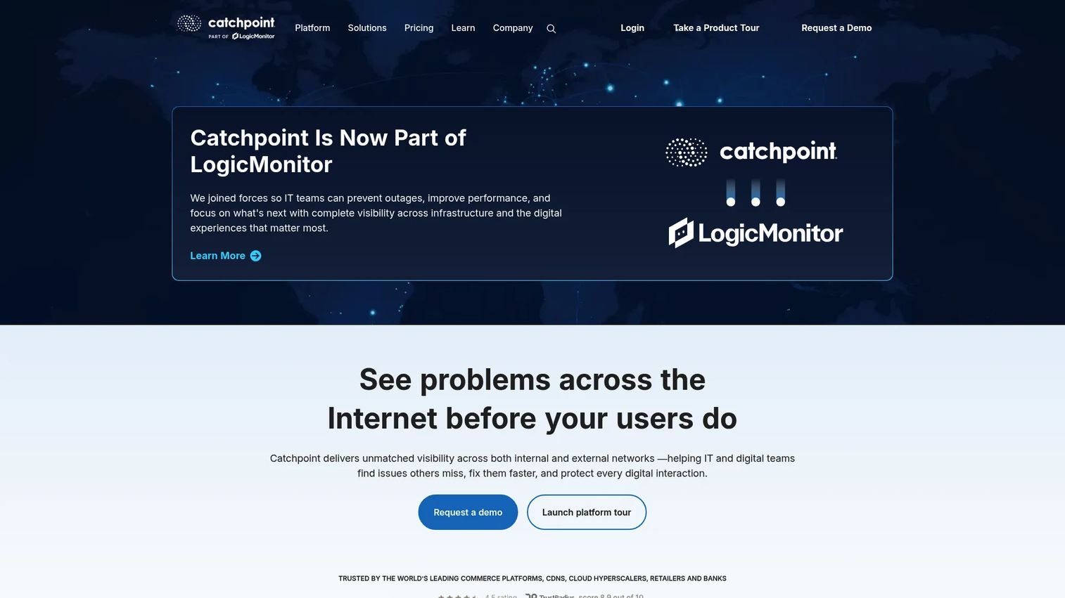
Catchpoint focuses on external digital experience assurance, internet performance intelligence, and synthetic testing at global scale. It monitors applications, DNS, CDN, API endpoints, and internet paths from hundreds of vantage points worldwide, which makes it useful for teams whose customer journeys depend on multiple external providers. Catchpoint also includes RUM, OpenTelemetry-based distributed tracing, and AI-assisted root-cause analysis.
Best for: Digital businesses where customer-facing journeys depend on external providers, third-party APIs, CDNs, or internet paths that the internal engineering team doesn't control.
Key features
- Global synthetic monitoring from hundreds of vantage points
- Internet performance testing with DNS, BGP, and routing analysis
- API and web transaction tests for critical workflows
- Endpoint experience visibility for distributed employee environments
- Digital experience scorecards for SLA and resilience tracking
Why choose Catchpoint: It's particularly strong for teams that need release confidence across geographies. Before shipping a change to login, checkout, or a partner-facing portal, you can validate that the critical path holds across every major ISP and region where customers operate, not just the cloud regions you control.
Catchpoint pricing: The AppAssure fixed-price package for monitoring one application starts at $37,950 for the first year. Broader Catchpoint pricing uses a points-based and volume-tier model through custom contracts.
G2 rating: 4.5/5 (verified October 2026).
6. Riverbed Aternity
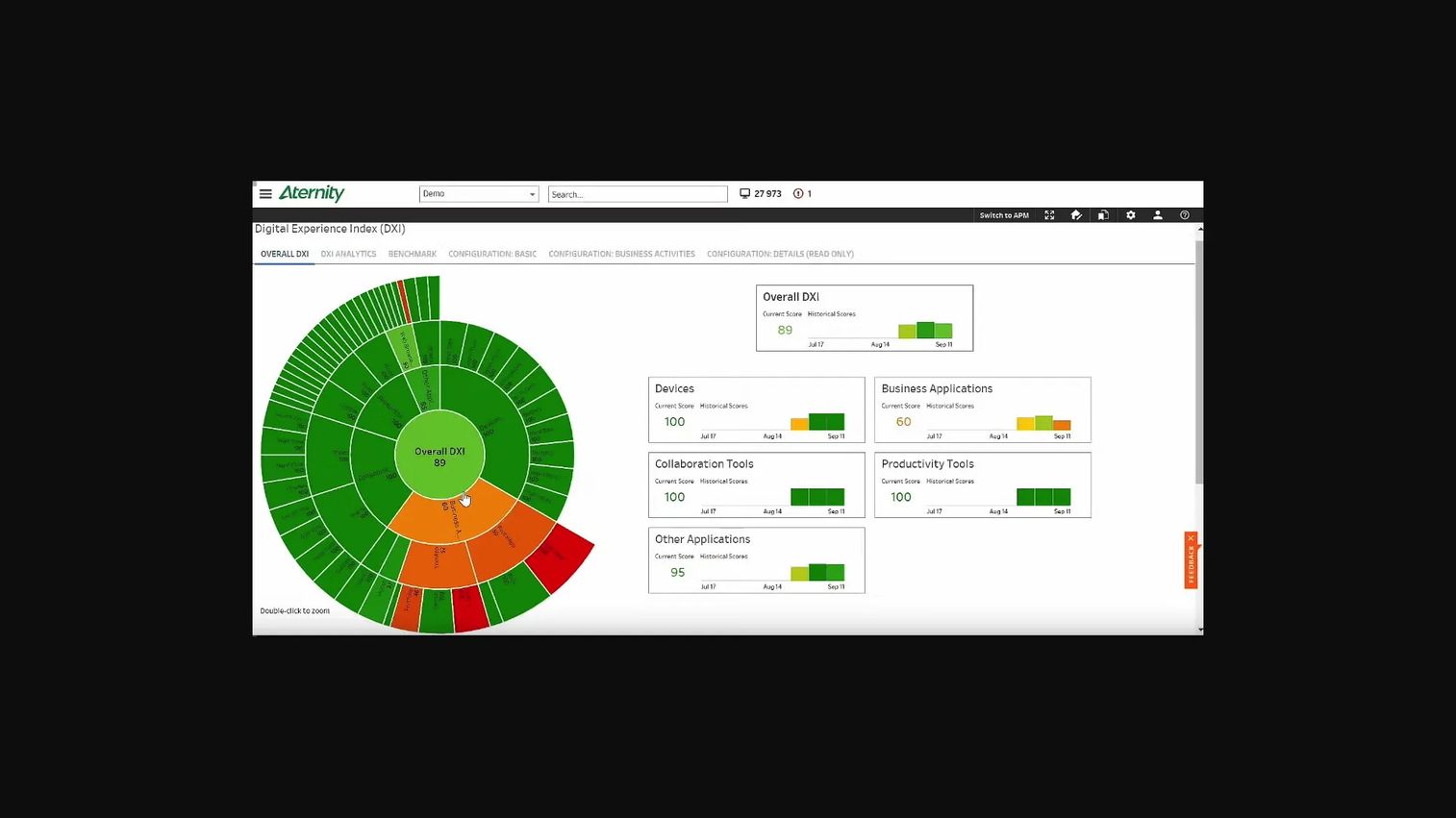
Riverbed Aternity is a digital employee experience platform that captures endpoint telemetry, device performance, and application experience data for workforce technology. It measures how employees experience SaaS applications, internal platforms, and collaboration tools from the device perspective rather than from the server. The platform includes a Digital Experience Index, ServiceNow integration, automated remediation runbooks, and employee sentiment analysis.
Best for: IT and product leaders responsible for employee-facing SaaS applications, internal admin tools, or hybrid work environments where device and network conditions shape the user experience.
Key features
- Endpoint telemetry covering device health, performance, and inventory
- Application experience scoring across SaaS and internal tools
- Device performance analysis for CPU, memory, and connectivity conditions
- ServiceNow integration for automated ITSM workflows
- Digital Experience Index and employee sentiment analysis
Why choose Riverbed Aternity: This platform is better aligned to employee technology experience than to customer-facing web conversion monitoring. If your product team supports internal users or operates employee-facing platforms alongside customer-facing ones, Aternity gives IT and product a shared view of where employee friction originates. Don't buy it expecting strong customer-facing RUM coverage.
Riverbed Aternity pricing: Riverbed documents Essentials and Enterprise editions but does not post prices. Contact their sales team for a quote based on endpoint count and deployment scope.
7. SolarWinds Observability
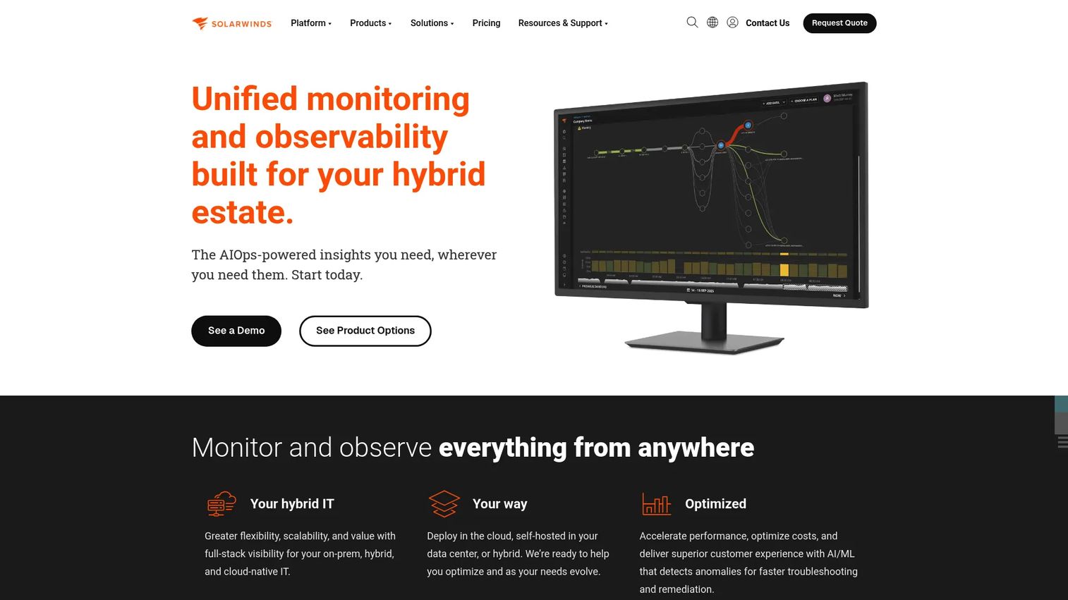
SolarWinds Observability is a unified monitoring platform covering applications, infrastructure, networks, databases, logs, and digital experience across hybrid and cloud environments. Its modular SaaS pricing lets teams add coverage incrementally, which suits organizations that need to balance network monitoring, infrastructure visibility, and application performance without adopting separate point solutions for each.
Best for: Mid-market IT teams managing hybrid infrastructure who need broad operational visibility across network, application, and cloud environments from one platform.
Key features
- Application performance monitoring with distributed tracing and service overviews
- Infrastructure and network monitoring for hybrid environments
- Database performance monitoring with query analysis
- Log observability with search, correlation, and alerting
- Digital experience monitoring via synthetic uptime checks and RUM
Why choose SolarWinds Observability: It's a practical choice for product managers working closely with IT teams that run customer-facing services and internal infrastructure from the same operational stack. The modular pricing means you can start with application observability and add digital experience or network monitoring as needs grow, rather than buying a full suite upfront.
SolarWinds Observability pricing: Modular SaaS pricing. Application Observability runs $27.50 per service per month. Network and Infrastructure Observability costs $15.75 per node per month. Log Observability is $5/GB/month. Digital Experience Observability (Synthetic) is $10 per 10 uptime or 2 transaction checks per month. RUM costs $10 per 100,000 page views per month. A 30-day free trial is available.
G2 rating: 4.3/5 (verified October 2026).
8. ManageEngine Site24x7
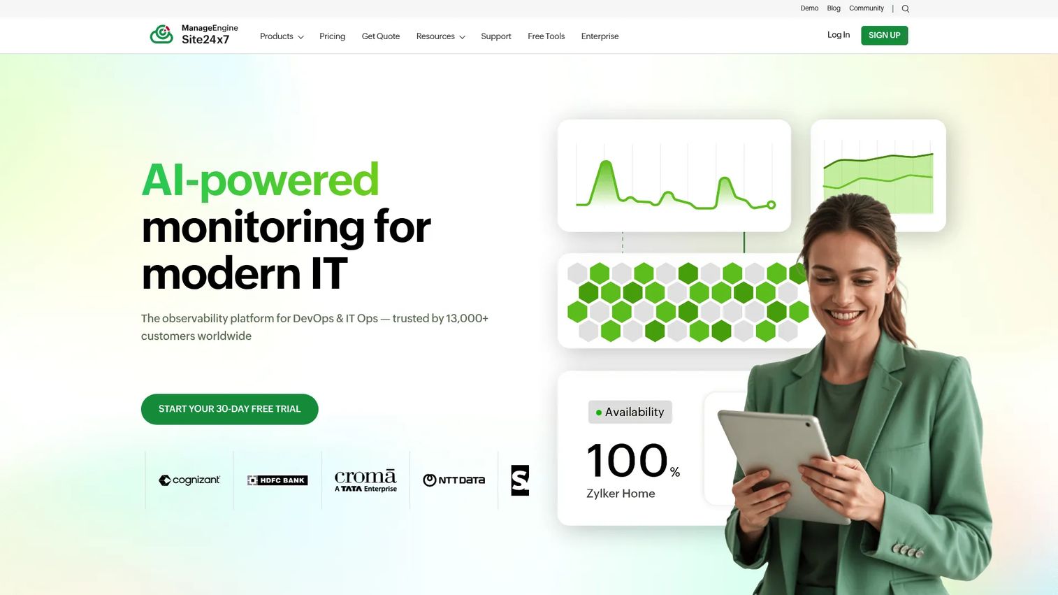
ManageEngine Site24x7 is an all-in-one monitoring platform covering website uptime, synthetic transactions, APM, cloud infrastructure, servers, networks, and logs. Its accessible pricing makes it a strong starting point for smaller product and IT teams creating their first monitoring baseline without adopting a large enterprise observability program. A free forever plan covers uptime monitoring for up to 50 resources.
Best for: Smaller product and IT teams that need broad monitoring coverage across websites, critical workflows, cloud services, and infrastructure without launching a large instrumentation project.
Key features
- Website monitoring with uptime, performance, and availability tracking
- Synthetic web transactions for scripted journey tests
- Cloud, server, Kubernetes, and network monitoring
- APM with code-level traces and error analysis
- Network device monitoring with SNMP and flow analysis
Why choose ManageEngine Site24x7: The Lite plan at $9/month covers enough to establish baselines across the customer journeys engineering already knows matter. For a product manager who needs to demonstrate monitoring value before requesting a larger budget, Site24x7 reduces the cost of that proof-of-concept cycle. Validate correlation depth and scale requirements during a trial before committing to higher tiers.
ManageEngine Site24x7 pricing: Lite starts at $9/month (billed annually). Professional runs $42/month (billed annually). Enterprise starts at $625/month (billed annually). A free forever plan supports up to 50 monitored resources.
G2 rating: 4.6/5 (verified October 2026).
9. ControlUp ONE
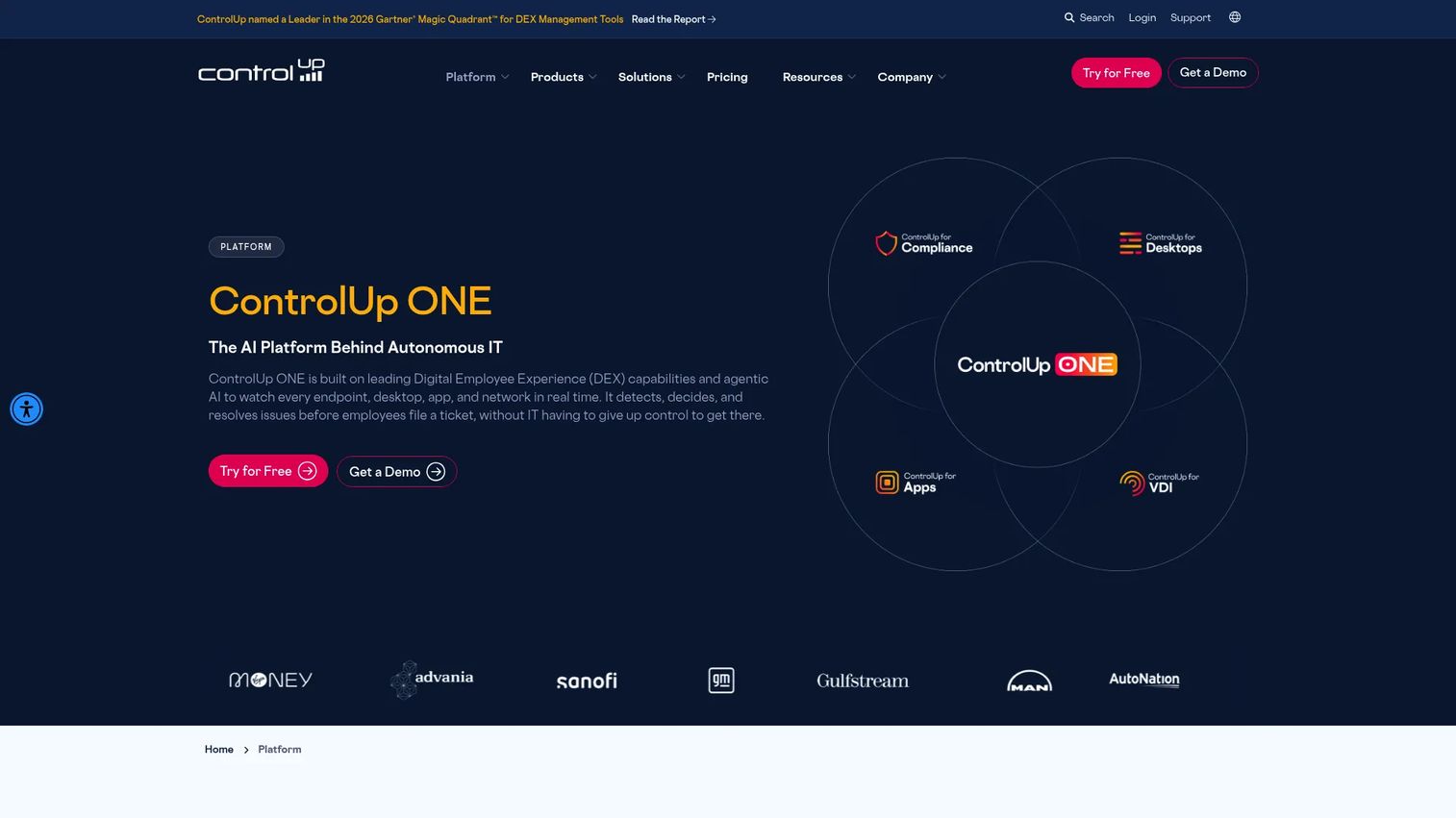
ControlUp ONE is a unified digital employee experience platform combining real-time endpoint monitoring, AI-powered diagnostics, patch and vulnerability management, automated remediation, and unified communications monitoring. It covers physical endpoints, VDI and DaaS environments, SaaS applications, and collaboration tools, which makes it relevant for IT and platform teams managing a distributed workforce on varied hardware and operating systems.
Best for: IT and digital workplace teams responsible for employee productivity, virtual desktops, endpoint reliability, and internal application performance.
Key features
- Endpoint monitoring with device health and performance analytics
- Digital employee experience scoring with trend analysis
- VDI and DaaS visibility across Citrix, VMware, and cloud environments
- Experience remediation with automated runbooks and workflows
- Unified communications monitoring for Teams, Zoom, and Webex
Why choose ControlUp ONE: It's built for IT operations teams that need to act on experience data, not just observe it. The remediation workflows let teams fix endpoint issues at scale without requiring users to file tickets or wait for manual intervention. For internal product teams and platform PMs, this reduces the support burden tied to environment-level failures that users report as product bugs.
ControlUp ONE pricing: Contact their sales team for a quote. Pricing is not posted publicly, with the company directing prospects to a sales conversation.
G2 rating: 4.7/5 (verified October 2026).
10. 7SIGNAL Platform
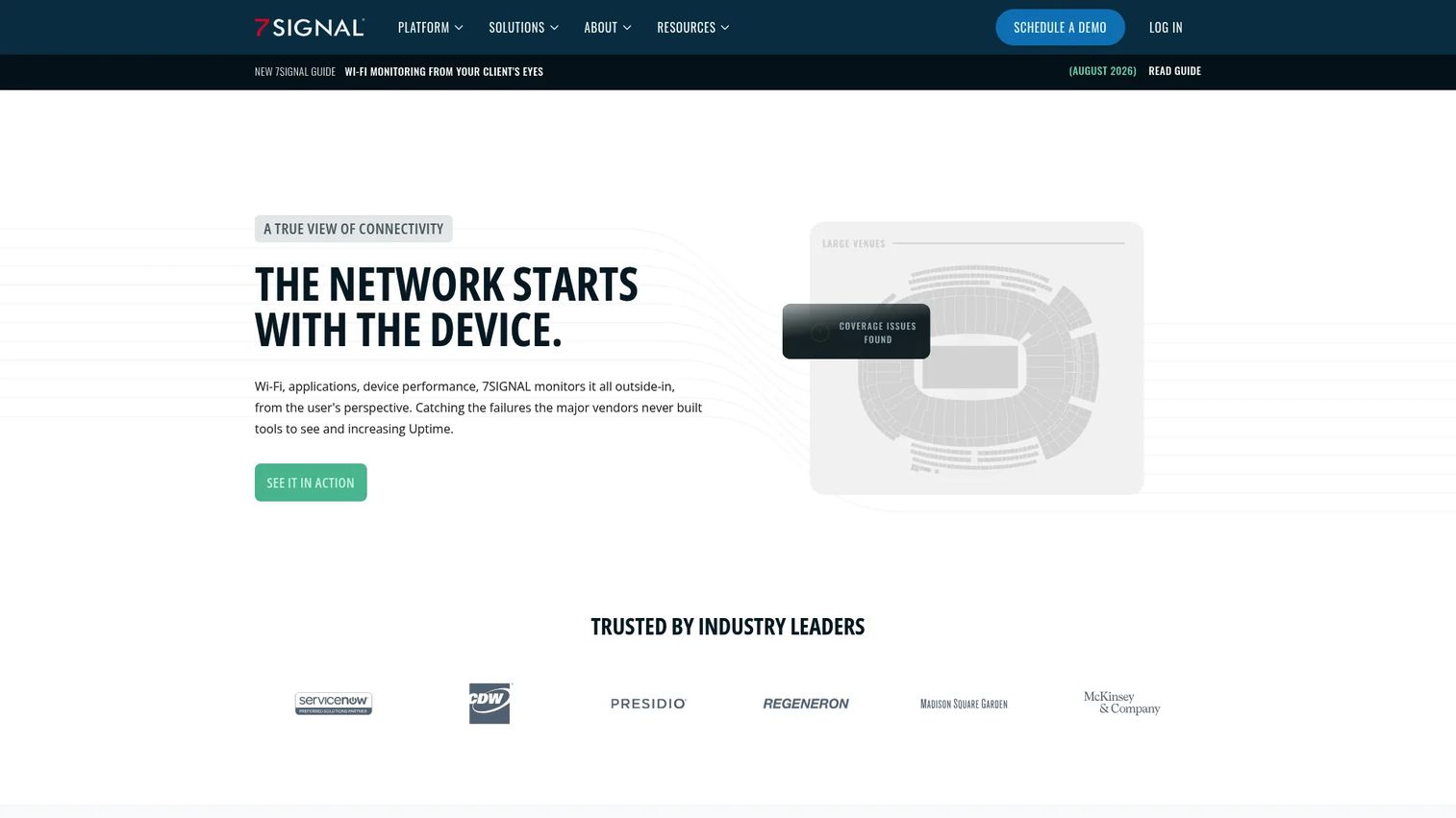
7SIGNAL Platform is an AI-powered cloud platform for monitoring and optimizing enterprise WiFi, wired connectivity, endpoint performance, and digital experiences. It uses a combination of endpoint agents and on-site WiFi sensors to collect wireless signal quality, RF analysis, synthetic test results, and user experience data. Its EYERIS virtual network engineer applies AI to surface root-cause explanations for wireless degradation.
Best for: Organizations where WiFi quality, branch connectivity, and wireless access directly shape employee or customer experience in managed locations.
Key features
- Vendor-agnostic WiFi and network monitoring from endpoint agents
- On-site WiFi sensors with RF analysis and packet capture
- Endpoint agents for Windows, macOS, Linux, and Android
- AI-powered EYERIS virtual network engineer for diagnostics
- Location-based visibility for campus, branch, and distributed sites
Why choose 7SIGNAL Platform: This is a specialist choice, not a default DEM platform. Add it to your shortlist when wireless conditions are a documented root cause of digital friction in environments such as offices, warehouses, clinics, campuses, or field locations. For customer-facing SaaS teams monitoring web application performance, it is not the right primary DEM platform.
7SIGNAL Platform pricing: Contact their sales team for a quote. Pricing is customized based on deployment scale, location count, and endpoint coverage.
Considerations when choosing digital experience monitoring tools
Define the experience layer first
Before comparing dashboards, decide whether the priority is customer-facing web and mobile experience, employee productivity and endpoint health, internet and SaaS dependencies, or a combination. A platform can be strong in one layer and lighter in another, so a mismatch here wastes the evaluation budget.
Name critical journeys before starting a vendor demo
Identify three to five transactions that matter commercially: Signup, login, first meaningful action, checkout, or API-dependent onboarding. Ask each vendor to demonstrate detection and investigation for a failure in one of those specific journeys, not a generic scenario. This is the fastest way to assess correlation depth versus data collection breadth.
Evaluate the investigation workflow, not just the alert volume
The platform should help a team move from a user-visible symptom to an owning team and a probable cause. During evaluation, run a realistic incident and measure how many steps it takes to reach an actionable conclusion. More telemetry doesn't improve outcomes unless teams can act on it quickly.
Model total cost against production volumes
RUM sessions, synthetic test frequency, retained log data, host count, endpoints, and traces all affect the final bill. Ask each vendor to price your expected production scale rather than a proof-of-concept configuration. The gap between POC and production pricing is where DEM budgets most often surprise finance.
Set alert ownership before rollout
A DEM platform generates alert fatigue when every team receives every signal. Before deploying, define which journeys trigger product escalation, who owns remediation for each failure type, and which customer-impacting metrics feed incident review meetings. This is an operational decision, not a technical one.
Conclusion
The ten platforms in this guide cover distinct layers of digital experience monitoring. ThousandEyes and Catchpoint address internet, SaaS dependency, and external experience visibility. Dynatrace, Datadog, and New Relic handle full-stack customer experience correlation across frontend, application, and infrastructure. Riverbed Aternity, ControlUp ONE, and 7SIGNAL Platform cover employee, endpoint, and wireless experience for workforce technology. SolarWinds Observability and ManageEngine Site24x7 provide broad operational monitoring across hybrid or growing environments, with accessible pricing for teams building their first monitoring baseline.
The clearest next step: Choose two critical customer journeys, establish a baseline for their completion rate and p95 response time today, then run a technical evaluation using the same incident scenario across the platforms on your shortlist. A vendor that can walk you through a realistic failure from first detection to owning team in under ten minutes is demonstrating something a feature checklist never captures.
For teams also exploring how to communicate product changes, onboarding flows, and feature adoption alongside their monitoring investments, Guideflow offers interactive demo and digital adoption tools that complement the observability layer.
Start your journey with Guideflow today!
FAQs
Digital experience monitoring is the practice of measuring the availability and performance of digital services from the user's perspective, using data from real browser sessions, synthetic transaction tests, application traces, network paths, and endpoint conditions. It answers the question "what did users experience technically" rather than "what did users do behaviorally." Most mature DEM deployments combine at least two data sources, such as RUM and synthetic monitoring, because each catches different failure patterns.
Real user monitoring (RUM) captures data from actual user sessions as they happen, revealing real-world performance by browser, geography, device, and cohort. Synthetic monitoring runs scripted tests at scheduled intervals, checking whether a defined workflow succeeds before any real user encounters a failure. RUM shows you what users experienced; synthetic monitoring tells you whether a journey is currently functional. Teams that rely on RUM alone miss failures that occur outside peak traffic hours.
No. APM focuses on application services, traces, and dependencies from the server side. DEM starts from the end-user experience and may include APM data, but it also covers browser rendering, network path conditions, endpoint constraints, and external SaaS dependencies. See the Guideflow guide to application performance monitoring tools for a deeper breakdown of APM-specific platforms.
Product analytics identifies behavioral patterns: Where users drop off, which features they adopt, how funnels convert. DEM identifies technical causes behind those patterns, including slow page loads, JavaScript errors, network degradation, or regional outages. A drop in activation after a release can look identical whether it's caused by a confusing UX change or a broken API call. DEM is what distinguishes the two. The two categories are complementary, not competing, and the best teams use both.
Dynatrace, Datadog, and New Relic are the strongest options for customer-facing SaaS applications that need frontend-to-backend correlation. ThousandEyes and Catchpoint add internet and SaaS dependency coverage for teams whose customer journeys pass through external providers. SolarWinds Observability and ManageEngine Site24x7 suit teams with hybrid environments or tighter budgets. See the Guideflow guide to AIOps tools for platforms that add AI-assisted incident detection on top of observability data.
Riverbed Aternity, ControlUp ONE, and 7SIGNAL Platform are purpose-built for employee digital experience. They measure device health, application responsiveness, virtual desktop performance, and wireless quality from the endpoint perspective. Customer-facing RUM platforms are not the right tool for diagnosing employee friction in CRM systems, internal admin tools, or collaboration software. The job is different, and the instrumentation layer needs to match.
Start with baselines before claiming improvement. Useful baseline metrics include critical journey success rate, p95 page response time, error rate for key flows, support ticket volume linked to technical failures, incident detection time, and mean time to resolution. After deployment, track whether incidents are detected faster, whether engineering escalations decrease, and whether affected-user cohort size shrinks during incidents. Changes in activation completion or trial conversion can serve as downstream proxy metrics, but connect them to a specific incident or improvement to make the claim credible.
Run a realistic incident scenario: Introduce a latency spike or a synthetic error in a critical workflow and measure whether the platform detects it, identifies which user segments were affected, connects the symptom to a probable cause, routes the alert to the right team, and supports a post-incident review with sufficient evidence. A POC that only tests dashboards and data collection misses the operational question that matters most: Can this platform help my team get from complaint to cause in under thirty minutes?