

Last updated: October 2026 | Author: Team Guideflow
Your product team ships a new workflow. Engineering rebuilds the modal, the validation rules, the table behavior, and keyboard states from scratch. Then the next release needs a different version of the same components.
This cycle is expensive. According to the Design Systems Report (2025), 79% of surveyed teams now have a dedicated design systems team, yet most still spend engineering cycles rebuilding patterns that already exist elsewhere. The wrong component library choice compounds this cost. It can create styling debt, migration risk, and UI drift that quietly slows every subsequent release.
The right choice depends on one thing most library comparisons skip: The ownership model. Packaged libraries move fast. Headless primitives hand responsibility to your team. Copy-paste models give you full source control. Choose the model before you pick the brand.
This guide covers 12 React component libraries across those models, with pricing verified from each vendor's site and selection criteria framed for product managers who care about release cadence, engineering opportunity cost, and long-term maintainability.
What's inside
This guide is for product managers, front-end leads, and technical PMs choosing a UI foundation for a new React application or design system refresh.
- Coverage: A comparison of 12 React component libraries across packaged, headless, and copy-paste models
- Selection criteria: Accessibility support, TypeScript coverage, design system ownership, and release maintenance
- Pricing: A verified licensing snapshot checked against live vendor pages before publishing
- Recommendations: Decision guidance for SaaS products, internal tools, and brand-sensitive interfaces
Tools are ordered by relevance to broadly used React product development patterns, not GitHub star count alone. For related reading on code review tools, AI code generation tools, and web design software, see the Guideflow blog.
TL;DR
- Best for enterprise product teams: MUI offers a mature Material Design system with advanced data-rich components for complex SaaS products
- Best for source code ownership: shadcn/ui lets teams copy components directly into their repository for full implementation control
- Best for accessible primitives: Radix UI gives engineering the interaction behavior foundation to build a custom visual system on top of
- Best for rapid delivery: Mantine and Chakra UI both offer broad, styled component catalogs for fast product assembly
- Best for enterprise administration tools: Ant Design covers data-dense interfaces where tables and forms dominate
- Best free Tailwind companion: daisyUI extends Tailwind CSS with semantic component classes at no cost
What is a component library?
A component library is a reusable collection of interface building blocks, such as buttons, forms, dialogs, navigation, tables, and feedback states, that teams use to build consistent applications faster.
The four component library models
Understanding the model is more important than comparing brands. Each model distributes a different kind of responsibility.
| Model | What the team gets | Ownership | Best fit |
|---|---|---|---|
| Packaged and styled | Ready-made visual components | Vendor dependency via package updates | Teams optimizing for delivery speed |
| Headless primitives | Accessible behavior, no imposed styling | Team owns the visual layer | Mature design systems |
| Copy-paste components | Source code copied into the product | Full source ownership | Deep customization needs |
| Utility CSS companion | Styling primitives with component classes | Shared utility conventions | Teams standardized on Tailwind CSS |
Core capabilities to evaluate
When assessing any React component library, check for:
- Accessible keyboard navigation and focus management
- Theme tokens and dark mode support
- TypeScript coverage
- Form validation compatibility
- Data tables and complex input components
- Server-side rendering support
- Versioning and migration documentation
Why product managers should care
Library selection directly affects release velocity, onboarding consistency, and cross-team alignment. A standardized component catalog reduces engineering debate over recurring UI patterns. It speeds up experiment validation by making A/B variants cheaper to build. It also reduces design drift across product surfaces, which matters when you are maintaining consistent activation flows across multiple user segments.
The component content management systems guide covers the adjacent challenge of documenting and governing the components you build.
When to use a component library
Standardize recurring product workflows
Use a component library when engineering repeatedly builds forms, empty states, settings pages, data tables, dialogs, and role-based navigation. Reusable patterns reduce inconsistency across onboarding and activation journeys, which shortens time to first value for new users.
Ship a new application without rebuilding a design system
Use a packaged library when the product needs to launch quickly and the team lacks capacity to build foundational components. The engineering opportunity cost of building a modal from scratch is real; a packaged library eliminates it.
Build a custom design system without rebuilding accessibility behavior
Use headless primitives or copy-paste components when brand differentiation and source ownership matter, but engineering still wants tested patterns for dialogs, menus, selections, and focus management. This model pays off when the product has enough surface area to justify maintaining the visual layer internally.
Component libraries comparison
The best component library for your team depends on who owns styling, how much accessibility behavior you want out of the box, and whether advanced data components are required.
Pricing and ratings verified October 2026 from each vendor's official pricing page and G2 listing.
| # | Product | Best for | Key differentiator | Pricing | G2 rating |
|---|---|---|---|---|---|
| 1 | MUI | Enterprise SaaS and data-rich apps | Material Design system plus advanced MUI X components | Free (Community); Pro $299/yr/dev; Premium $599/yr/dev | 4.5/5 |
| 2 | shadcn/ui | Source code ownership and deep customization | Copy-paste components built around accessible primitives | Free, open source | N/A |
| 3 | Radix UI | Custom design systems with accessible primitives | Unstyled, WAI-ARIA compliant primitives | Free, open source | N/A |
| 4 | Chakra UI | Fast, accessible React product UI | Accessible styled components with theme customization | Free, open source | N/A |
| 5 | Mantine | Full-featured SaaS interfaces | 120+ components plus hooks and form management | Free, open source | N/A |
| 6 | Ant Design | Data-dense enterprise tools | Enterprise component set with TypeScript and i18n | Free, open source | 4.5/5 |
| 7 | Headless UI | Tailwind-based custom interfaces | Unstyled accessible components for Tailwind projects | Free, open source | N/A |
| 8 | React Aria Components | Accessibility-first custom UI | Adobe's accessible React hooks and components | Free, open source | N/A |
| 9 | Base UI | Low-level customizable foundations | Unstyled components under MIT license | Free, open source | N/A |
| 10 | HeroUI | Polished modern React applications | Styled components with Tailwind v4 theming and React Aria | Free (core); Pro pricing not publicly displayed | N/A |
| 11 | daisyUI | Fast Tailwind prototyping | Semantic CSS class-based component system | Free, open source | N/A |
| 12 | React Bootstrap | Bootstrap-based React applications | Bootstrap UI rebuilt for React, no jQuery required | Free, open source | 4.4/5 |
Best 12 component libraries for React in 2026
1. MUI
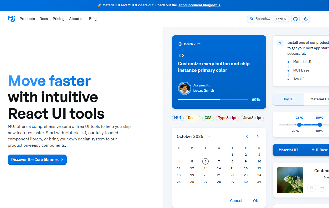
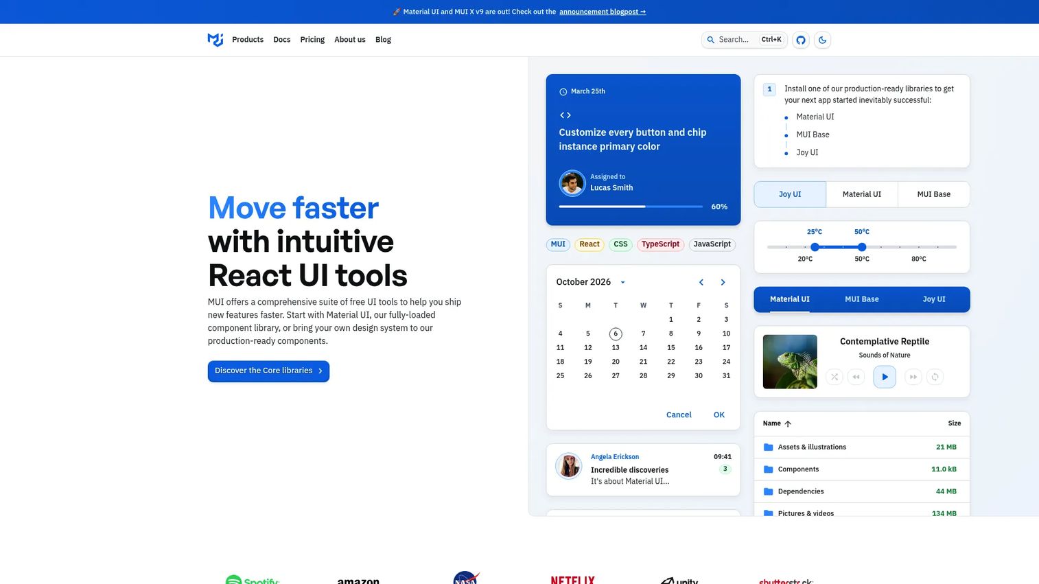
MUI is a React component library based on Material Design with a free Community tier and commercial MUI X options for advanced data-rich product interfaces. It covers everything from basic inputs and layout to complex data grids, date pickers, charts, and schedulers. The documentation is extensive, TypeScript support is built in, and the component catalog has been production-tested across thousands of applications.
Best for: Product teams building enterprise SaaS apps, admin consoles, or data-heavy workflows that need a mature, governed component catalog.
Key features
- Material Design component system with theme tokens
- MUI X advanced components: Data grid, date/time pickers, charts, tree view
- Full TypeScript support across all components
- Accessible components with WAI-ARIA compliance
- Commercial support plans available with Pro and above
Why choose MUI: It removes the engineering debate around common UI patterns. When Material Design is a workable baseline for your brand, MUI gives product teams a governed, well-documented foundation that holds up through multiple release cycles.
MUI pricing: The Community plan is free forever and includes MUI Core plus 40+ free components. Pro costs $299 per developer per year (billed annually). Premium is $599 per developer per year, and Enterprise is $1,399 per developer per year. Pricing is per developer, not per seat, so teams should factor in who actively builds on the library.
G2 rating: 4.5/5 (verified October 2026).
2. shadcn/ui
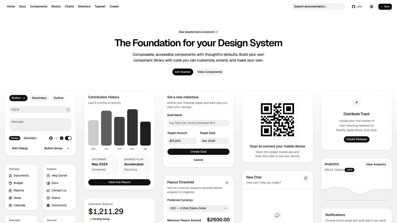
shadcn/ui uses a copy-paste distribution model rather than a conventional package dependency. Teams install components via a CLI, which copies the source code directly into their project. That means your team owns the implementation and can modify it without waiting on an upstream release.
The components are built on accessible primitives and styled with Tailwind CSS. An AI-ready component registry, block templates, and community extensions have expanded the ecosystem considerably.
Best for: Product teams that expect heavy customization, already use Tailwind CSS, and want the roadmap flexibility that comes with owning source code.
Key features
- Copy-paste ownership: Components live in your codebase
- CLI-based installation per component
- Built on accessible component foundations
- Tailwind CSS styling throughout
- AI-ready registry and community blocks
Why choose shadcn/ui: When your product needs to look and behave distinctly from every other SaaS app, owning the component source removes the ceiling that package-based libraries impose.
shadcn/ui pricing: The core library is free and open source. The official site describes it as free forever. Some third-party template ecosystems exist separately; they are not official shadcn/ui products.
3. Radix UI
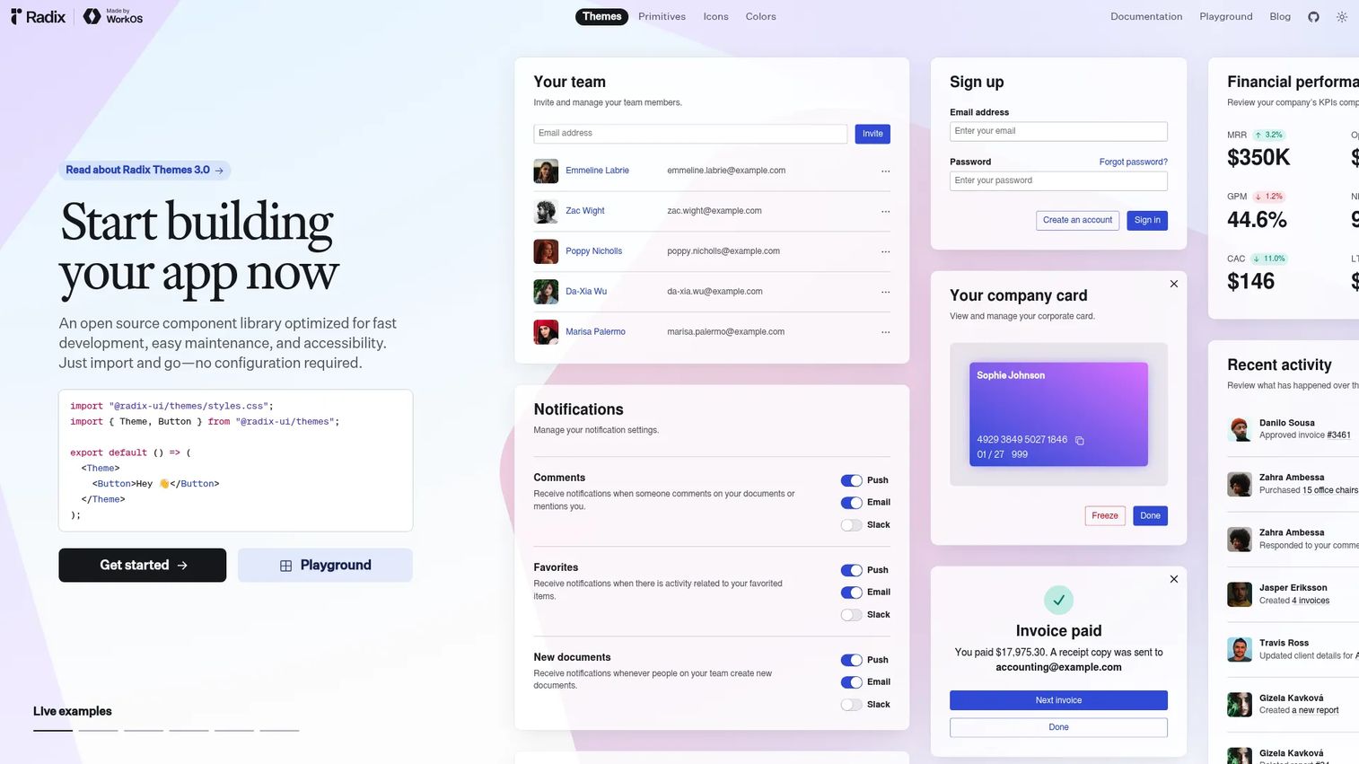
Radix UI provides low-level, unstyled React primitives built around WAI-ARIA design patterns. It handles the hard parts of interface behavior, focus management, keyboard navigation, controlled and uncontrolled state, and composable APIs, while leaving every visual decision to the team.
This is the library under shadcn/ui's default components, which reflects how widely trusted its primitives have become.
Best for: Product organizations with design system maturity and the engineering capacity to own their visual layer.
Key features
- Unstyled components compatible with any styling approach
- WAI-ARIA compliant interaction patterns throughout
- Focus management built into dialogs, popovers, and menus
- Composable APIs via the
asChildprop - Fully typed and tree-shakeable package structure
Why choose Radix UI: It lets teams avoid rebuilding difficult interaction behavior while retaining full control over brand expression. The engineering investment is in styling, not in accessibility logic.
Radix UI pricing: Free and open source. No paid tiers were found on the official site.
4. Chakra UI
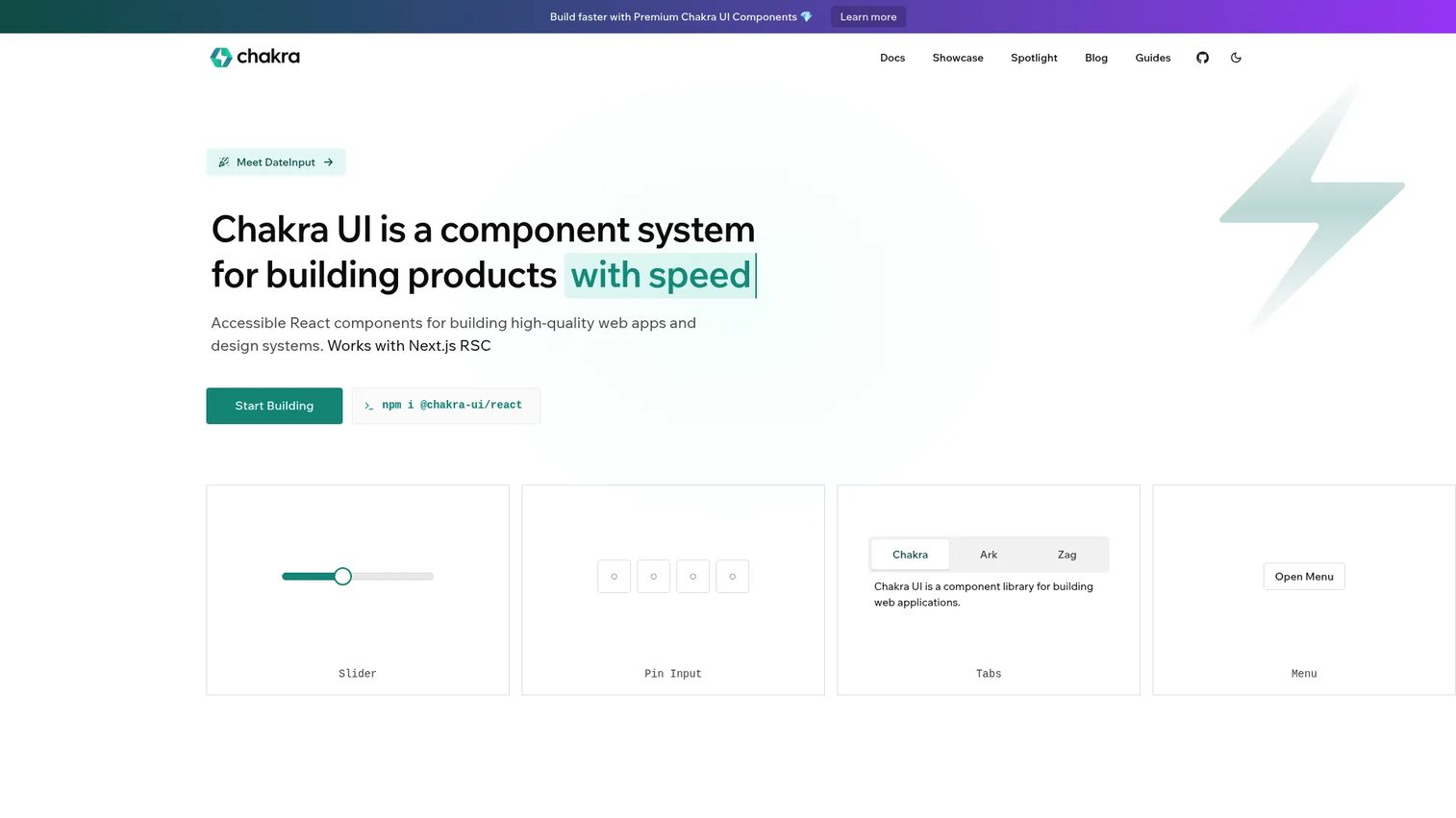
Chakra UI is a styled React component library built around accessible components, design-system tokens, and practical theme configuration. It supports Next.js and Vite, includes pre-built component snippets, and covers responsive style props natively.
The library occupies the middle ground: More opinionated than a headless library, less visually constrained than Material Design.
Best for: Teams that want a ready-made, accessible React UI foundation without committing to a specific design language.
Key features
- Accessible React components by default
- Design-system tokens: Typography, color, spacing, recipes
- Theme customization through a config-based system
- Responsive style props built in
- Dark mode support out of the box
Why choose Chakra UI: It shortens the path from an approved workflow design to a production-ready screen. When the team needs to move fast and accessibility is non-negotiable, Chakra UI reduces implementation overhead for both.
Chakra UI pricing: Free and open source. The official pricing page was not readable as a current numeric table. G2 reviewers report no separate commercial pricing for the core library.
5. Mantine
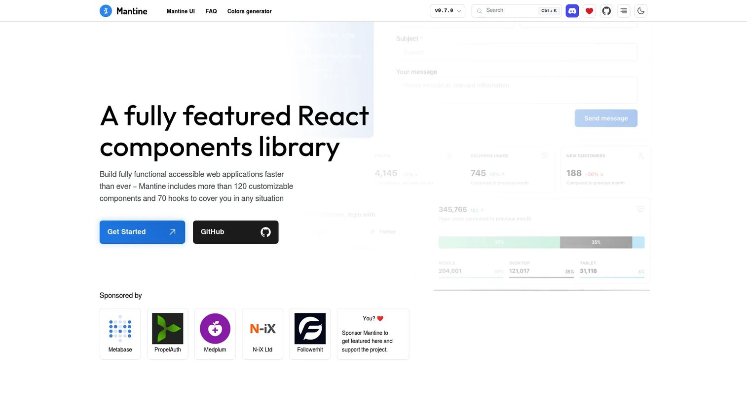
Mantine is a full-featured React component library with over 120 customizable components, 70+ utility hooks, a built-in form library with schema validation, and extensions covering a rich text editor, charts, notifications, modals, and a command palette (Spotlight).
The official site states that Mantine components are free forever for everyone.
Best for: SaaS product teams that need breadth across dashboards, settings workflows, forms, notifications, and data displays without assembling multiple smaller packages.
Key features
- 120+ customizable React components
- 70+ hooks for state and UI management
- Form library with validation, nested objects, and list fields
- Dark and light color scheme support with a flexible Styles API
- Extensions: Charts, rich text editor, carousel, Spotlight
Why choose Mantine: When a team wants to spend product capacity on workflow differentiation rather than assembling foundational UI parts, Mantine's breadth reduces the number of separate library evaluations engineering must do.
Mantine pricing: Free. The library is open source and the homepage explicitly states it is free forever for everyone.
6. Ant Design
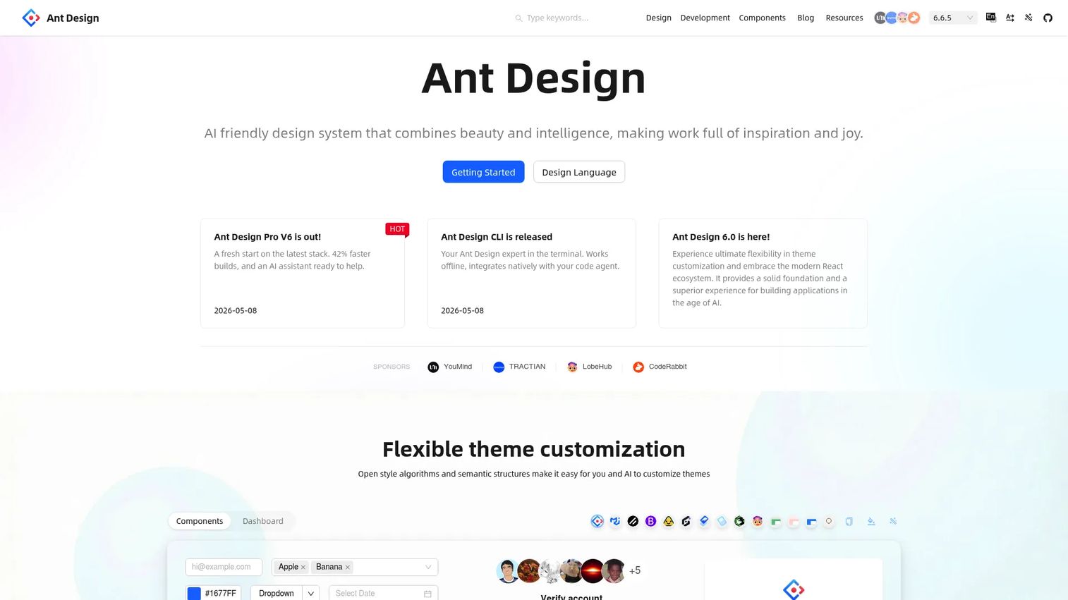
Ant Design offers a broad suite of enterprise-oriented React components, covering 60+ reusable UI elements with TypeScript support, theme token customization, internationalization for dozens of languages, and server-side rendering compatibility. It is a popular foundation for internal tools, admin interfaces, and B2B SaaS products where users spend their day in dense tables and forms.
Best for: Internal tools, enterprise SaaS applications, and workflow-heavy products where data tables, filters, and form patterns are the core experience.
Key features
- 60+ enterprise-grade React components
- TypeScript support with predictable static types
- Design token customization for theming
- Internationalization support for multiple languages
- Server-side rendering and Electron compatibility
Why choose Ant Design: When the product's core workflow is dense data, permissions, or configuration screens, Ant Design's native patterns cover the most common administrative interface requirements without custom engineering.
Ant Design pricing: Free and open source. The official documentation describes it as an installable React library with no paid subscription tiers.
G2 rating: 4.5/5 (verified October 2026).
7. Headless UI
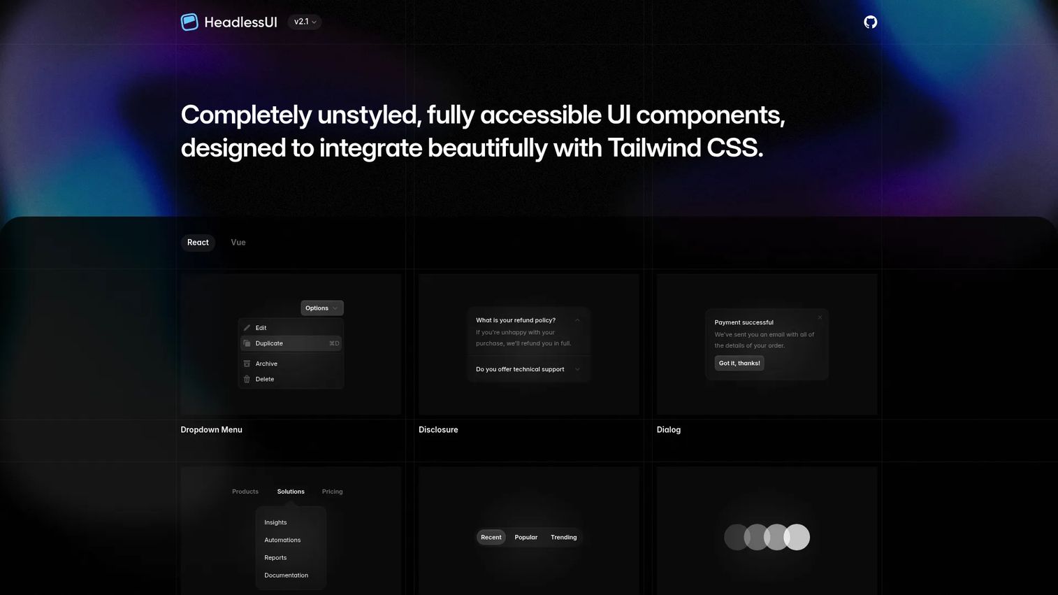
Headless UI is a small library of unstyled, accessible components designed to work naturally with Tailwind CSS. It covers menus, dialogs, popovers, tabs, disclosure panels, and form controls, each with keyboard interaction and focus management handled by default.
The library covers React and Vue, making it useful for teams running multiple frontends.
Best for: Teams already standardized on Tailwind CSS that want accessible primitive behavior without a predefined visual system.
Key features
- Tailwind CSS-native component design
- Unstyled interaction primitives with full keyboard support
- Dialog, menu, popover, combobox, and tabs covered
- React and Vue support
- Maintained by the Tailwind CSS team
Why choose Headless UI: It gives a focused starting point for teams whose design system already lives in utility classes. Behavior is handled; styling is fully yours.
Headless UI pricing: Free and open source. No paid tiers were found on the official site.
8. React Aria Components
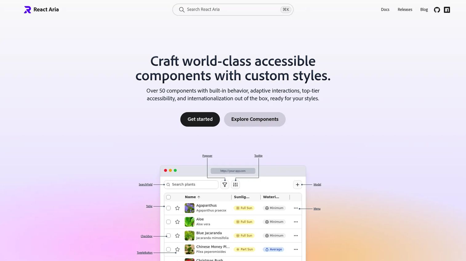
React Aria Components is Adobe's open-source library of accessible React building blocks. It covers interaction behavior, ARIA patterns, internationalization, and keyboard handling across forms, selections, overlays, and date inputs. Starter kits for vanilla CSS and Tailwind are available for teams that want a visual starting point.
The lower-level hooks are available separately for teams that need finer control over composition.
Best for: Product teams where accessibility requirements are central requirements, not post-launch additions, and engineering plans to build a distinct visual system.
Key features
- Accessible interaction behavior built into every component
- Full keyboard navigation and focus management
- ARIA pattern compliance across all components
- Internationalization support built in
- Starter kits for CSS and Tailwind
Why choose React Aria Components: Accessibility is a product quality requirement, not a styling feature. React Aria Components treats it as the first constraint rather than the last one.
React Aria Components pricing: Free and open source. Available via npm with no paid tiers.
9. Base UI
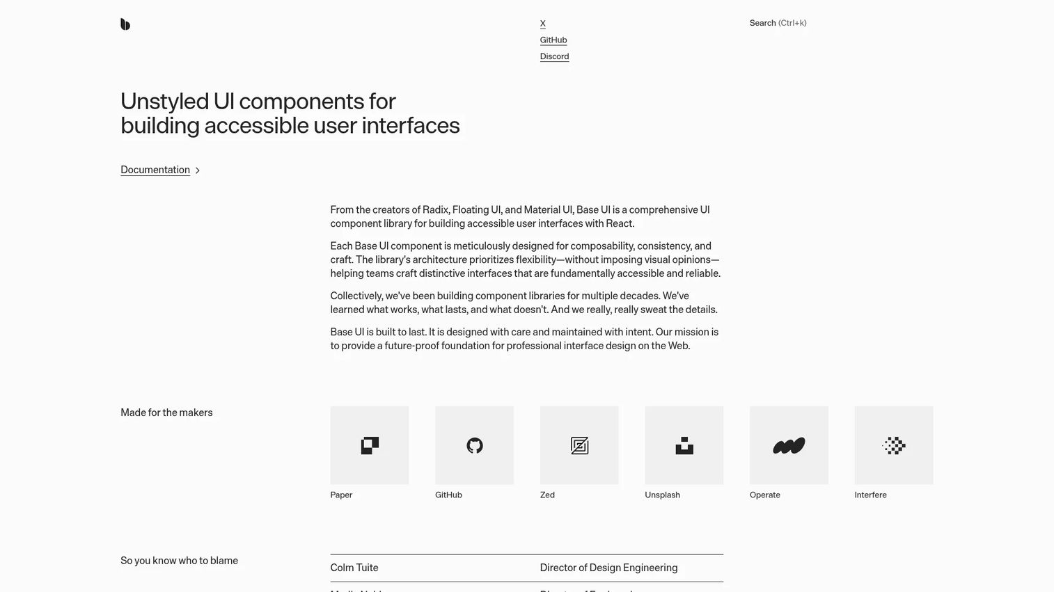
Base UI is an unstyled React component library from the MUI team, available under the MIT license. It provides composable, accessible components including Select, Combobox, Dialog, Drawer, Slider, Toolbar, and Number Field, built around ARIA Authoring Practices Guide patterns and WCAG 2.2.
Unlike MUI Core, Base UI imposes no design language. It is compatible with Tailwind, CSS Modules, CSS-in-JS, and plain CSS.
Best for: Engineering and design teams building a custom system that needs composable components with long-term ownership and no inherited visual constraints.
Key features
- Unstyled components compatible with any styling approach
- ARIA APG patterns and WCAG 2.2 compliance baked in
- Composable React components: Select, Combobox, Dialog, Slider, Toolbar
- MIT licensed, free for commercial use
- No formal enterprise SLAs currently offered
Why choose Base UI: Teams that want the governance discipline of MUI without its visual defaults will find Base UI the lowest-friction path to an accessible, custom design system.
Base UI pricing: Free for commercial use under the MIT license.
10. HeroUI
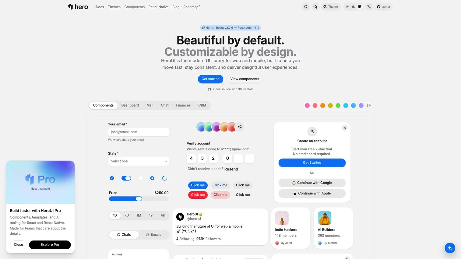
HeroUI is an open-source UI library offering 75+ React web components and 37 React Native components. Accessibility is powered by React Aria, theming uses Tailwind CSS v4, and the library supports compound component composition. HeroUI Pro adds template editions for web, mobile, and combined projects, though numeric prices were not displayed on the pricing page at the time of verification.
Best for: Startups and product teams that need polished visual defaults and a credible interface baseline without designing every control from scratch.
Key features
- 75+ web components and 37 React Native components
- Accessibility powered by React Aria throughout
- Tailwind CSS v4 theming and customization
- Compound component composition pattern
- AI tooling: MCP servers, Agent Skills, and LLMs.txt
Why choose HeroUI: It suits teams trying to balance design quality with delivery speed during early product iteration. The React Aria foundation means accessibility comes with the components rather than as a separate workstream.
HeroUI pricing: The core open-source library is free. HeroUI Pro offers paid template editions (Web Hero, Mobile Hero, Super Hero), but numeric prices were not displayed on the official pricing page at the time of verification.
11. daisyUI
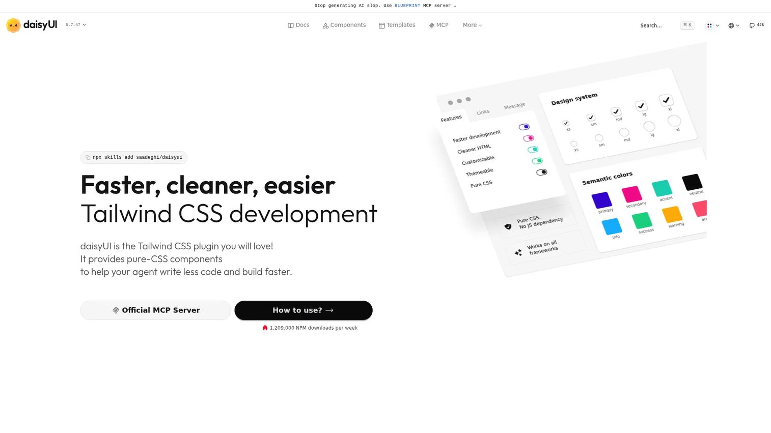
daisyUI is a free Tailwind CSS plugin that adds semantic component class names, 68 components, and 600+ utility classes on top of Tailwind's base. It requires no JavaScript dependency, works with all major frameworks, and ships with customizable themes and MIT licensing for commercial projects.
The core library is $0. Separate paid products, including templates and Blueprint, are sold through the official store and are distinct from the core library.
Best for: Small product teams or individuals already using Tailwind CSS who want common UI patterns available immediately.
Key features
- Pure CSS: No JavaScript dependency
- 68 components and 600+ utility classes
- Framework-agnostic: Works with React, Vue, Svelte, and others
- Customizable themes and semantic color system
- MIT licensed for commercial use
Why choose daisyUI: For teams standardized on Tailwind, it cuts the initial UI assembly time significantly. The tradeoff to plan for is governance: As the product grows and component variants multiply, the team needs a process for managing customizations.
daisyUI pricing: The core library is free and open source ($0). Paid templates and Blueprint are separate products with separate pricing.
12. React Bootstrap
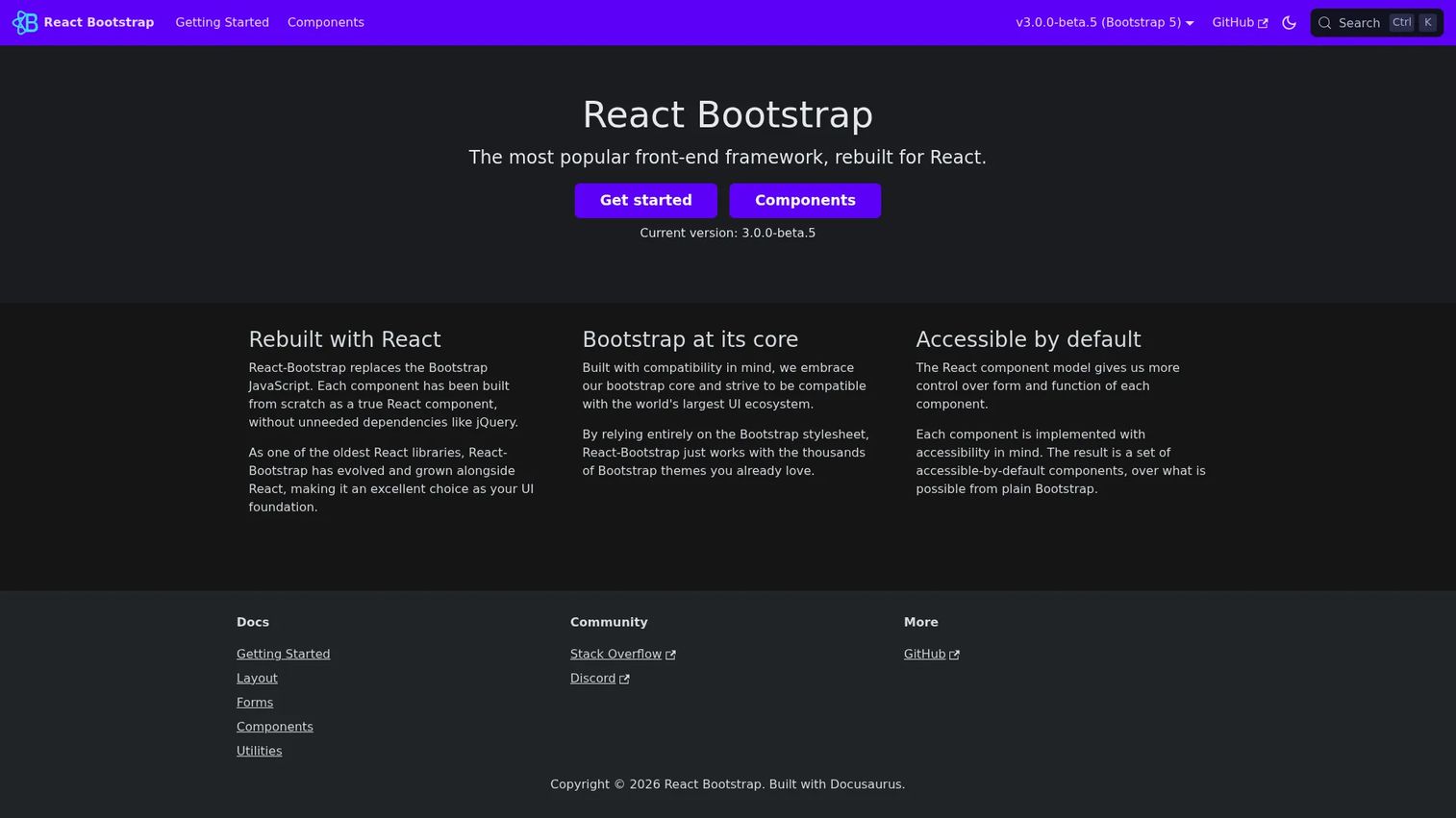
React Bootstrap rebuilds Bootstrap's UI components as native React components, eliminating the jQuery and bootstrap.js dependency. It covers responsive layout, forms, navigation, modals, cards, alerts, and tables with accessible defaults and compatibility with existing Bootstrap themes.
Best for: Teams maintaining Bootstrap-based products or building internal tools where fast adoption of familiar patterns matters more than a highly customized design language.
Key features
- Bootstrap components rebuilt as native React APIs
- No dependency on jQuery or bootstrap.js
- Responsive layout grid and utility support
- Accessible-by-default components
- Compatible with existing Bootstrap themes
Why choose React Bootstrap: It reduces migration friction for teams already invested in Bootstrap conventions. Frame this as a continuity choice for an existing stack rather than a default selection for a new, brand-sensitive SaaS product.
React Bootstrap pricing: Free and open source. No paid tiers were found on the official site.
G2 rating: 4.4/5 (verified October 2026).
Considerations when choosing a component library
Match the ownership model to the team's capacity
Packaged libraries move faster at the start, but they introduce an upstream dependency. Headless and copy-paste models shift upgrade responsibility into your codebase. The right choice depends on who will own component variants, documentation, and visual regression testing through the next several release cycles.
Validate accessibility with your product's actual workflows
A library's accessibility claims are a starting point, not a verdict. Test keyboard navigation, focus order, error states, dynamic forms, data tables, dialogs, and screen reader behavior in the workflows customers use daily. The best web design software guide covers tools that support this kind of design validation. Accessibility debt compounds faster than most PMs expect.
Check design token and Figma alignment
Define how color, typography, spacing, states, and component variants map between design files and production code before adoption. Without this map, the library becomes another source of design drift rather than a cure for it. See the data visualization tools guide for related thinking on design and engineering handoffs.
Measure bundle and runtime impact
Engineering should inspect imports, code splitting, and SSR behavior before committing, especially for heavy components like data grids or charts. Treat performance as a production validation task. Library marketing pages do not measure your product's specific import profile.
Plan the upgrade path before you start
Ask how the team will handle major version updates, deprecated APIs, documented overrides, and uncontrolled component variants that feature teams create independently. A library that is hard to upgrade becomes a tax on every subsequent sprint.
Conclusion
The decision comes down to ownership model first, then brand.
Choose MUI when a standardized Material Design system and advanced enterprise components matter more than visual differentiation. Choose shadcn/ui when source ownership and Tailwind-based customization are product strategy, not preferences. Choose Radix UI, Headless UI, React Aria Components, or Base UI when a custom design system needs accessible behavior without inheriting someone else's visual layer. Choose Chakra UI or Mantine when delivery speed and a broad component catalog are the priority. Choose Ant Design for data-dense internal workflows. Choose HeroUI, daisyUI, or React Bootstrap when their existing conventions and visual defaults lower implementation risk.
The practical next step: Create a one-page evaluation scorecard, test two finalist libraries against your most complex workflow, then commit to the option your team can maintain through the next four release cycles.
Start your journey with Guideflow today!
FAQs
MUI is a strong default for mature enterprise applications with complex data requirements. The best option for your team depends on whether you need styled components, headless primitives, or copy-paste source control. Evaluate your most complex workflow first, not button appearance.
shadcn/ui functions as a component library, but its distribution model differs from conventional packages. Teams copy component source code into their own project via a CLI, giving them full ownership of the implementation rather than a versioned package dependency.
Accessible outcomes depend on implementation and testing, not on a library's self-description. Radix UI, React Aria Components, Chakra UI, and Headless UI all treat accessibility as a core design constraint. Each one deserves validation against your product's real interaction patterns before you commit.
Packaged libraries suit teams optimizing for speed and standardization, where Material Design or a similar established language is acceptable. Headless libraries suit teams with established design systems that need full control over the visual layer while still getting tested accessibility behavior out of the box.
MUI and Ant Design are the most common choices for complex, data-heavy enterprise products. Before deciding, test tables, filters, date ranges, empty states, permission states, and bulk actions. Advanced MUI X components add a commercial cost for the most demanding data grid requirements.
Many free libraries are production-ready. The full cost includes engineering time for accessibility QA, major version upgrades, documentation, design token governance, and support. MUI's advanced MUI X components require a paid plan, which is worth factoring into total cost estimates for data-intensive products.
Inventory every component in use, isolate design tokens, and migrate high-traffic workflows first. Use visual regression tests before and after each migration batch. Avoid a full simultaneous rewrite unless the existing library blocks core product work entirely. Prioritize by user impact, not engineering preference.
Compatibility varies by library and version. Server component support, hydration behavior, and styling approach all affect whether a library works cleanly in a Next.js app. Check the official documentation for current SSR and client component requirements before adoption, particularly for libraries that use CSS-in-JS at runtime. The application server software guide covers related infrastructure considerations.