

You can collect connected data faster than you can understand it. Customer journeys, partner ecosystems, fraud rings, dependency trees, knowledge graphs. They all sit in tables as rows and foreign keys, and the relationships that actually matter stay invisible.
A table tells you that node A connects to node B. It does not tell you that node A sits at the center of a cluster of 4,000 others, or that one outlier link bridges two communities that should never touch. Graph visualization makes that structure obvious in seconds. The right graph visualizer turns clusters, hubs, and outliers into something you can see, point at, and explain to someone who has never opened a query console.
The demand is real and growing. According to Neo4j's roundup of graph visualization tools, there is now a mature ecosystem of specialized options spanning development, exploration, embedded use, and dashboarding. Analysts project the graph database market growth projections to grow at well over 20% annually this decade, reaching the mid-teens of billions of dollars by 2030, driven by relationship-heavy use cases like fraud detection, recommendations, and knowledge graphs.
This guide compares 15 graph visualization tools, sorted by relevance to the keyword. Each was chosen on four practical criteria:
- Scale: how well it handles large graph visualization, from thousands to millions of nodes
- Output quality: publication-ready exports, web embeds, and styling control
- Flexibility: layout algorithms, filtering, and customization
- Usability: how quickly a non-specialist can get to a useful view
What's inside
This guide is for anyone evaluating graph visualization software: data analysts, developers, researchers, and the product marketing managers who need to turn product, customer, or market relationships into visuals for launches, internal alignment, and storytelling. If your goal is showing how a product works rather than mapping raw data, an interactive demo can do the heavy lifting for product storytelling.
We included four kinds of tools so you can match the choice to your workflow:
- Standalone applications for analysts and researchers
- Technical rendering tools for reproducible, automated diagram output
- JavaScript libraries for developers embedding graphs into products
- Enterprise platforms for governed, collaborative graph exploration
Selection leaned on the four criteria above: scale, output quality, flexibility, and usability. Pricing and ratings reflect publicly available information at the time of writing.
TL;DR
- Best for large network analysis: Gephi, the open source standard for exploring and styling big networks.
- Best for publication-ready exports: Graphviz, for deterministic, multi-format diagram rendering from text.
- Best for developers: Cytoscape.js and react-force-graph for embedding interactive graphs in web and React apps.
- Best for enterprise exploration: Linkurious Enterprise and GraphAware Hume for governed, investigation-grade workflows.
- Best open source option: Cytoscape for research-grade network analysis at no cost.
- Best for fast browser-based large graphs: Cosmograph, built for GPU-accelerated interactive exploration.
What are graph visualization tools?
Graph visualization tools render nodes (entities) and edges (relationships) as a visual network so you can see structure that stays hidden in tables and queries.
Network visualization is its own category. It is not a bar chart or a dashboard. The job is to reveal relationships, clusters, hubs, and anomalies in connected data. Modern graph visualization software shares a recognizable set of capabilities, and these are the features worth expecting:
- Graph layout algorithms: Force-directed layouts (like ForceAtlas2 and Fruchterman-Reingold), hierarchical, circular, and radial arrangements that expose communities and hierarchy. Layout is where structure becomes visible.
- Styling and filtering: Color, size, and shape mapped to data attributes, plus filters that hide noise so the signal stands out.
- Export options: The ability to export graph visuals as PNG, PDF, SVG, or interactive web output. Export quality decides whether a graph ships in a paper, a deck, or a product.
- Scalability: Performance under load. A tool that draws 500 nodes cleanly can choke on 500,000. Large graph visualization is a different engineering problem.
- Documentation and community: Active docs, forums, and open source communities reduce the cost of long-term adoption.
A quick glossary for the rest of this guide:
- Node: an entity (a person, account, gene, server).
- Edge: a relationship between two nodes.
- Layout: the algorithm that positions nodes in space.
- Graph database visualization: rendering data that lives in a graph database like Neo4j directly from queries.
When to use graph visualization tools
Explore relationships in connected data
When the question is "how are these things connected?", a graph is the right model. Use a graph visualizer to find clusters of related accounts, identify the hubs that hold a network together, and surface the hidden links that a relational view buries. This is where fraud rings, recommendation patterns, and org structures stop being abstract and become something you can point at.
Prepare diagrams for research, publishing, or presentation
When the output leaves your screen, export quality and styling control become the deciding factors. A graph headed for a journal, a board deck, or a launch page needs clean SVG or PDF output, consistent branding, and labels that survive being resized. Publication-ready graph outputs are a feature, not an afterthought. For product launches specifically, the right product launch software can help you turn those visuals into a cohesive go-to-market story.
Debug or inspect graph structures at scale
When you are working with thousands or millions of nodes, performance and layout control matter more than anything else. Large graph visualization demands GPU rendering, smart filtering, and layouts that converge without freezing the browser. If the tool stalls at scale, nothing else about it matters.
Comparison table
Tools are ordered by relevance to graph visualization as a standalone job, then grouped loosely by type. Read the Intent column to find your category, then the Key differentiation column to narrow the shortlist. Pricing and G2 ratings reflect publicly available information; where a figure is not public, the table says so.
| # | Product | Intent | Key differentiation | Pricing | G2 rating |
|---|---|---|---|---|---|
| 1 | Gephi | Network analysis and exploration | Open source desktop standard for large networks | Free, open source | 4.3/5 |
| 2 | Graphviz | Text-based diagram rendering | DOT language, deterministic, multi-format output | Free, open source | Not listed |
| 3 | Neo4j Browser | Query-driven graph inspection | Visualize Cypher results inside Neo4j | Included with Neo4j | Not listed |
| 4 | Neo4j Bloom | No-code graph exploration | Perspective-based exploration for non-technical users | Basic free; Full Access via Enterprise | 4.5/5 |
| 5 | Cytoscape | Research and bioinformatics analysis | Open source network analysis with apps | Free, open source | Not listed |
| 6 | Cytoscape.js | Embedded web graph visualization | JavaScript library with graph algorithms | Free, open source | Not listed |
| 7 | react-force-graph | React graph components | 2D/3D/VR/AR force-directed graphs | Free, open source | Not listed |
| 8 | Cosmograph | Fast browser-based large graphs | GPU layout plus in-browser analytics | Free for non-commercial; Enterprise custom | Not listed |
| 9 | Linkurious Enterprise | Enterprise investigation | Search, alerts, case management on graph data | From €490/month/user | 4.5/5 |
| 10 | GraphAware Hume | Enterprise intelligence analysis | Visual multi-hop analysis without query language | Contact vendor | Not listed |
| 11 | SemSpect | Scalable no-code exploration | Exploration trees for Neo4j and RDF | Free tier; RDF from €16,000/year | Not listed |
| 12 | yFiles Graphs for Jupyter | Notebook graph visualization | Interactive graphs from Python data sources | Free license | 4.0/5 |
| 13 | yFiles for HTML | Production web diagramming | Client-side SDK with layout quality | Perpetual license, contact vendor | 4.0/5 |
| 14 | NeoDash | Graph dashboarding | Dashboards and reports on connected data | Public plans, no listed price | Not listed |
| 15 | Graphileon | Low-code graph applications | Build interactive graph apps and dashboards | Free tier; paid from €150/month | 5.0/5 |
1. Gephi
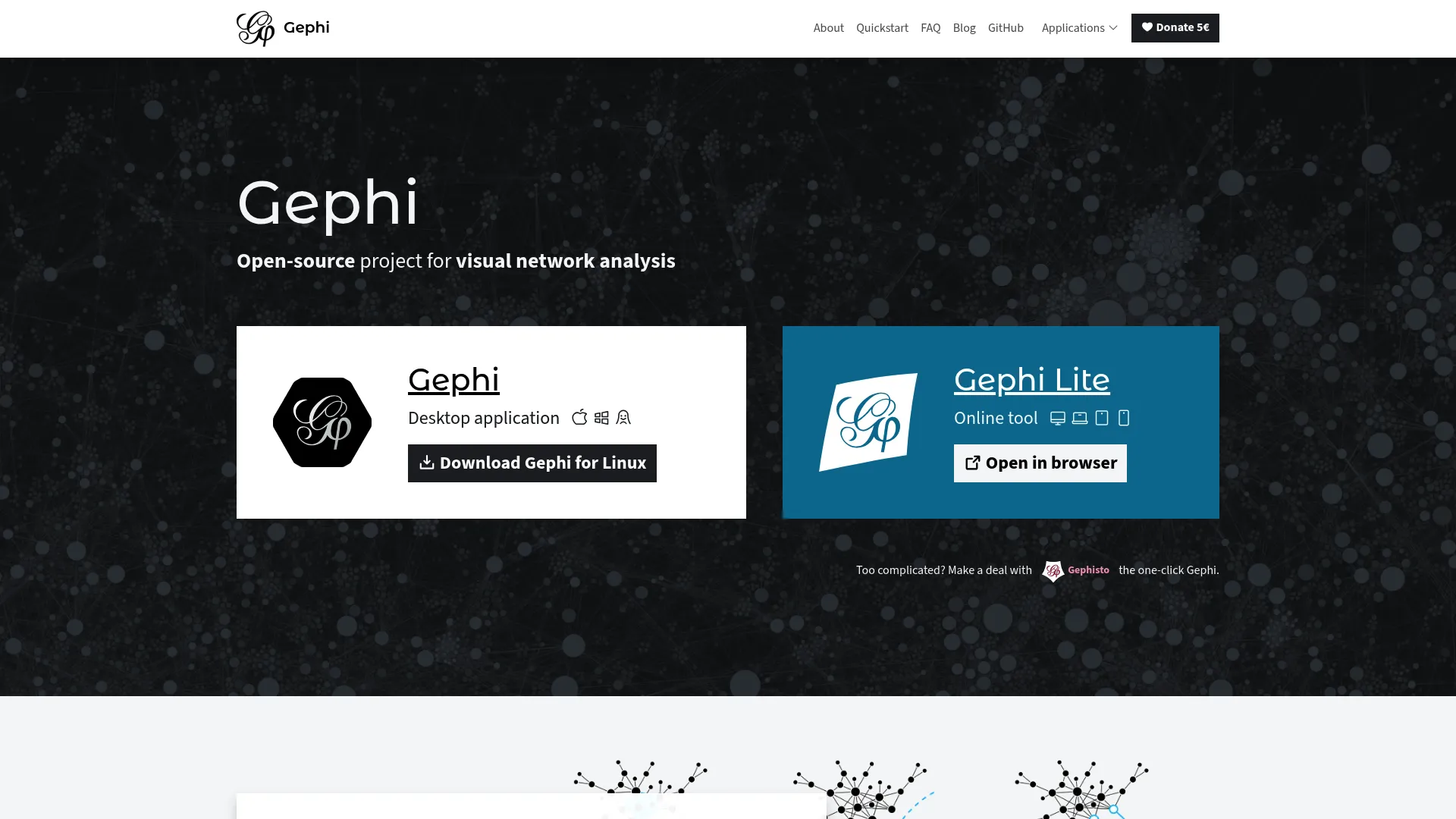
Gephi is the open source standard for visual network analysis. It runs as a desktop application and is built for exploring, manipulating, and styling large networks rather than rendering a fixed diagram. Researchers and analysts reach for it when they need to find communities, measure centrality, and turn a tangle of edges into a readable map.
Best for: Researchers and analysts mapping and exploring complex networks.
Key strengths
- Built-in network analytics: Algorithms for community detection, centrality measures, and clustering analysis surface structure automatically.
- Spreadsheet-style data handling: Search, transform, import, and filter your data inside the data laboratory before you ever lay it out.
- Layout and export control: Customizable styling, force-directed layout algorithms, and exports to PNG, PDF, and SVG.
Gephi stands out because it combines genuine analysis with publication-quality output. You can run ForceAtlas2 to reveal clusters, color nodes by a computed metric, filter out low-degree noise, then export a clean vector file for a paper or deck. For teams handling large network visualization on a single machine, it remains a reference point. There is also Gephi Lite, a lightweight web-based viewer for exploring networks in the browser when you do not need the full desktop toolset.
Gephi pricing: Gephi is free and open source. The project lists no paid tiers.
2. Graphviz
Graphviz takes a different approach: you describe a graph in text using the DOT language, and Graphviz lays it out and renders it for you. This text-first model makes it the go-to for automated, reproducible diagram generation in networking, bioinformatics, software architecture, databases, and machine learning pipelines.
Best for: Developers and technical teams needing programmatic graph layout and diagram generation.
Key strengths
- Automatic layout from text: Write a simple DOT description and Graphviz handles positioning, so the same input always produces the same diagram.
- Multi-format rendering: Output to images, SVG, PDF, and PostScript for both web and print.
- Styling control: Colors, fonts, line styles, hyperlinks, and custom shapes without touching pixel coordinates.
Graphviz suits engineers because it slots into build pipelines and scripts. Generate a dependency graph from code, commit the DOT file, and regenerate the diagram on every change. The output is deterministic, which is exactly what you want when a diagram has to match the system it documents. It is widely supported with documentation, an issue tracker, and source available for anyone who needs to dig in.
Graphviz pricing: Graphviz is open source and free to use. No paid plans are published.
3. Neo4j Browser
Neo4j Browser is the developer-facing web interface for running Cypher queries against a Neo4j database and seeing the results as a graph. It is the fastest path to graph database visualization when your data already lives in Neo4j and you think in queries.
Best for: Teams that need a browser-based interface to query and inspect Neo4j graphs.
Key strengths
- Run Cypher queries: Write a query and get an interactive node-and-edge view back immediately.
- Visualize nodes and relationships: Inspect the structure of a result set without leaving the browser.
- Export tabular results: Pull query output into tables when you need the data, not just the picture.
Neo4j Browser works best as a query-to-visual loop. You are inspecting, debugging, and validating graph data interactively rather than producing a polished deliverable. For developers already inside the Neo4j ecosystem, it is the default first stop, and it ships with the database itself.
Neo4j Browser pricing: Neo4j Browser is included out of the box with Neo4j's graph database offerings. There is no separate paid plan for Browser itself.
4. Neo4j Bloom
Neo4j Bloom is the no-code companion to Browser, built so business users and stakeholders can explore Neo4j data without writing Cypher. It translates graph data into something a non-technical viewer can search, navigate, and present.
Best for: Teams that need visual, non-code exploration of Neo4j graph data.
Key strengths
- Perspective-based exploration: Curated views let stakeholders explore relevant slices of the graph without query syntax.
- GPU-powered visualization: Smooth interaction even as the scene grows.
- Direct editing: Edit graph data right in the visualization.
Bloom matters because it lowers the barrier between graph data and the people who need to act on it. A product marketer or analyst can search for an entity, expand its connections, and walk a stakeholder through the result in a presentation-friendly view. When that walkthrough needs to be guided and repeatable, product tour software offers a complementary way to package an explanation for non-technical audiences. It pairs naturally with Browser: developers query, business users explore.
Neo4j Bloom pricing: Bloom Basic Access is free. Bloom Full Access works with Neo4j Enterprise edition and requires a server plugin; pricing for the full version is handled through Neo4j directly.
5. Cytoscape
Cytoscape is open source software for visualizing and analyzing complex networks, with deep roots in molecular interaction networks and biological pathways. It remains a staple in research-heavy and bioinformatics workflows.
Best for: Researchers needing open source network visualization and biological pathway analysis.
Key strengths
- Network visualization: Render and explore complex networks with fine control over appearance.
- Data integration: Layer in annotations and expression data to enrich the network.
- Apps and extensibility: A large catalog of apps adds analysis, scripting, and import capabilities.
Cytoscape stays relevant because its plugin ecosystem lets research teams extend it to fit specialized analysis without rebuilding the platform. It handles the analysis and the visualization together, which is why it has held a place in scientific workflows for years. For visualizing graphs in a research context, it is a safe, well-supported choice.
Cytoscape pricing: Cytoscape is open source and freely available. No paid pricing is published.
6. Cytoscape.js
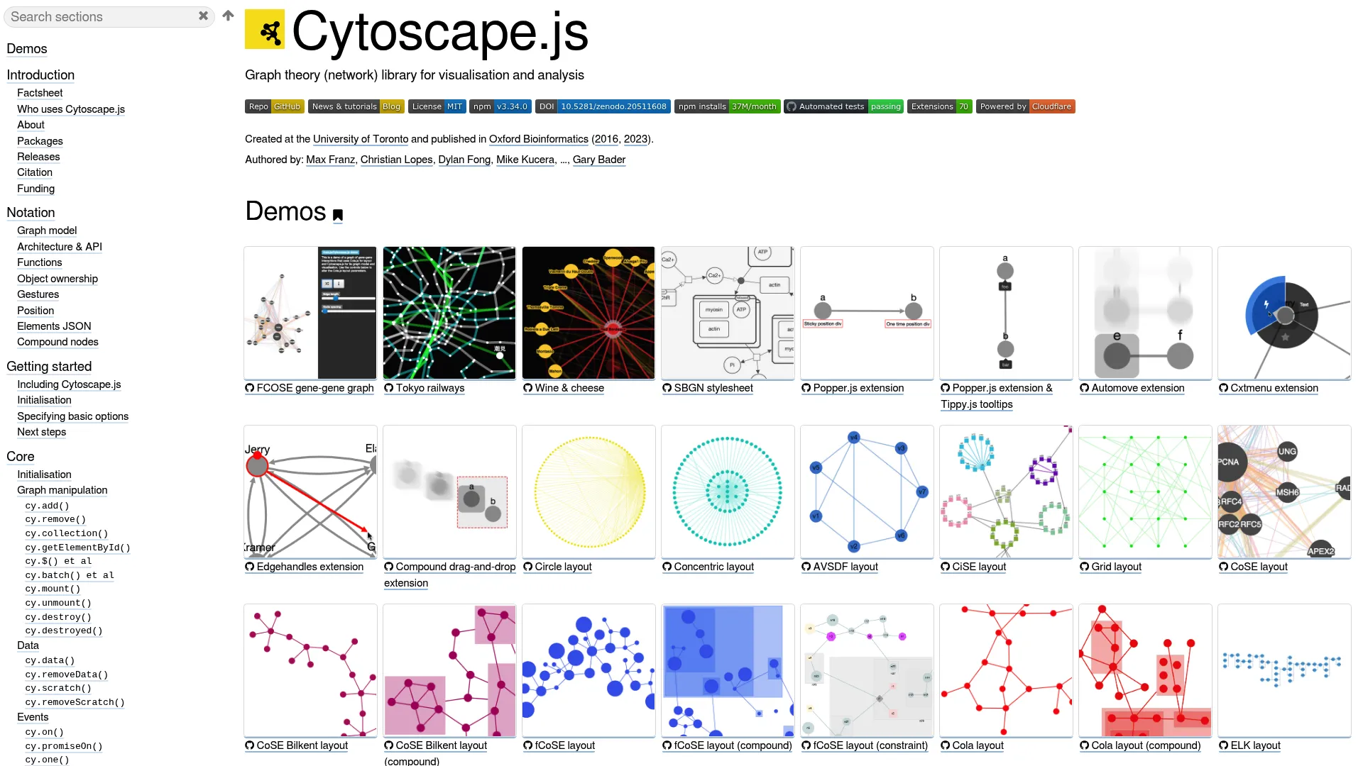
Cytoscape.js is an open source JavaScript library for graph theory and network visualization in the browser. It is distinct from the Cytoscape desktop app and is aimed squarely at developers embedding interactive graphs into web applications.
Best for: Developers building interactive graph/network visualizations in web apps.
Key strengths
- Interactive visualization: Render, pan, zoom, and manipulate graphs directly in the browser.
- Flexible layouts: Automatic or manual node positioning to fit the data.
- Built-in algorithms: Graph algorithms including BFS, PageRank, Dijkstra, and A* ship with the library.
Teams choose Cytoscape.js when graph visualization needs to live inside a product, not a research tool. It is well-documented, framework-agnostic, and gives developers the algorithms and interaction model they need without building from scratch. For an interactive graph browser inside a web app, it is a proven foundation.
Cytoscape.js pricing: Cytoscape.js is open source with no paid plans.
7. react-force-graph
react-force-graph provides React bindings for force-directed graph visualizations across 2D, 3D, VR, and AR. It is the natural fit for frontend teams already building in React who want an interactive network view without leaving their stack.
Best for: Developers building interactive graph visualizations in React.
Key strengths
- Multiple render targets: 2D, 3D, VR, and AR components from a single library.
- Force-directed layout: An iterative physics layout that untangles networks automatically.
- Canvas and WebGL rendering: Zoom, pan, and node/link interactions handled out of the box.
react-force-graph fits teams that want a force-directed graph as a React component, with the option to go 3D for more striking, explorable network graphs. Because it is open source and MIT licensed, it drops cleanly into existing React projects. For productized graph experiences with a frontend already in React, it removes most of the boilerplate.
react-force-graph pricing: The project is open source and MIT licensed. There are no paid tiers; support is community-driven.
8. Cosmograph
Cosmograph is browser-based graph visualization and analytics software built for large network graphs and embeddings. Speed is the headline: GPU-accelerated layout and rendering let it handle datasets that bog down lighter tools.
Best for: Teams needing high-performance local graph exploration and analytics.
Key strengths
- GPU force layout and rendering: Large graphs lay out and animate fast, right in the browser.
- In-browser analytics: DuckDB-powered analysis runs locally without a backend.
- Rich exploration controls: Timeline, filtering, search, clustering, shapes, and images.
Cosmograph is the pick when large graph visualization has to stay interactive. It runs in the browser, keeps the data local, and stays responsive at scale, which makes it useful for both exploration and embedding modern, high-performance graph views. For datasets that punish slower renderers, the speed difference is the point.
Cosmograph pricing: Cosmograph is free for personal, educational, and other non-commercial use. An AI & Team tier is in closed beta, and Enterprise pricing is custom.
9. Linkurious Enterprise
Linkurious Enterprise is graph visualization and analytics software for exploring connected data in governance-heavy, operational settings. It is built for teams running investigations into fraud, anti-money-laundering, intelligence, and cybersecurity.
Best for: Teams investigating fraud, AML, intelligence, or cybersecurity in graph data.
Key strengths
- Search and exploration: Full-text and fuzzy search plus visual network exploration and a no-code query builder.
- Analysis depth: Geospatial and temporal analysis, entity resolution AI, and alerts.
- Operational workflow: Collaboration, exports, case management, web hooks, a REST API, and custom plugins.
Linkurious works for teams that need controlled access and structured investigation, not just a picture of the graph. The combination of search, alerting, and case management turns graph exploration into an operational process with governance built in. For regulated environments where who-can-see-what matters, that structure is the differentiator.
Linkurious Enterprise pricing: Linkurious Enterprise Cloud starts at €490 per month per user. The Decision Intelligence Platform is quote-based through sales. A 30-day free trial is available.
10. GraphAware Hume
GraphAware Hume is a graph-powered intelligence analysis platform built for mission-critical environments. It targets teams that need to assemble a single picture from messy, connected data and act on it.
Best for: Law enforcement, national security, and fraud/intelligence teams needing graph-based investigation workflows.
Key strengths
- Unified intelligence picture: Combine structured and unstructured data into one connected view.
- Visual multi-hop analysis: Trace relationships across many hops without writing a query language.
- Operational tooling: Alerting, graph data science, workspaces, and collaborative decision-making.
Hume suits teams using Neo4j or complex connected datasets who need structured, repeatable access to graph intelligence. Letting analysts run multi-hop investigations visually, without query syntax, opens the platform to investigators who are not engineers. For high-stakes analysis where speed and collaboration matter, it is purpose-built.
GraphAware Hume pricing: Hume pricing is handled through GraphAware directly. No public price is listed.
11. SemSpect
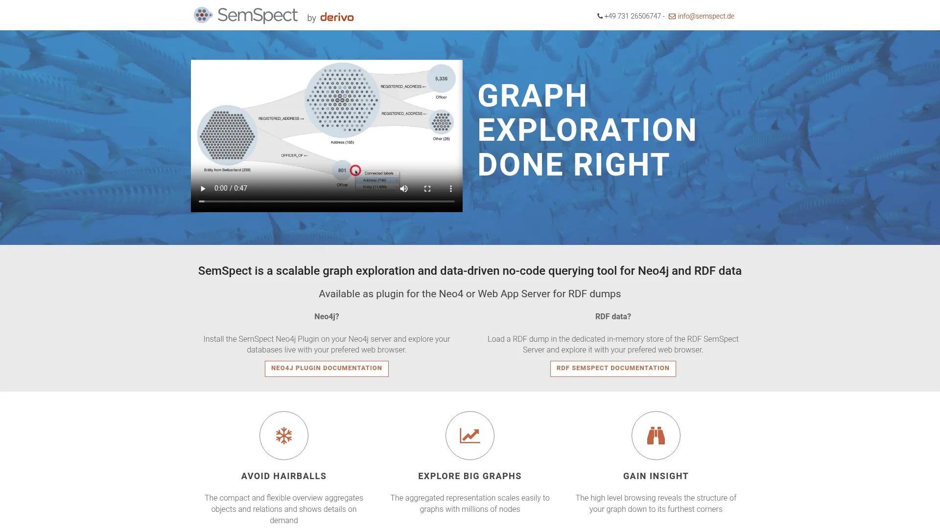
SemSpect is a scalable graph exploration and no-code querying tool for Neo4j and RDF data. Its exploration-tree model helps users understand structure without manually reading raw relationships, which makes it well-suited to investigative analysis on large knowledge graphs.
Best for: Teams exploring large Neo4j or RDF knowledge graphs without writing query syntax.
Key strengths
- Graph exploration for Neo4j and RDF: Works across both major connected-data models.
- No-code querying: Exploration trees let users segment and drill into the graph without writing queries.
- Flexible licensing: A free version is available, with commercial and academic options.
SemSpect helps users discover relationships and segment large graphs through guided exploration rather than manual traversal. That guided approach scales to graphs that would overwhelm a free-form canvas, which is why it fits investigative and knowledge-graph work. Academic and open-data licenses are free, lowering the barrier for research teams.
SemSpect pricing: A free version is available with limitations, and academic or open-data licenses are free of charge. Commercial RDF SemSpect Server licenses are priced per server instance by concurrent sessions, starting at €16,000 per year for one session and rising with capacity, with unlimited sessions quoted on request.
12. yFiles Graphs for Jupyter
yFiles Graphs for Jupyter is a free JupyterLab and Jupyter Notebook extension for visualizing graph data with yFiles layouts and interactive exploration. It brings production-grade layout quality into the notebook where data scientists already work.
Best for: Jupyter users who need interactive graph/network visualization from Python data sources.
Key strengths
- Broad data import: Pull graph data from NetworkX, igraph, PyGraphviz, Neo4j, or node-edge lists.
- Automatic layouts: Hierarchic, organic, tree, orthogonal, circular, and radial arrangements.
- Interactive exploration: Neighborhood views, data inspection, search, mappings, and export options.
This extension fits experimentation and analysis directly inside Jupyter, so you can move from a Pandas DataFrame or a Neo4j query to an interactive graph without switching tools. The range of automatic layouts means the same data can be viewed several ways while you figure out what the graph is telling you. For data scientists, it keeps visualizing graphs inside the analysis loop.
yFiles Graphs for Jupyter pricing: The extension is offered under a perpetual, free, non-transferable license. No paid price is published.
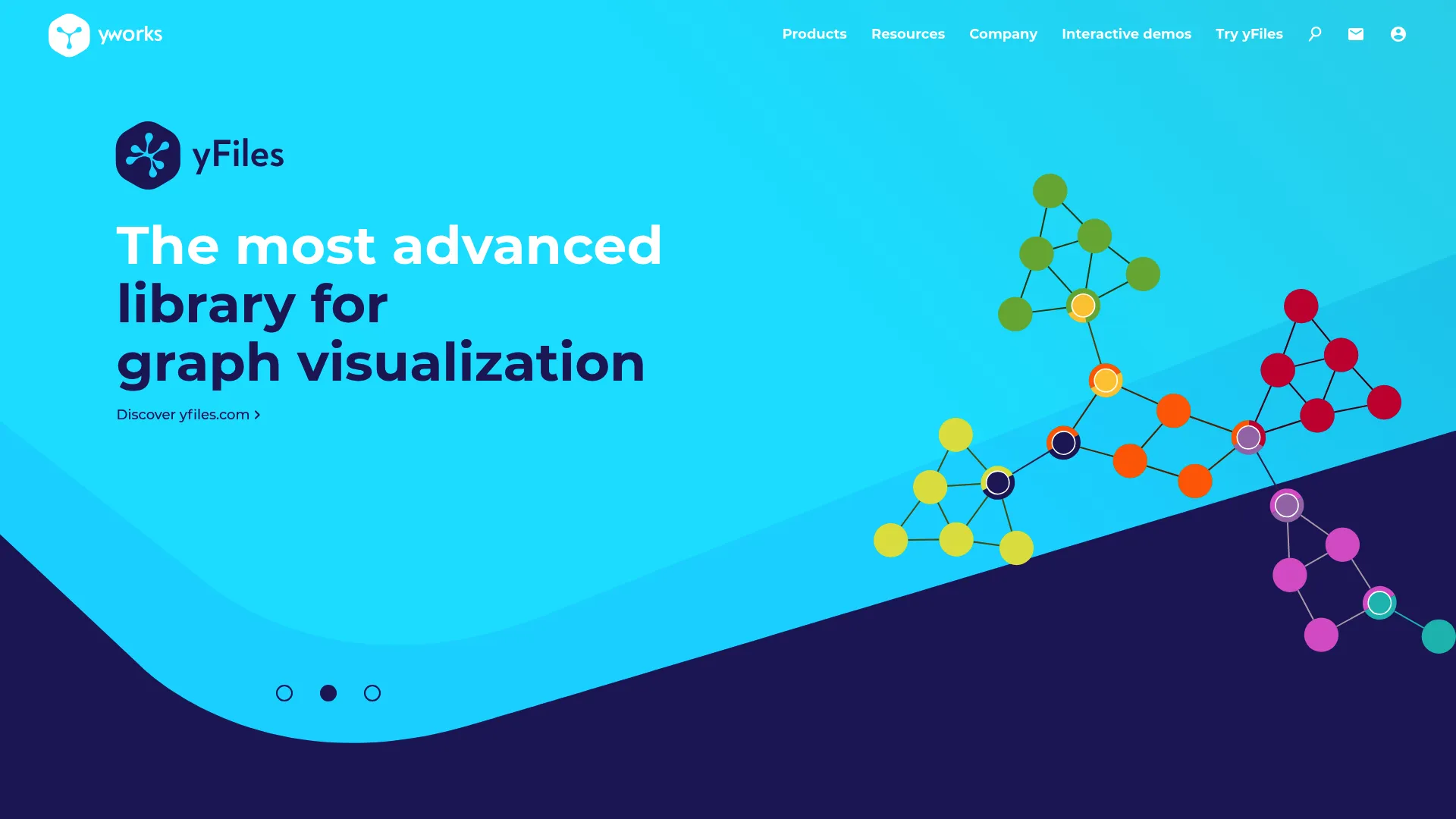
13. yFiles for HTML

yFiles for HTML is a JavaScript and HTML diagramming SDK for building interactive graph and network visualization apps in the browser. It is aimed at teams shipping production-grade web interfaces where layout and rendering quality are non-negotiable.
Best for: Teams building browser-based graph, network, or diagramming applications.
Key strengths
- Client-side rendering: 100% client-side graph drawing and editing, with no server dependency for rendering.
- Framework integration: TypeScript support and pure JavaScript integration with Angular, React, and Vue.
- Layout and analysis: Automatic graph layout, graph analysis, and interactive editing and viewing.
yFiles for HTML suits enterprise app development because it pairs deep layout control with the polish a customer-facing product demands. Teams that have outgrown a basic library reach for it when diagram rendering quality and interaction design start to matter as much as the underlying data. It is a toolkit for building, not just displaying.
yFiles for HTML pricing: Licenses are available for single developers, projects, and sites. They are perpetual and royalty-free, with an optional annual subscription for maintenance and support. Pricing is handled through yWorks directly.
14. NeoDash
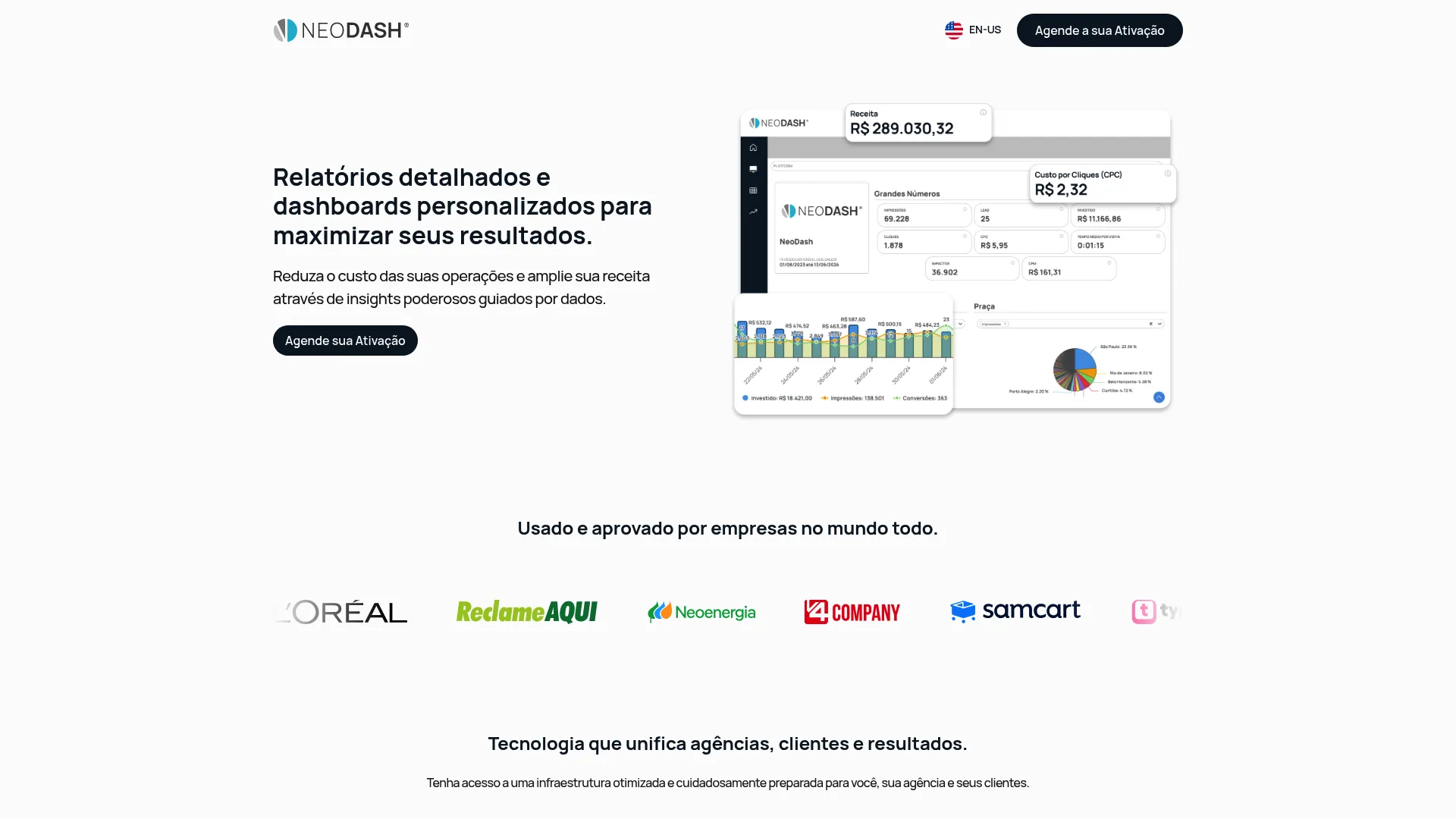
NeoDash turns connected data into shareable, interactive dashboards. It is the reporting-oriented end of the spectrum: less about exploring a raw graph, more about packaging graph data into something a team can read on a recurring basis.
Best for: Agencies and marketing teams needing centralized media and CRM reporting and dashboarding.
Key strengths
- Custom dashboards and reports: Build interactive views tailored to the questions a team asks repeatedly.
- Data integrations: Native integrations plus API data import to bring sources together.
- Modeling and automation: ETLs, alerts, and CRM plus media data modeling.
NeoDash is useful when the goal is reporting and storytelling rather than open-ended exploration. Parameterized dashboards let viewers adjust inputs and see the graph data respond, which makes it a fit for stakeholders who want answers, not a query console. For teams that need to operationalize graph data into regular reporting, it fills that gap. If the underlying data lives in a CRM, pairing it with the right CRM software keeps the reporting layer in sync with your source of truth.
NeoDash pricing: Plans are named Basic, Intermediary, Advanced, and Custom, with spend limits and workspace counts visible on the pricing page. Specific prices are not published; activation is arranged through NeoDash.
15. Graphileon
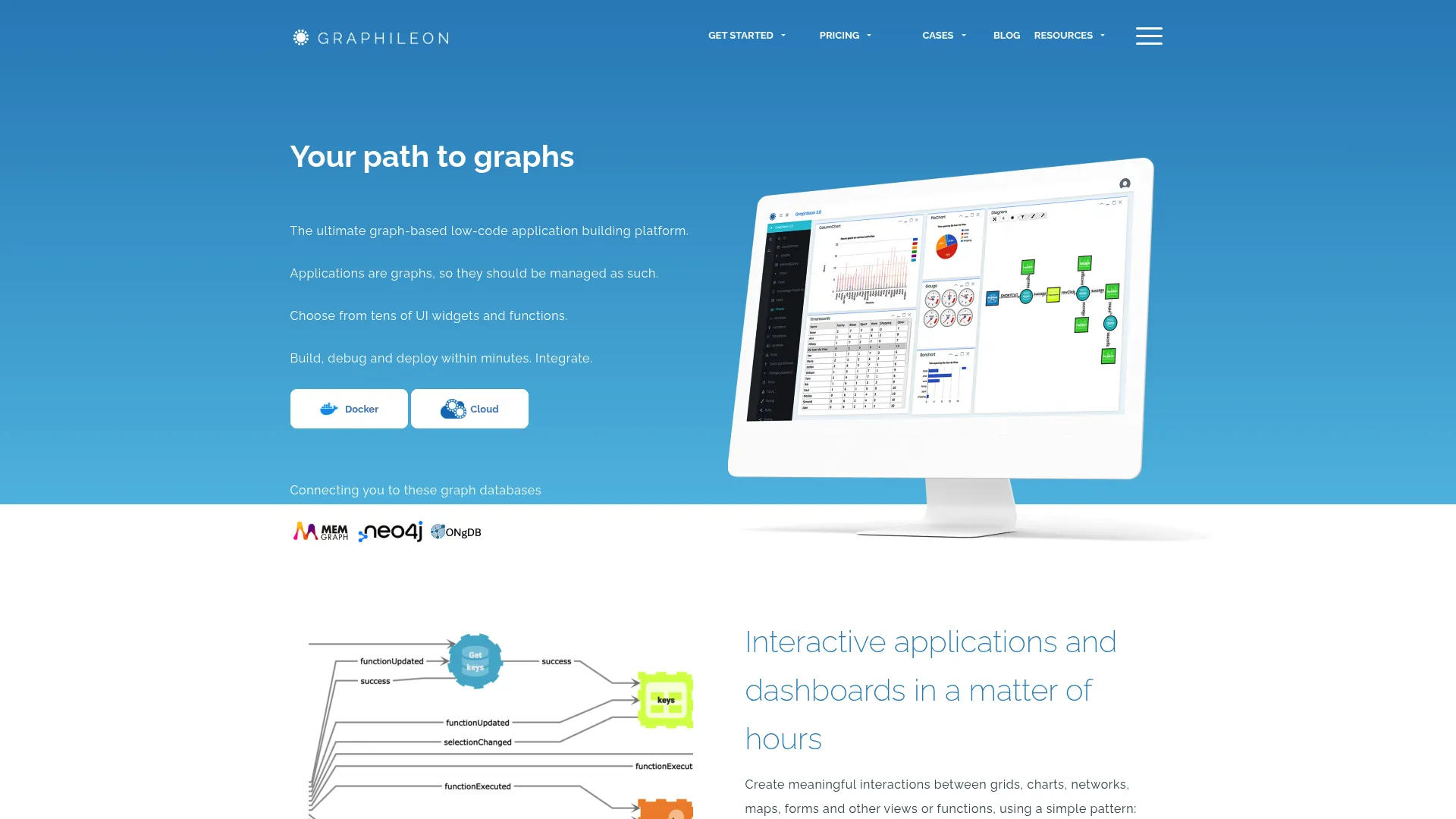
Graphileon is a graph-driven low-code platform for building dashboards and interactive applications on top of graph data. It is for teams that need more than a static graph display and want app-like experiences without starting from scratch.
Best for: Teams building graph-based internal tools, dashboards, and interactive applications.
Key strengths
- Low-code app development: Build graph-driven dashboards and applications without heavy custom coding.
- Rich component set: Networks, tables, forms, charts, maps, timelines, and calendars in one canvas.
- Extensibility: Custom functions, API endpoints, and embedding for production use.
Graphileon fits teams that want to assemble interactive graph applications, wiring up exploration, forms, and reporting into a single tool. The component variety means a graph view can sit next to a table, a map, and a form, which turns graph data into a working internal application. For workflows that outgrow a viewer but do not justify a full custom build, the low-code path saves real time.
Graphileon pricing: A Personal Edition is free. Paid monthly licenses start at €150 for the Development Edition, with higher tiers including yFiles-powered Company and Enterprise editions. Cloud pricing starts at roughly one euro per day.
Considerations before you choose
The right tool depends on your constraints, not a feature count. Run your shortlist through this checklist before committing.
Large graph performance
If you are working with thousands or millions of nodes, test with your real data, not a sample. Verify layout speed, filtering responsiveness, and rendering under load. GPU-accelerated tools like Cosmograph are built for this; lighter tools may stall. Performance is the first thing that breaks at scale and the last thing a demo will show you.
Export and sharing needs
Decide where the graph ends up. PNG works for a quick share, SVG and PDF matter for publication-ready graph outputs that resize cleanly, and web output matters when the graph has to live online or inside a product. Confirm the export formats you need before you invest time in styling. When you need to share interactive content beyond a static export, an embeddable, link-shareable format keeps the experience interactive.
Ease of use versus customization
GUI-first tools like Gephi get an analyst to a view quickly. Code-first libraries like Cytoscape.js and react-force-graph give developers full control but require building. There is no wrong answer, only a fit. Match the tool to who is using it and how often.
Community and documentation
For long-term adoption, check the docs, forum activity, and open source community. A well-supported open source graph visualization tool is easier to maintain than a niche product with thin documentation. Active communities also mean answers when you get stuck.
Integration and workflow fit
Decide where the tool needs to live: a data stack, a Jupyter notebook, a web app, or a graph database. Notebook users should look at yFiles Graphs for Jupyter, Neo4j users at Browser and Bloom, and product teams at the JavaScript libraries. The best tool is the one that fits the workflow you already have. If part of that workflow involves onboarding teammates to a new tool, user onboarding software can shorten the time it takes for them to get value.
Conclusion
There is no single winner here, only the best fit for your job.
For researchers and analysts, Gephi and Cytoscape lead, combining real analysis with publication-ready exports. For developers, Cytoscape.js, react-force-graph, and yFiles for HTML give you the control to embed graphs directly into products. For enterprise exploration, Linkurious Enterprise and GraphAware Hume bring governance, search, and investigation workflows. For publication-ready outputs, Graphviz delivers deterministic, multi-format rendering from text, while Gephi covers styled exports for decks and papers. And for fast large graph visualization in the browser, Cosmograph is built for the scale that breaks lighter tools.
Start with your workflow, not the feature list. If your data lives in Neo4j, begin with Browser and Bloom. If you are in a notebook, start with yFiles Graphs for Jupyter. If you are shipping a product, pick a library and prototype. Pick the tool that matches where the work already happens, then test it against your real data before you commit. And if you also need to explain that product to buyers or teammates, explore more best tools roundups to round out your stack.
FAQs
It depends on what you need from scale. For interactive exploration of large graphs in the browser, Cosmograph uses GPU rendering to stay responsive. For desktop analysis of big networks, Gephi is the long-standing choice. For deterministic rendering of large structures, Graphviz handles it from text. The deciding factor is whether you need to explore, analyze, or render at scale.
Graphviz is text-driven and deterministic: you describe a graph in the DOT language and it produces the same diagram every time, which suits automated and reproducible output. Gephi is interactive and exploratory: you load a network, run layout algorithms, filter, style, and explore visually. Choose Graphviz for pipeline-generated diagrams and Gephi for hands-on network analysis.
Developers usually want code-first or embed-ready options. Graphviz fits automated diagram generation, Cytoscape.js and react-force-graph embed interactive graphs into web and React apps, and yFiles for HTML powers production-grade web diagramming. The right one depends on your stack and whether the graph needs to ship inside a product.
Gephi and Cytoscape are the common picks in research settings. Gephi pairs network analysis with publication-quality exports, while Cytoscape is widely used for biological pathways and molecular networks and extends through a large app ecosystem. Both are open source, well-documented, and free, which matters for academic budgets and reproducibility.
Look for PNG for quick shares, SVG and PDF for publication-ready outputs that scale without pixelation, and web-friendly formats when the graph lives online. Export quality decides whether a graph survives being dropped into a paper, a slide deck, or a landing page. Confirm the formats you actually need before committing to a tool.
Some handle scale far better than others. Tools built for large graph visualization, like Cosmograph, use GPU acceleration to stay interactive with hundreds of thousands of nodes, while lighter tools slow down well before that. Before buying, test layout performance, filtering, and rendering speed against your real dataset, not a small sample.
No-code tools like Gephi, Neo4j Bloom, and SemSpect are better for quick exploration and for users who do not write code. Libraries like Cytoscape.js, react-force-graph, and yFiles for HTML are better when the graph needs to live inside an application and you need full control over interaction and rendering. Match the choice to who uses it and where it runs.
Many are strong enough for production. Cytoscape.js, Graphviz, and Gephi are mature, widely adopted, and well-supported by their communities. Before relying on one in production, check support availability, governance and access controls, and how deeply it integrates with the rest of your stack, since those gaps matter more at scale than raw rendering capability.


.avif)