

Your button component has four shades of blue. The marketing site uses one, the app uses another, the sales deck uses a third, and nobody can tell you which is correct. Multiply that by every spacing value, every type ramp, and every component variant, and you have the quiet tax most product teams pay every single sprint.
This is what design system tools exist to fix. According to Zeroheight (2023), around 75% of organizations using a design system report faster design and development cycles, with many citing 20 to 50% time savings on common UI tasks. Knapsack (2023) found that 83% of design and engineering leaders consider a design system very or extremely important to scaling their product teams. The value is real. The problem is that the work spreads across too many disconnected places.
Documentation lives in one app. Tokens live in another. Component code lives in a repo. Governance lives in someone's head. When those layers drift apart, you get inconsistent UI, slower launches, and cross-functional confusion that lands hardest on the people who own the product story. For a product marketing manager, that drift shows up as messaging that no longer matches the interface, and launches that slip because nobody agrees on what "done" looks like.
The right design system software pulls those layers back together into a single source of truth. The catch is that no single category does everything. Some tools document, some manage tokens, some build components, and some govern. Picking well means knowing which job you are solving first. If you also evaluate adjacent stacks, our roundups of the best product management tools and ai design tools pair naturally with this list.
What's inside
This guide is for the people who choose and live with design system tooling: design system managers, design ops leads, frontend engineers, product designers, and the product marketing managers who depend on UI consistency for clean launches. It covers documentation platforms, design tokens tools, component development environments, design-to-code bridges, and governance hubs.
We selected the 15 tools below on four criteria: documentation depth, sync and repository integration, token and theming support, and governance plus analytics. Where pricing or ratings are publicly verifiable, they are included. The list mixes standalone tools and full platform layers, sorted by relevance to design system work rather than alphabetically.
TL;DR
- Best documentation and management platform: zeroheight, for teams that want styleguides, theming, token workflows, and adoption analytics in one place.
- Best developer-centric platform: Backlight, for teams running docs and component development in a shared workflow.
- Best design workspace foundation: Figma, where shared libraries, variables, and components usually originate.
- Best component development environment: Storybook, the open-source standard for building and documenting UI in isolation.
- Best design tokens tools: Tokens Studio for Figma and Specify, depending on whether tokens start in Figma or sync across many destinations.
- Best governance hub: Knapsack, for enterprise teams that need version control, approvals, and Git-backed structure.
What design system tools are
A design system tool is software that helps teams define, document, distribute, and govern the reusable parts of a product interface: components, tokens, patterns, and the rules that hold them together. The category exists to make one set of decisions visible and enforceable across design, engineering, product, and marketing.
Most design system tools fall into four workflow areas. Understanding these buckets is the fastest way to evaluate any platform.
- Docs: Documentation platforms and design system documentation tools that explain components, usage rules, and guidelines. This is where version-controlled documentation and a single source of truth usually live.
- Delivery: Token tools, component libraries, and design-to-code bridges that keep design and code in sync and push changes into production.
- Measurement: Design system analytics that track adoption, search behavior, page health, and design drift across products.
- Management: Governance systems that handle approvals, ownership, versioning, and controlled updates as the system scales.
Buyers should expect a credible design system platform to cover most of the following:
- Component and pattern documentation with usage guidelines
- Design tokens tools for color, type, spacing, and theming
- Figma sync and repository integrations to keep design and code in sync
- Version-controlled documentation and change history
- Design system governance with approvals and ownership
- Design system analytics for adoption monitoring
- AI-enabled design system workflow support for faster authoring
The phrase you will see everywhere is single source of truth. It means one authoritative place where the current state of the system lives, so a designer in Figma, an engineer in a repo, and a PMM writing launch copy are all looking at the same decisions. When that source fragments, design drift creeps back in.
When to use design system tools
A few sticky notes in Figma and a Notion page can carry a small team for a while. The moment a real tool earns its place is when the cost of inconsistency starts exceeding the cost of the tool. Here are the situations where that flips.
Scaling component reuse across teams. When more than one squad builds on the same components, informal docs stop working. You need a documentation platform that publishes a current, searchable reference everyone trusts, so two teams do not ship two slightly different modals.
Keeping design and code in sync. If designers update a token in Figma and engineers never hear about it, the interface fractures. Token management, Figma sync, and repository integrations close that loop and reduce manual translation between design output and production reality.
Tracking adoption and design drift. Once leadership asks whether the system is actually used, you need design system analytics. The Design System Metrics Collection (2023) notes that mature teams target 70 to 90% of products built primarily from system components. You cannot prove that number without measurement.
Frequent launches with cross-functional teams. When launches are constant and the buying committee spans design, product, and marketing, governance and a single source of truth keep messaging and UI aligned. This is exactly where a PMM feels the difference between a launch that ships clean and one that slips.
Comparison table
The table below compares all 15 tools at a glance. Use the broad use-case labels (documentation hub, token workflow, component library, governance, design-to-code bridge) to narrow your shortlist, then read the full sections for detail. Pricing and ratings reflect publicly verifiable values at the time of writing; where a vendor gates pricing or a rating is not meaningfully aggregated, the field is left open.
| # | Product | Best for | Key differentiation | Pricing | G2 rating |
|---|---|---|---|---|---|
| 1 | zeroheight | Documentation hub + management | Docs, theming, tokens, and adoption analytics together | Free; Starter from $59/editor/mo | 4.3/5 |
| 2 | Backlight | Developer-centric platform | Docs and component development in one workflow | Free tier available; usage-based paid plans | 4.3/5 |
| 3 | Figma | Design workspace foundation | Shared libraries, variables, Dev Mode handoff | Free; Professional from $16/mo | 4.7/5 |
| 4 | Storybook | Component development | Build, test, and document UI in isolation | Open source, free | Not aggregated |
| 5 | Tokens Studio for Figma | Token workflow | Token management and theming inside Figma | From €17/mo (billed annually) | Not aggregated |
| 6 | Specify | Token workflow | Token and asset sync across design and code | From $69/mo | Not aggregated |
| 7 | Anima | Design-to-code bridge | Figma-to-code and app building | Free; Enterprise from $500/mo | 4.3/5 |
| 8 | Knapsack | Governance | Git-backed version control and approvals | Contact sales (annual) | 4.3/5 |
| 9 | InVision DSM | Management reference | Historic DSM, services discontinued | Not available | 4.4/5 |
| 10 | Abstract | Version control | Branch-based version control and review | Free; from $29/mo per contributor | 3.9/5 |
| 11 | Zeplin | Design-to-dev handoff | Specs, tokens, and delivery to developers | Free; Basic from $13.75/mo | Not aggregated |
| 12 | Framer | Design and prototyping | Visual site building with components | Free; Basic from $10/mo | 4.5/5 |
| 13 | Chromatic | Measurement and QA | Visual testing and UI review for Storybook | Free; Starter from $179/mo | 4.3/5 |
| 14 | Pattern Lab | Component library | Open-source pattern-driven architecture | Open source, free | Not aggregated |
| 15 | Open-source and community tools | Flexible, self-hosted | Fractal, Patternplate, Git-based docs | Free / open source | Varies |
Best design system tools for 2026
1. zeroheight
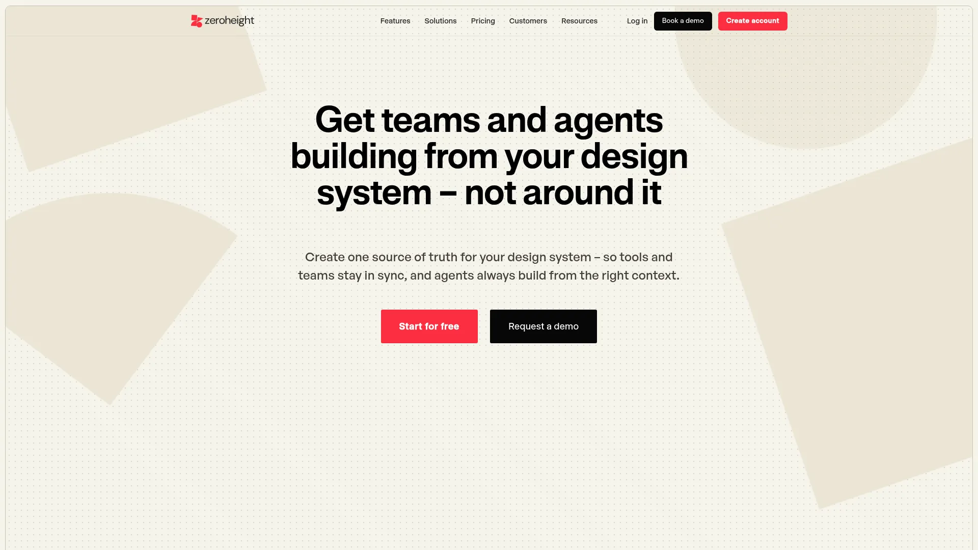
zeroheight is a design system documentation and management platform built to be the single source of truth for design teams. It combines styleguides, pages, blocks, templates, and collections with theming and token workflows, then layers on analytics so you can see how the system is actually used. It connects to Figma and to code repositories, so documentation reflects the real state of design and code rather than a stale snapshot.
Best for: Teams that want documentation, governance, and measurement living in one design system platform.
Key strengths
- Documentation depth: Styleguides, pages, blocks, templates, and collections give a structured, searchable reference.
- Theming and tokens: Token workflows and theming support keep visual decisions consistent across brands and products.
- Adoption analytics: Page insights and search feedback show what gets used, what gets searched, and where design drift hides.
Why choose zeroheight: If your pain is fragmented docs and no visibility into adoption, zeroheight pulls documentation, theming, and design system analytics together. The AI-powered features and MCP/AI tool connections speed up authoring, which matters when the system changes faster than anyone can write.
zeroheight pricing: zeroheight offers a Free plan that supports a single editor. The Starter plan is billed per editor at $59 per editor monthly, or $49 per editor billed annually. Enterprise pricing is handled through sales and is not public. zeroheight holds a 4.3/5 rating on G2.
2. Backlight
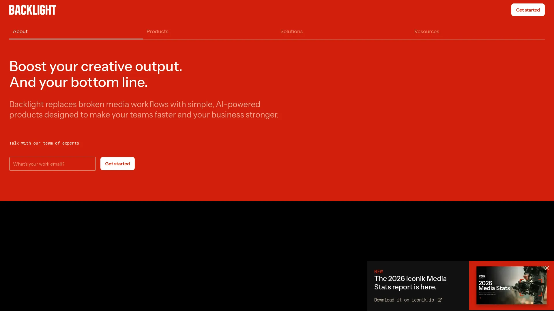
Backlight is a developer-friendly design system platform that brings documentation and component development into one workflow. Rather than treating docs as a separate layer bolted on after the code, it lets teams build, document, and collaborate on components in a system-minded environment. That makes it a strong fit for teams that think about their design system as living code, not just a styleguide.
Best for: Engineering-leaning teams that want a unified design system workflow rather than a docs-only layer.
Key strengths
- Unified workflow: Docs and component development sit together, reducing handoffs between writing and building.
- Collaboration: Built for teams to work on the same component system without context loss.
- System-minded structure: Organizes work around the design system itself, not scattered files.
Why choose Backlight: Choose Backlight when your design system is owned closely by engineering and you want documentation that stays tied to the components themselves. It suits teams that prefer to manage docs, delivery, and collaboration in the same place.
Backlight pricing: Backlight's site directs pricing to its individual product lines rather than a single company-wide plan, and a free tier is available with usage-based paid options above it. Public numeric pricing varies by product, so confirm the plan that matches your team. Backlight shows a 4.3/5 rating on G2.
3. Figma
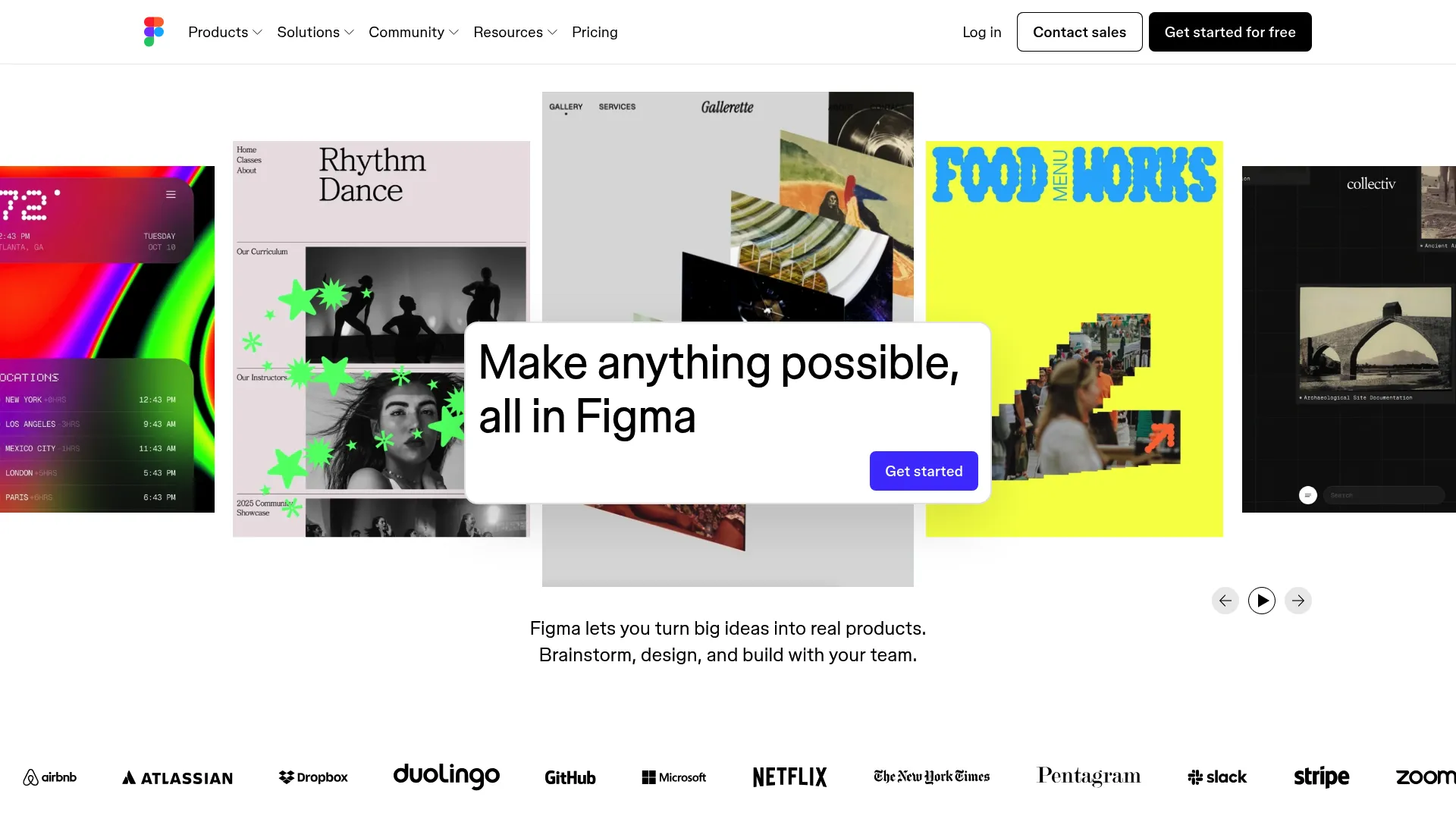
Figma is the cloud-based design and collaboration workspace where most design systems are born. Shared libraries, reusable components, and variables let teams define the visual building blocks in one place, and Dev Mode helps hand those decisions to engineers. It is the foundational design workspace, not a full governance layer, which is why teams pair it with documentation and management tools.
Best for: Product teams that need collaborative design, prototyping, and handoff in one workspace.
Key strengths
- Shared libraries: Reusable components and styles act as the starting source of truth for design.
- Variables: Native variables support tokens and theming directly inside the design file.
- Dev Mode handoff: Gives engineers specs and measurements to keep design and code in sync.
Why choose Figma: Teams still start here even when they need other tools for docs or governance, because the components and variables that everything else references usually originate in Figma. It excels as the design foundation that documentation platforms, token tools, and design-to-code bridges plug into.
Figma pricing: Figma's Starter plan is free. Professional starts at $16 per month, Organization at $55 per month billed annually, and Enterprise at $90 per month billed annually, with additional seat types for dev and collaboration. Figma holds a 4.7/5 rating on G2.
4. Storybook
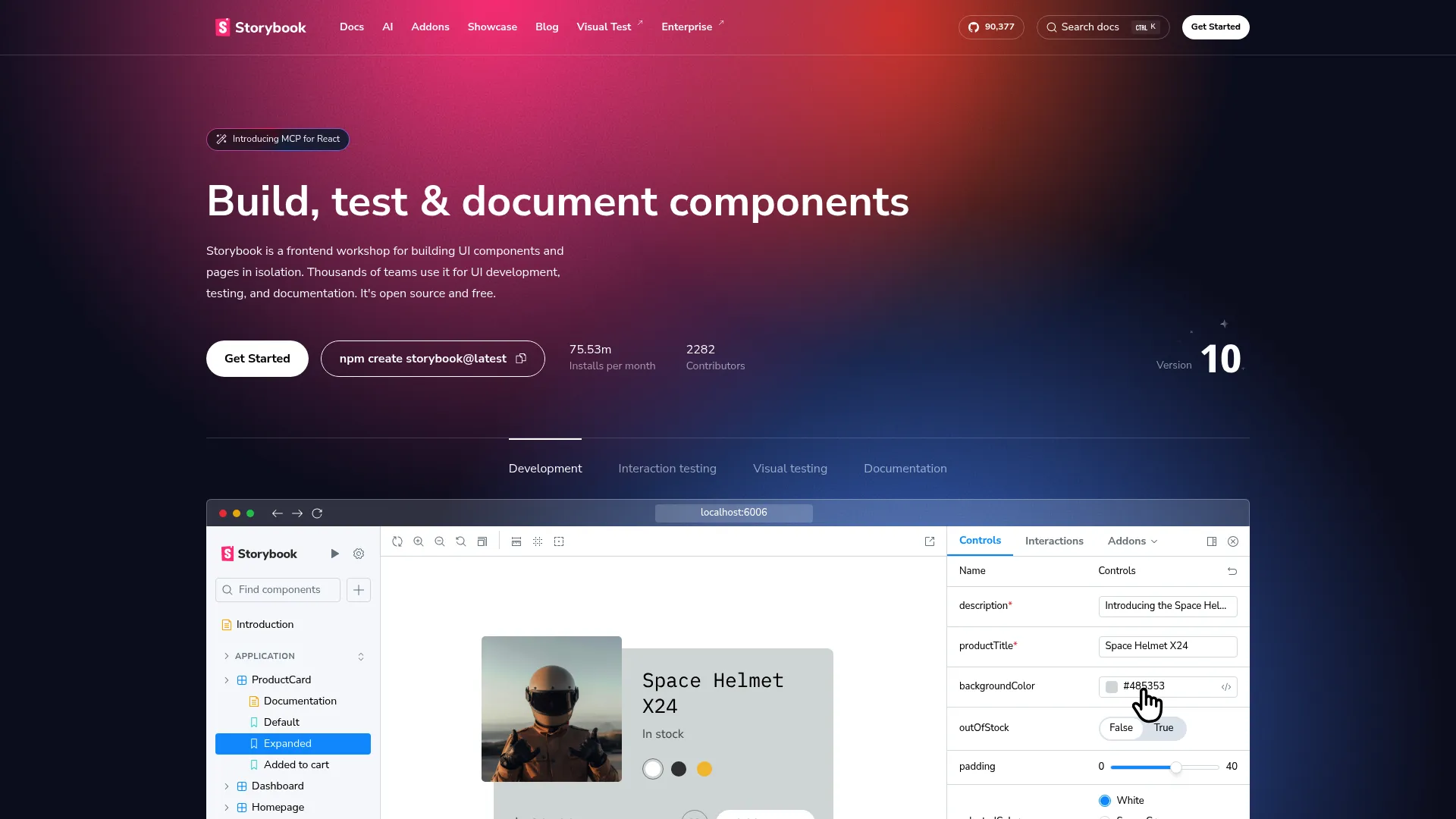
Storybook is the open-source frontend workshop for building, testing, and documenting UI components in isolation. Engineers capture each component state as a "story," then preview, test, and document it away from the full application. For engineering-led design systems, it is often the practical home of the component library and its living documentation.
Best for: Frontend teams that need isolated component development, testing, and UI documentation.
Key strengths
- Isolated development: Build and view components outside the app, free of unrelated dependencies.
- Component states as stories: Capture every variant and edge case as a reusable, documented story.
- Built-in testing and docs: Documentation and testing workflows live alongside the components.
Why choose Storybook: Storybook excels when engineers own the component library and want a single environment to develop, test, and document UI. It integrates with the rest of the workflow rather than trying to be the whole system, which is why teams pair it with tools like Chromatic for visual testing and documentation hubs for usage rules.
Storybook pricing: Storybook is open source and free to use. No paid plan or public price is listed on the project site. It does not carry a meaningful aggregated G2 rating.
5. Tokens Studio for Figma
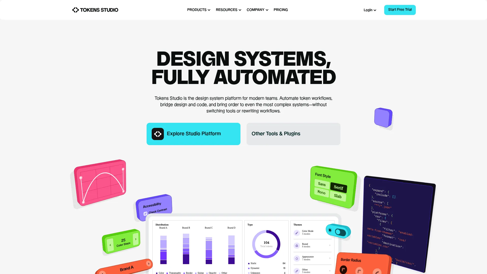
Tokens Studio for Figma is a design system platform focused on creating and managing design tokens inside Figma, then syncing them to code. It lets teams structure tokens for color, type, spacing, and more, manage themes, and push tokens to external storage and development workflows. For token-driven teams, it operationalizes design tokens so they are not just values in a file but a managed, syncable asset.
Best for: Design teams standardizing and syncing design tokens across Figma and development.
Key strengths
- Token management in Figma: Define and organize tokens where designers already work.
- Themes management: Build and switch themes from a structured token set for consistent theming.
- Sync to code: Push tokens to external storage and code workflows to keep design and code in sync.
Why choose Tokens Studio for Figma: This is the tool for teams who want tokens to start in Figma and flow outward, reducing the manual translation that causes design drift. It coordinates design and development around a shared token structure rather than ad hoc values.
Tokens Studio for Figma pricing: Public pricing starts with the Variables plan at €17 per month, Essential at €169 per month, and Organization at €499 per month, all billed annually, with free trial access mentioned on the pricing page. It does not carry a meaningful aggregated G2 rating.
6. Specify
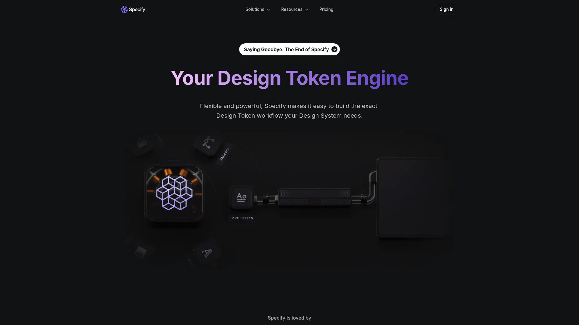
Specify is a design token engine that synchronizes and distributes tokens and assets across design and development tools. It automates token and asset syncing, supports Figma styles and variables as a source, and connects to Tokens Studio, GitHub, an SDK, and a CLI. The point is to act as a token source of truth that pushes consistent values everywhere they are needed, with less manual hand-translation.
Best for: Teams managing design tokens and assets between design and engineering workflows.
Key strengths
- Automated token sync: Collects, defines, and distributes tokens across destinations automatically.
- Figma as source: Uses Figma styles and variables as an upstream source for tokens.
- Broad integrations: Connects to Tokens Studio, GitHub, SDK, and a CLI for delivery into code.
Why choose Specify: Token-centric teams use Specify to reduce manual translation work as the system matures and the number of destinations grows. It fits more mature workflows where tokens need to reach many tools and repositories from one definition.
Specify pricing: Specify's Essentials plan starts at $69 per month, Teams at $134 per month, and Enterprise is contact sales. The pricing page shows monthly and yearly toggles, with the visible listed plan prices shown monthly. A current aggregated G2 rating was not available at the time of writing.
7. Anima
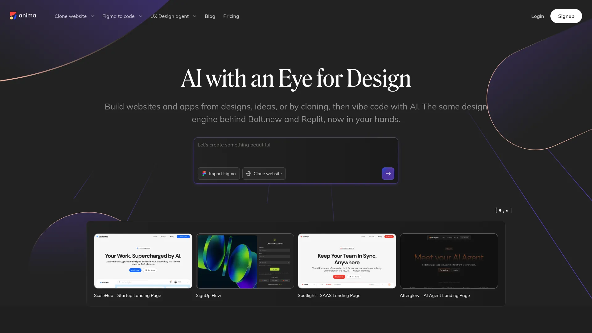
Anima is a design-to-code platform that turns Figma designs, websites, and prompts into code. For design systems, its value is closing the gap between design output and production reality, so the components engineers ship match what designers intended. It includes Figma design imports, an AI playground with chat prompts, and code view, edit, and export, which helps teams reduce manual handoff work and maintain visual consistency.
Best for: Teams that want to convert designs into code and prototype app flows quickly.
Key strengths
- Figma-to-code: Imports designs and generates code to shorten the path from design to build.
- AI playground: Chat prompts help generate and adjust output quickly.
- Code export: View, edit, and export code, plus database and flow management.
Why choose Anima: Choose Anima when the recurring friction is manual handoff and design-code drift, and you want a faster route from Figma to production-adjacent code. It keeps the design system workflow centered on closing the implementation gap rather than generic prototyping.
Anima pricing: Anima offers a Free plan, and its Enterprise plan starts at $500 per month paid annually. Public pricing for standard paid tiers between those was not clearly listed at the time of writing, so confirm the mid-tier plan that fits your team. Anima holds a 4.3/5 rating on G2.
8. Knapsack
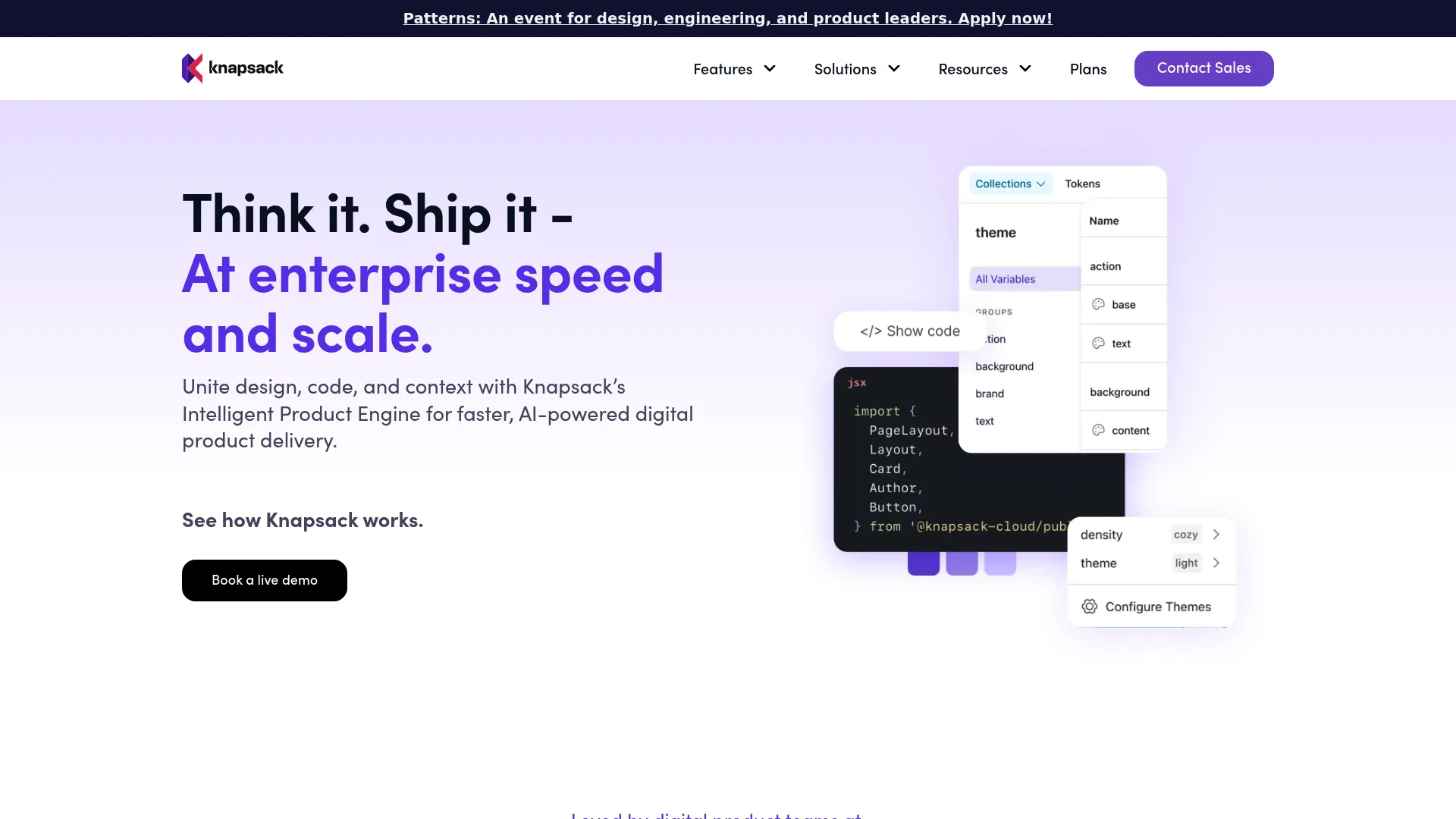
Knapsack is an enterprise design system and digital production platform that connects design, code, and documentation. Its strength is design system governance: Git-backed version control, structured workflows, and Figma integration that let teams manage controlled updates and approvals at scale. For organizations where process discipline matters as much as the components themselves, Knapsack provides the structure.
Best for: Enterprise teams managing design systems across design, code, and documentation.
Key strengths
- Git-backed version control: Versioned changes give a controlled, auditable update path.
- Design token management: Manage tokens alongside components and docs in one platform.
- Figma integration: Connect design work to the governed system of record.
Why choose Knapsack: Knapsack fits teams that care about workflow structure, approvals, and cross-functional alignment as the system spans many products. It supports the governance and version-controlled documentation that large organizations need to scale without chaos.
Knapsack pricing: Knapsack lists three annual enterprise plans: Basic (5+ users, 50 viewers included), Core (10+ users, 200 viewers included), and Pro (20+ users, unlimited free viewers). Pricing is contact sales with no public numeric price shown. Knapsack holds a 4.3/5 rating on G2.
9. InVision DSM
InVision DSM was a long-standing reference point in the design system management category, covering documentation, component organization, prototyping, and collaboration. It matters historically because it helped popularize the idea of a managed design system hub. Its current status has changed materially: InVision discontinued its design collaboration services, prototypes, Inspect, DSM, and boards on December 31, 2024, and its site now redirects to Miro.
Best for: Teams researching the history of the design system management category rather than buying today.
Key strengths
- Design system management: Historically organized components and documentation in one hub.
- Prototype sharing: Supported sharing and feedback on prototypes.
- Collaboration: Provided commenting and review around design work.
Why choose InVision DSM: Given the discontinuation, InVision DSM is included here as a category reference point, not a current recommendation. Teams evaluating tooling for 2026 should plan around its retirement and choose an actively maintained platform from this list. InVision holds a 4.4/5 rating on G2 based on historic reviews.
10. Abstract
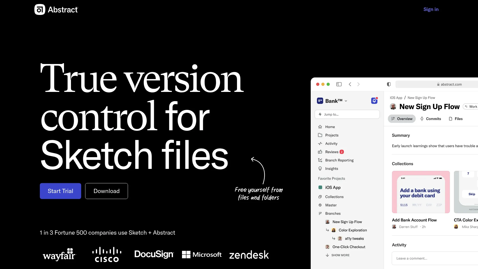
Abstract is a design collaboration and version control platform for managing, versioning, and documenting design work. It brings branch-based collaboration and merging to Sketch files, plus Notebooks for design review and documentation. For teams that want structure around design assets and iteration, Abstract adds the governance and review layer that raw file storage lacks.
Best for: Design teams needing version control, review workflows, and collaboration around Sketch-based work.
Key strengths
- Version control for files: Track and manage versions of design files over time.
- Branch-based collaboration: Branch, review, and merge changes with a clear history.
- Notebooks: Document and review design decisions in one place.
Why choose Abstract: Choose Abstract when your design assets need real version control and a review process rather than ad hoc file sharing. It emphasizes governance and collaboration for teams iterating on a shared design library.
Abstract pricing: Abstract offers a Notebooks Free Forever plan. Notebooks Pro is $29 per month per contributor billed annually, and the Abstract (Branches) Pro plan is $35 per month per contributor billed annually, with Enterprise priced custom. Abstract holds a 3.9/5 rating on G2.
11. Zeplin
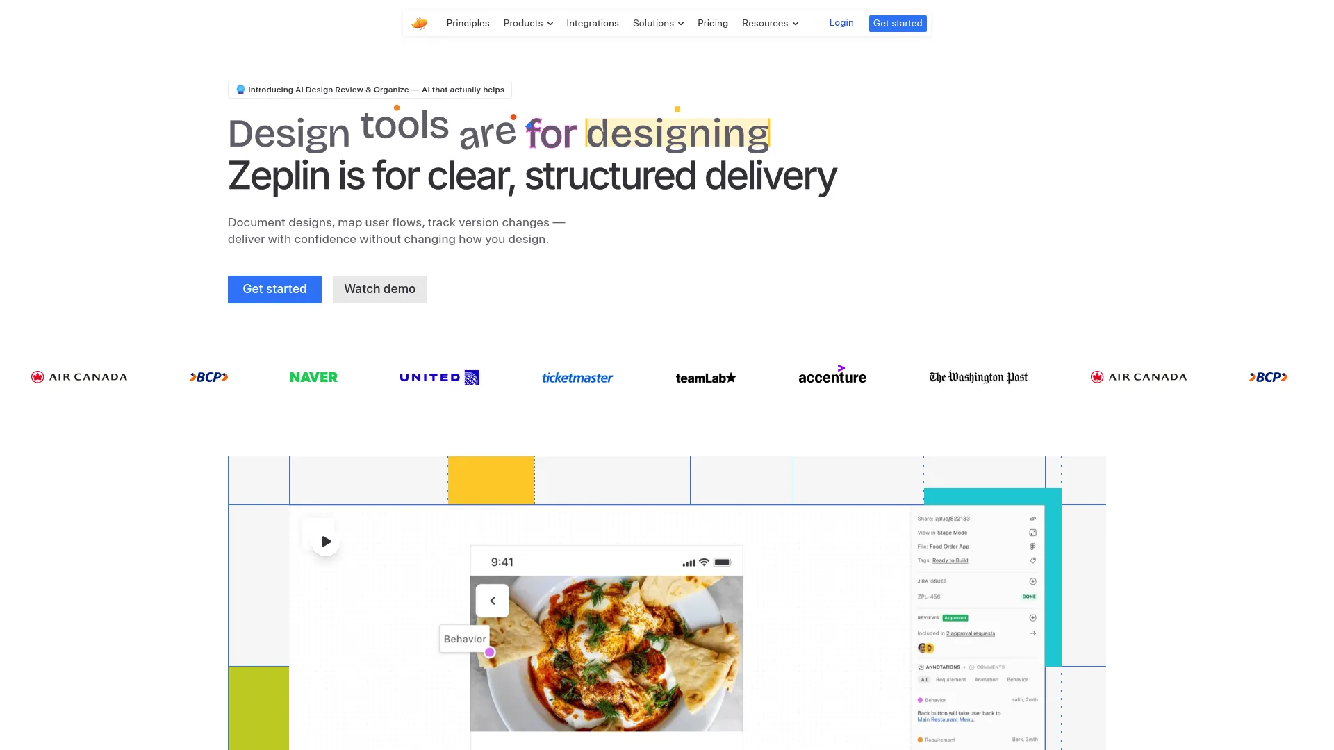
Zeplin is a design delivery platform that hands off designs, specs, and tokens to developers. It strengthens the bridge between design and development with annotations, flows, approvals, screen version comparisons, and integrations with Jira, Azure DevOps, VS Code, Storybook, Slack, and Teams. It sits between a full design system platform and raw handoff, giving engineers implementation clarity without forcing them to interpret a design file.
Best for: Design-to-development handoff and workflow coordination for product teams.
Key strengths
- Specs and annotations: Detailed design annotations, flows, and approvals reduce guesswork in implementation.
- Version compare: Compare screen versions and variants to track what changed.
- Deep integrations: Connects to Jira, Azure DevOps, VS Code, Storybook, Slack, Teams, and an API.
Why choose Zeplin: Zeplin is a strong bridge tool when the gap is between finished design and confident implementation. It pairs well with a documentation platform for usage rules and a component environment for the code itself.
Zeplin pricing: Zeplin offers a Free plan. Basic is priced per project in preset packs starting at $13.75 per month, Advanced is $12 per seat per month and includes 50 projects, and Enterprise is contact sales. A current aggregated G2 rating was not available at the time of writing; Zeplin maintains a public rating on Capterra.
12. Framer
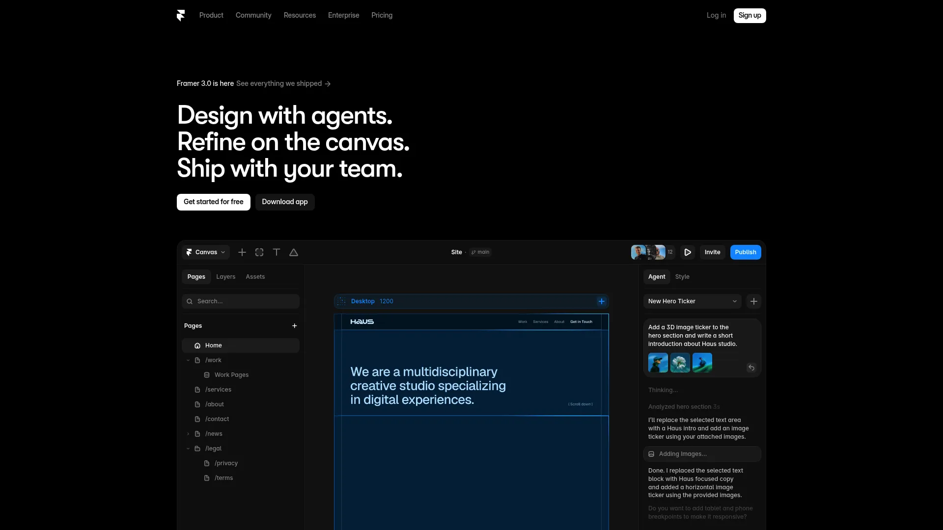
Framer is a visual website builder that lets designers and teams design, build, and publish responsive sites with components. In a design system context, it supports component-based experiences and interactive design communication, with AI site generation, responsive breakpoints, and a built-in CMS. It sits adjacent to the core design system source of truth rather than replacing it, useful when teams need production-adjacent output fast.
Best for: Designers and teams that want a visual website builder with AI and live collaboration.
Key strengths
- AI site generation: Generate and edit sites on the canvas to move quickly from idea to live.
- Responsive layouts: Breakpoints keep component-based experiences consistent across devices.
- Built-in CMS and hosting: Publish without stitching together separate tools.
Why choose Framer: Choose Framer when you need interactive design communication and production-adjacent web output that reuses components. Keep it positioned as adjacent workflow support, with your documentation, token, and governance tools holding the real source of truth.
Framer pricing: Framer offers a Free plan. Basic is $10 per month and Pro is $30 per month, with Enterprise priced custom. Framer holds a 4.5/5 rating on G2.
13. Chromatic
Chromatic is a visual testing and UI review platform built for Storybook and frontend teams. It runs visual regression tests across Chrome, Firefox, Safari, and Edge, supports interaction and accessibility tests, and provides UI review workflows. For Storybook-centric design systems, it is the measurement layer that validates UI consistency and catches regressions before they reach users.
Best for: Teams using Storybook that need visual regression testing and async UI review.
Key strengths
- Cross-browser visual tests: Catch visual regressions across Chrome, Firefox, Safari, and Edge.
- Interaction and accessibility tests: Validate clicks, typing, hover, drag-and-drop, and accessibility.
- UI review workflows: Review and approve component changes asynchronously.
Why choose Chromatic: Chromatic is the quality-assurance and measurement piece for teams already living in Storybook. It connects directly to your component library and keeps the system consistent as it changes, which is essential when many engineers ship to the same components.
Chromatic pricing: Chromatic offers a Free plan. Starter is $179 per month and Pro is $399 per month, with Enterprise priced custom; paid plans add higher snapshot limits and broader browser coverage. Chromatic holds a 4.3/5 rating on G2.
14. Pattern Lab
Pattern Lab is an open-source frontend workshop environment for building, viewing, testing, and showcasing design system UI components. Built around atomic, component-driven architecture, it supports nested patterns, dynamic data, and viewport resizing tools. For engineering-heavy teams that want a structured, framework-oriented way to compose UI from patterns, it remains a recognizable reference in the category.
Best for: Teams needing an open-source design system pattern library and workshop environment.
Key strengths
- Nested patterns: Compose larger components from smaller patterns for consistent structure.
- Dynamic data: Populate patterns with data to preview realistic states.
- Viewport tools: Resize viewports to validate responsive behavior.
Why choose Pattern Lab: Pattern Lab fits engineering teams that favor a structured, open-source approach to pattern libraries and want full control over the architecture. Note that the project is archived and community-driven, so weigh long-term maintenance against the value of an open, self-hosted setup.
Pattern Lab pricing: Pattern Lab is open source and free to use, with no public pricing page or paid plans. It does not carry a meaningful aggregated rating from the primary review platforms.
15. Open-source and community design system tools
!Open-source design system tooling
Beyond the named platforms, a healthy ecosystem of open-source and community tools covers the same design system jobs for teams that prefer self-hosted, flexible setups. These options trade managed convenience for control and zero licensing cost, which suits engineering-heavy teams and organizations with strict data requirements.
Best for: Teams that want flexible, self-hosted, open-source design system tooling.
Key strengths
- Fractal: An open-source tool for assembling, previewing, and documenting component libraries.
- Patternplate: A development environment for building and documenting UI patterns and design systems.
- Git-based documentation: Markdown-driven, version-controlled documentation setups built on Git for full ownership.
Why choose open-source tools: These options excel when you want full control, no per-seat cost, and a documentation platform that lives in your own repositories. They pair naturally with Storybook for component development and your CI pipeline for measurement, giving engineering-led teams a single source of truth they fully own.
Open-source tooling pricing: Most community and open-source design system tools are free to use under permissive licenses, with costs limited to your own hosting and maintenance. Aggregated ratings vary and are often not centralized on the major review platforms.
Considerations
Picking a design system tool is less about the longest feature list and more about matching the tool to where your pain actually lives. Use these criteria to pressure-test any shortlist.
Documentation depth and maintenance
Look at how documentation is authored, searched, and kept current. A strong documentation platform makes updates fast and low-effort, because the system that is hardest to maintain is the one that goes stale first. Check for version-controlled documentation and change history so you can trust what you read.
Sync, tokens, and repository integration
Evaluate Figma sync, design tokens tools, and repository integrations together, since they determine whether you can actually keep design and code in sync. The goal is a single token definition that flows to every destination without manual translation, which is the root cause of most design drift.
Analytics, adoption, and governance
Decide how you will measure adoption monitoring and design drift, and how changes get approved. Design system analytics and design system governance turn the system from a static artifact into a managed product. Without measurement, you cannot prove the system is worth the investment.
Team shape: developer-first, designer-first, or doc-first
Match the tool to your operating model. Engineering-led systems gravitate toward component environments and visual testing, designer-led systems toward Figma-centric token and theming tools, and cross-functional systems toward documentation and management hubs. Choose the lens that fits how your team actually works.
Future scalability
Check whether the tool can scale across multiple product lines and brand systems. Theming, multi-brand token support, and AI-enabled design system workflow features signal whether the platform will grow with you or cap out as you add products.
Conclusion
There is no single best design system tool, only the best fit for the job in front of you. If documentation and adoption are the gap, a documentation and management platform like zeroheight or Backlight does the most work. If the friction is tokens, Tokens Studio for Figma and Specify keep values consistent from Figma to code. If you are engineering-led, Storybook plus Chromatic covers component development and visual QA, and Knapsack adds governance at enterprise scale. Figma almost always anchors the design layer underneath all of it.
The practical next step is to audit where your current design system drifts. Map your workflow across docs, delivery, measurement, and management, then find the layer that breaks first. Buy for that gap, not for a feature list. A tool that closes your single worst source of drift will pay for itself faster than a platform that does a little of everything. For teams aligning launch consistency across functions, our guides to the best product analytics software tools and ai governance tools are useful companions, and Guideflow covers adjacent product education and interactive demo workflows.
FAQs
A design system tool is software that helps teams define, document, distribute, and govern the reusable parts of a product interface, including components, design tokens, and usage rules. It supports consistency, scale, and collaboration by giving design, engineering, product, and marketing one shared source of truth. Categories range from documentation platforms to token tools, component environments, and governance hubs.
A design system platform is broader infrastructure for documentation, governance, and analytics across the whole system, while Storybook is a component-centric environment for building, testing, and documenting UI in isolation. Storybook excels at the component layer for engineers; a documentation platform covers usage rules, adoption monitoring, and cross-functional governance. Many teams use both together, with Storybook feeding the component library and the platform holding the wider source of truth.
Token-first tools like Tokens Studio for Figma and Specify are purpose-built for creating, structuring, and syncing design tokens. Tokens Studio works inside Figma and pushes tokens to code, while Specify acts as a token engine that distributes tokens and assets across many destinations. Doc-first platforms such as zeroheight and Knapsack also support token workflows as part of a broader system, so choose based on whether tokens are your primary pain or one part of a larger setup.
No. Figma usually remains the design workspace where components, variables, and the initial source of truth live, while design system tools handle documentation, sync, governance, and analytics around it. Most teams keep Figma at the center of design and connect it to a documentation platform, token tools, and design-to-code bridges. The two are complementary rather than competing.
Keeping design and code in sync relies on a single token definition, Figma sync, and repository integrations that push changes from design into production code. Token tools distribute values, design-to-code bridges reduce manual translation, and version-controlled documentation records what changed. The underlying principle is a single source of truth, so designers and engineers reference the same authoritative decisions rather than maintaining parallel copies that drift apart.
A product marketing manager should look for tools that protect launch consistency, support cross-functional collaboration, and provide analytics on how the system is used. UI consistency directly affects whether messaging matches the product, and governance keeps that alignment from slipping as launches stack up. Prioritize documentation depth, adoption monitoring, and a credible single source of truth that design, engineering, and marketing all trust.
Governance-focused tools emphasize versioning, approvals, ownership, and controlled updates. Knapsack offers Git-backed version control and structured workflows for enterprise teams, Abstract brings branch-based version control to design files, and documentation platforms like zeroheight add analytics and version-controlled documentation. The right choice depends on whether your governance pain sits in code, design files, or documentation.
Choose based on where the strongest pain is right now. If teams cannot find or trust the current rules and adoption is unclear, start with a documentation platform that establishes a single source of truth. If the recurring problem is inconsistent values and design drift between Figma and code, start with design tokens tools. Most mature setups end up using both, but solving the loudest problem first delivers the fastest return.