Half your new users will never come back after day one. Not because your product is wrong, but because you can't see where they got stuck.
User onboarding analytics tracks how new users move through their first product experiences and where they succeed, struggle, or abandon the journey entirely. This guide covers the 12 metrics that matter most and how to build a measurement framework that connects onboarding data to revenue. It also covers the specific mistakes that keep teams guessing instead of knowing.
Key takeaways
- User onboarding analytics track how new users move through initial product experiences. This data reveals exactly which steps cause friction and which drive retention.
- Time to value, activation rate, and early retention are the three highest-signal metrics. If you only track a few things, track these.
- Building a measurement framework starts with defining your activation event. Then map user journeys, construct funnels, and connect onboarding data to revenue systems.
- Segmenting analytics by persona and acquisition source exposes patterns that aggregate data hides. Different user types often require different onboarding paths.
- Teams connecting onboarding metrics to CRM and billing systems see which paths produce higher lifetime value. This turns onboarding data into pipeline intelligence.
Why user onboarding analytics drive SaaS growth
User onboarding analytics is the practice of measuring how new users progress through their first product experiences. It identifies where users succeed, struggle, or abandon the journey entirely. Onboarding is the highest-leverage moment in the user lifecycle because it determines whether users reach value or leave before understanding what your product does.
When you can't see where users drop off, you can't fix the friction. When you can't identify which features drive activation, you invest in the wrong improvements. The result is higher churn, lower expansion revenue, and a product team guessing instead of knowing.
Here's what onboarding analytics actually give you:
- Visibility into friction: Analytics reveal exactly where users get stuck, whether that's a confusing setup wizard, a missing feature, or too many clicks.
- Data for prioritization: Instead of debating which onboarding improvements matter most, you can see which steps lose the most users and fix those first.
- Connection to revenue: Onboarding performance directly predicts retention because a 25% activation boost drives 34% more revenue. Users who activate quickly retain and expand faster.
According to Mixpanel's 2024 Product Benchmarks Report, the median activation rate across B2B SaaS products is just 36%. That means most products lose nearly two-thirds of new users before they reach value.
12 user onboarding metrics to measure
Not every team needs all 12 of these metrics. Together, they cover the full picture from first login to long-term retention.
They fall into three groups: speed metrics, engagement metrics, and outcome metrics. Speed metrics measure how fast users reach value, engagement metrics measure depth of interaction, and outcome metrics track what happens after onboarding ends.
Time to value
Time to value (TTV) measures the elapsed time between signup and the moment a user experiences the core benefit of your product. What counts as "value" varies by product.
For a reporting tool, it might be generating the first report. For a collaboration platform, it might be completing the first shared project.
TTV is the single most important leading indicator of onboarding success. Users who reach value quickly retain at dramatically higher rates than those who take longer.
Activation rate
Activation rate is the percentage of new users who complete a defined "activation event" within a set period. The activation event is the earliest meaningful action that correlates with retention. It's not just any action; it's the specific behavior that separates users who stick around from those who churn.
Examples of activation events include:
- Sent first message (communication tools)
- Created first project (project management)
- Invited a teammate (collaboration platforms)
- Generated first report (analytics tools)
Defining the right activation event requires analysis. Look at your retained users and work backward to find the common action they all completed early in their journey.
Onboarding completion rate
Onboarding completion rate measures the percentage of users who finish your designed onboarding flow. This is distinct from activation rate.
Completion measures whether users followed your intended path, while activation measures whether they reached value. Teams looking to boost their onboarding completion rates with interactive guides often see significant improvements in both metrics.
Users can activate without completing onboarding (they skip the tour but figure things out). Users can also complete onboarding without activating (they click through every step but never do anything meaningful). Track both metrics separately to understand whether your onboarding flow is effective and whether it's actually necessary.
Onboarding funnel drop-off rate
Drop-off rate shows why 30 to 50% of users abandon onboarding at each step. This metric pinpoints exactly where friction exists. If 80% of users complete step one but only 40% complete step two, you know where to focus.
A 50% drop-off at a specific step is a clear signal that something about that step is confusing, unnecessary, or poorly designed. Fix the biggest leaks first.
Feature adoption rate
Feature adoption rate measures the percentage of users who use a specific feature within a time window. Tracking adoption of key features during onboarding matters because users who skip core functionality miss value and churn later.
If your product's main value comes from a specific feature and only 20% of new users try it in week one, you have an onboarding problem. That low adoption signals a gap in your onboarding flow. Either users don't know the feature exists, don't understand why it matters, or can't figure out how to use it.
User engagement score
A user engagement score is a composite metric combining multiple engagement signals: logins, actions taken, time in product, features used. This provides a holistic view when single metrics are too narrow.
Engagement scores require calibration to your specific product. A daily-use tool and a monthly-use tool have very different healthy engagement patterns. Build your score based on what engaged, retained users actually do in your product.
Daily and monthly active users
DAU (daily active users) and MAU (monthly active users) count unique users who take a meaningful action within the respective time period. The DAU/MAU ratio reveals stickiness. A ratio of 0.5 means half your monthly users come back every day.
DAU and MAU are lagging indicators that reflect onboarding quality over time. Strong onboarding produces higher DAU/MAU ratios because users who reach value quickly develop habits around your product.
Retention rate
Retention rate measures the percentage of users who return after a specific period. Day 7 and day 30 retention are the most common benchmarks. Early retention (first week) is heavily influenced by onboarding quality.
This metric is the ultimate validation that onboarding worked. If users come back, they found value. If they don't, something in the early experience failed them.
Churn rate
Churn rate is the percentage of users who stop using the product within a period. It's the inverse of retention. High early churn often signals onboarding failure rather than product-market fit issues.
When users churn in the first week, they usually never understood what your product does or how it helps them. That's an onboarding problem, not a product problem.
Free trial conversion rate
Free trial conversion rate measures the percentage of trial users who become paying customers. This metric directly ties onboarding to revenue.
Improving onboarding often has a larger impact on conversion than pricing changes because 8% is the median conversion rate. Users who reach value during a trial convert at higher rates because they've already experienced the benefit.
Support ticket volume during onboarding
This metric counts support requests from users in their first days or weeks. High ticket volume indicates unclear onboarding flows or missing guidance.
Support tickets are both a friction signal and a cost metric. Every ticket represents a user who got stuck and a support team member who had to help them. Teams can reduce this burden by implementing interactive guides for customer support that help users self-serve during onboarding.
Net promoter score for new users
NPS measures likelihood to recommend, typically on a 0-10 scale. Surveying new users specifically matters because their NPS reflects onboarding experience quality.
Timing is critical. Survey too early and users lack context to evaluate the product.
Survey too late and other factors (feature gaps, bugs, support interactions) dominate their response. The sweet spot is usually after activation but within the first few weeks.
Metric | What it measures | When to use |
|---|---|---|
Time to value | Speed to first meaningful outcome | Primary leading indicator |
Activation rate | Completion of key activation event | Defining onboarding success |
Completion rate | Finish rate of designed flow | Evaluating flow design |
Drop-off rate | Abandonment at each step | Identifying friction points |
Feature adoption | Usage of specific features | Ensuring value discovery |
Engagement score | Composite engagement health | Holistic user assessment |
DAU/MAU | Active user counts and ratio | Measuring stickiness |
Retention rate | Return rate over time | Validating long-term success |
Churn rate | User loss rate | Identifying failure patterns |
Trial conversion | Free to paid conversion | Connecting to revenue |
Support tickets | Help requests from new users | Spotting confusion |
NPS (new users) | Satisfaction and advocacy | Qualitative feedback |
How to build an onboarding measurement framework
Tracking individual metrics is not enough. User onboarding analytics requires a structured framework that connects metrics to decisions. Without a framework, you'll have data but no clarity on what to do with it.
1. Define your activation event
The activation event is the foundation of your measurement framework. This is the earliest action that correlates with retention. To identify it, look at your retained users and find the common behavior they all completed early.
Avoid choosing vanity milestones that don't predict success. "Completed profile" sounds meaningful but often has no correlation with retention.
"Created first project" or "invited first teammate" typically do. Test your hypothesis by comparing retention rates between users who completed the event and those who didn't.
2. Map onboarding milestones and user journeys
Document the steps users take from signup to activation. Not all users follow the same route, so map multiple paths.
Some users explore on their own. Others follow guided tours using product tour software. Some skip straight to the feature they came for.
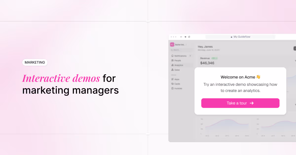
Understanding user journeys helps you identify which paths lead to activation and which lead to abandonment. Interactive demos can help teams visualize and test onboarding journeys before building analytics, letting you see how users naturally want to move through your product.
3. Build funnels to track each step
Funnel construction requires defining an entry point, intermediate steps, and a conversion point. Use consistent event naming so you can compare data over time and across segments.
Most analytics tools support funnel visualization natively. The key is choosing the right steps to include.
Too few steps and you miss where friction occurs. Too many steps and the data becomes noisy. Start with 5-7 key milestones and refine from there.
4. Identify drop-off points
Read funnel data to find the biggest leaks. Prioritize by fixing the step with the largest absolute drop-off first. A 50% drop-off at step two affects more users than a 50% drop-off at step five.
Quantitative data shows where drop-offs happen. Qualitative data explains why. Use session recordings, user interviews, or in-app surveys to understand the reasons behind the numbers.
5. Connect onboarding data to revenue systems
Integrating onboarding analytics with CRM and billing systems unlocks powerful insights. You can see which onboarding paths produce higher lifetime value, better expansion rates, and faster sales cycles.
This connection turns onboarding data into pipeline intelligence. When a specific onboarding path converts at 3x the rate of others, you can prioritize getting more users down that path. Teams using Guideflow can analyze engagement data on interactive demos to understand where prospects experience value before they even sign up.
How to use onboarding analytics to reduce churn
Data without action is useless. The goal of user onboarding analytics is improvement through action. Here's how to turn onboarding insights into experiments that reduce churn.
Segment analytics by persona and acquisition source
Aggregate metrics hide important patterns. A 40% activation rate might mean 60% activation for one persona and 20% for another. If you only look at the aggregate, you'll miss that one group is struggling badly.
Segment by:
- Role: End users, admins, and executives have different needs
- Company size: SMB and enterprise users face different challenges
- Acquisition channel: Users from different sources have different expectations
- Use case: Users who signed up for different reasons require different paths
Different segments often require different onboarding experiences that deliver 40% higher retention. A one-size-fits-all approach optimizes for the average user, who may not actually exist. This is why training and enablement teams use interactive demos to create tailored onboarding paths for different user personas.
Prioritize fixes by revenue impact
Connect drop-off points to revenue outcomes. Not all users are equally valuable. A drop-off that loses mostly free users matters less than one that loses high-intent trial users from enterprise accounts.
Use a simple prioritization framework: fix the step where the most high-value users abandon. If enterprise users have a 70% drop-off at step three but SMB users have only 30%, focus on step three for enterprise first.
Run experiments on high drop-off steps
The experiment cycle is straightforward: hypothesis, change, measure, iterate. Types of experiments include:
- Simplifying steps: Remove unnecessary fields or actions
- Adding guidance: Include tooltips, videos, or contextual help
- Removing friction: Eliminate steps that don't contribute to activation
- Reordering flows: Put high-value features earlier in the journey
Interactive demos let teams test onboarding changes without engineering effort. You can prototype a new flow, share it with users, and measure engagement before committing to development work.
Common mistakes in user onboarding measurement
Even teams that apply user onboarding analytics make predictable errors. Here are the patterns to avoid:
- Tracking too many metrics: Metric overload causes analysis paralysis. Start with 3-5 core metrics and expand only when you've mastered those.
- Measuring completion without activation: A 90% completion rate means nothing if users never reach value. Completion is a process metric; optimize for activation outcomes instead.
- Ignoring qualitative signals: Quantitative data shows what happened; qualitative data explains why. Without interviews or recordings, you're guessing at the reasons.
- Setting activation events too late: If your activation event is in week three, churned users are already gone. Choose an event from the first session or first few days.
- Not segmenting by user type: Aggregate data hides persona-specific friction; one segment may struggle while overall rates look healthy. Always segment before drawing conclusions.
Customer onboarding success metrics that predict retention
If you only track a few things within user onboarding analytics, focus on time to value, activation rate, and early retention. These three metrics have the strongest predictive power for long-term success.
- Time to value as leading indicator: Speed to first outcome predicts everything downstream. Users who reach value quickly retain at far higher rates.
- Activation rate as quality gate: Activation separates users who retain from those who won't. First-session activators retain at 2-3x the rate of those who don't.
- Early retention as confirmation: Day 7 and day 14 retention validate that onboarding worked. Users absent by day 14 rarely return.
Combining activation rate, time to value, and early retention into a health score enables proactive intervention. When a user has slow TTV, hasn't activated, and hasn't returned in three days, that's an at-risk user. Reach out before they churn, not after.
Tip: Set up automated alerts for users who haven't activated within your target timeframe. A well-timed email or in-app message can recover users who got stuck but haven't given up yet.
Start tracking onboarding analytics today
Here's what to do in the next 24 hours:
- Define your activation event. Look at retained users and identify the earliest action they all completed early.
- Set up a basic funnel. Map signup-to-activation steps in your analytics tool; you don't need perfect data to start learning.
- Identify your biggest drop-off point. Find where most users abandon the journey - that's your first optimization target.
- Run one experiment. Simplify, add guidance, or remove the high-drop-off step, then measure the impact.
- Connect to your CRM. Flow onboarding data into sales and customer success systems to see which paths produce the best customers.
Teams using Guideflow can analyze engagement data on interactive demos to understand where prospects experience value before they even create an account. This gives you onboarding intelligence earlier in the funnel, before users sign up.
FAQs about user onboarding metrics
What is a good benchmark for time to value in SaaS products?
Benchmarks vary dramatically by product complexity. Simpler products (note-taking apps, basic tools) aim for minutes.
Complex products (enterprise software, multi-step workflows) may take days. The goal is always to minimize TTV as much as possible without sacrificing user comprehension.
How do teams measure onboarding for products with multiple stakeholders?
Multi-stakeholder products track both individual user activation and account-level activation. Account-level activation occurs when enough users in an account reach value to drive a purchase or renewal decision.
Both metrics matter, but account-level activation often predicts revenue more directly. Some teams embed interactive guides into certification programs to ensure consistent activation across all stakeholders.
Should product-led and sales-led companies track onboarding metrics differently?
The core metrics are the same. PLG companies weight self-serve activation more heavily because users convert without sales involvement.
Sales-led companies connect onboarding data to deal progression and use it to inform sales conversations. The metrics don't change; the actions you take based on them do.
How often should teams review user onboarding analytics?
Weekly review catches trends and allows for timely intervention. Set up automated alerts for significant drop-off changes so you can respond quickly to emerging problems. Monthly deep-dives help identify longer-term patterns and inform roadmap decisions.
What is the difference between activation rate and onboarding completion rate?
Completion rate measures whether users finished the designed flow. Activation rate measures whether users reached a value milestone.
Users can activate without following the intended path - they skip the tour but figure things out. Or they can complete onboarding without activating - clicking through every step but never doing anything meaningful.
Can teams track analytics for pre-signup demo users?
Yes. Interactive demos with built-in analytics let teams see which features prospects explored and where they dropped off. This provides onboarding intelligence before the user even creates an account, helping you understand what resonates and what confuses potential users.
.avif)


.avif)