


Your dashboard says revenue dropped 12% last week. It does not say why. It does not say which segment, which cohort, or what to do about it before your next standup.
That gap is the whole problem. Raw numbers pile up faster than anyone can read them, and most teams end up with more data than interpretation. The global data analytics market sits at $108.79B in 2026, projected to reach $438.47B by 2031, according to Mordor Intelligence (2026). Spending grows. Clarity does not always follow.
Most data analysis tools stop at the chart. What a product manager actually needs is the next step: what changed, why it changed, and which lever to pull. That means moving from messy source data to a decision, not just a prettier bar graph.
The right data analytics tools depend on your data type, your team's skill level, and how much prep or governance you need before anyone trusts the output. This guide breaks down seven options so you can match the tool to the job instead of the hype.
What's inside
This guide is for product managers, analysts, and operators who need to turn raw data into decisions, not just visuals.
Here is how the seven tools were chosen and compared:
- Coverage across categories: business intelligence software, statistical analysis software, and broader analytics platforms
- Data prep depth: how much cleaning, shaping, and modeling happens in-tool
- Visualization quality: clarity of dashboards and exploration
- Collaboration and governed access: sharing, permissions, and consistent metrics
- Fit by skill level: what non-technical users can do versus what analysts and engineers need
TL;DR
Short on time? Here are the quick picks:
- Best overall for most teams: Power BI, especially if you already run Microsoft 365 or Azure
- Best for visual storytelling and exploration: Tableau
- Best for semantic modeling and governed self-serve: Looker
- Best for a unified Microsoft analytics platform: Microsoft Fabric
- Best for enterprise reporting and governance: IBM Cognos Analytics
- Best for associative analytics and guided discovery: Qlik Sense
- Best for operational dashboards across teams: Domo
Most of these overlap on data visualization tools and dashboards. The real difference is prep depth, governance, and who on your team actually has to build things.
What is data interpretation software
Data interpretation software helps teams turn raw data into usable insight through querying, cleaning, modeling, visualization, dashboards, and reporting. It sits one layer past collection: the point is not to store numbers, but to explain them and act.
The category overlaps with business intelligence software, statistical analysis software, and full analytics platforms. Business intelligence software leans toward dashboards and reporting. Statistical analysis software leans toward modeling, significance testing, and forecasting. An analytics platform often bundles storage, engineering, and BI together.
Common capabilities across these data visualization tools and platforms:
- Connects to databases, spreadsheets, and cloud warehouses
- Cleans and shapes messy source data for data prep and cleaning work
- Builds dashboards, reports, and visual narratives
- Supports filtering, slicing, and drill-down analysis
- Enables SQL analytics and modeled metrics for consistency
- Helps teams share findings, then act on them
For a product manager, the practical test is simple. Can this tool take a messy export, shape it, model a metric everyone agrees on, and put a drill-down dashboard in front of a stakeholder who does not write SQL? The tools below answer that question in different ways, which is exactly why category fit matters more than a feature checklist.
When to use
Different jobs call for different tools. Here are three patterns worth matching against.
Turn messy data into a decision-ready view
Sometimes the data lives in five exports and none of them agree. You need prep, modeling, and dashboarding in one place. A tool with strong shaping and a clean modeling layer lets you go from raw CSV to a metric your team trusts, without a separate pipeline project. This is where combined prep-plus-BI tools earn their keep.
Give non-technical stakeholders self-serve answers
Your VP does not want a Slack thread. They want to filter the dashboard themselves. Self-service BI shines when business users need drill-downs, filters, and shareable views without pinging an analyst. The win is fewer "can you pull this?" requests and faster decisions across segments and plans.
Support deeper statistical or operational analysis
Some questions need forecasting and modeling, not just a chart. Cohort retention curves, significance tests, or operational alerts across departments push you toward tools built for depth. Here you weigh statistical horsepower or real-time operational reporting against ease of use for everyone else.
Comparison table
The tools below are sorted by broad relevance to product managers and business users choosing data analytics tools. Pricing reflects publicly listed starting points where available. Where a vendor prices by quote or capacity, that is noted plainly.
| # | Product | Best for | Key differentiator | Pricing | G2 rating |
|---|---|---|---|---|---|
| 1 | Power BI | Microsoft-native BI and dashboards | Deep Excel and Azure integration | From $14/user/month | 4.5/5 |
| 2 | Tableau | Visual storytelling and exploration | Drag-and-drop visual analytics | From $15/user/month | 4.4/5 |
| 3 | Looker | Governed semantic modeling | LookML metric layer and embedded analytics | Quote-based | 4.4/5 |
| 4 | Microsoft Fabric | Unified analytics platform | Data engineering plus BI in one SaaS | Capacity-based | 4.7/5 |
| 5 | IBM Cognos Analytics | Enterprise reporting and governance | Scheduled reporting with AI-assisted query | From $44.90/user/month | 4.1/5 |
| 6 | Qlik Sense | Associative data discovery | Associative engine surfaces hidden links | Contact sales | Rating varies |
| 7 | Domo | Operational cross-team dashboards | Live shared metrics with automation | Usage-based | 4.3/5 |
Best 7 data interpretation software tools for 2026
Here is the detailed breakdown of each tool, including what it does well, who it fits, and how pricing works.
1. Power BI
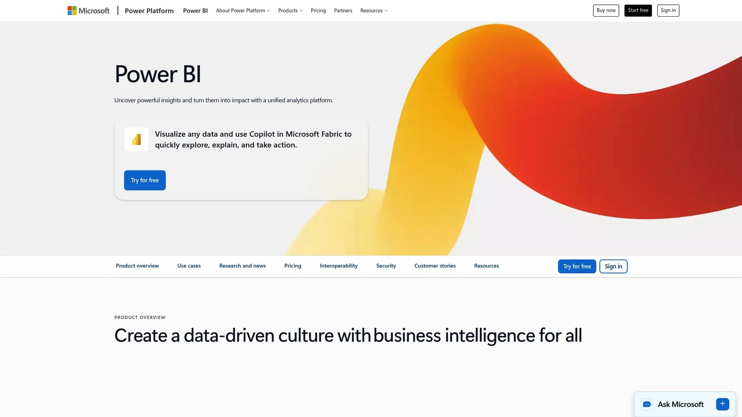
Power BI is Microsoft's business analytics and visualization platform, and the most broadly relevant pick for teams already living in Microsoft 365 or Azure. It builds interactive dashboards, models data, and shares reports across desktop and mobile. If your finance team already exports to Excel, the handoff into Power BI is short.
For a product manager, the appeal is practical. You get recurring metrics visible to the whole org without standing up a heavy analytics function. DAX measures and semantic modeling handle the "one definition of a metric" problem, and Copilot-style AI features help surface insight faster.
Best for: Teams on the Microsoft stack that want broad BI coverage without enterprise complexity upfront.
Key features
- Interactive dashboards across web, desktop, mobile
- Data modeling with DAX measures
- Native Excel and Microsoft 365 integration
- Copilot AI and advanced semantic modeling
- Report sharing and collaboration
Why choose Power BI
It is a strong default when you want wide functionality without committing to an enterprise rollout on day one. The value climbs sharply when your data stack already leans Microsoft, since integration work mostly disappears.
Pricing
Power BI Pro starts at $14 per user per month, and Premium Per User is $24 per user per month. A free trial is available, and embedded and Fabric capacity options are billed by usage.
Power BI holds a 4.5 out of 5 rating on G2.
2. Tableau
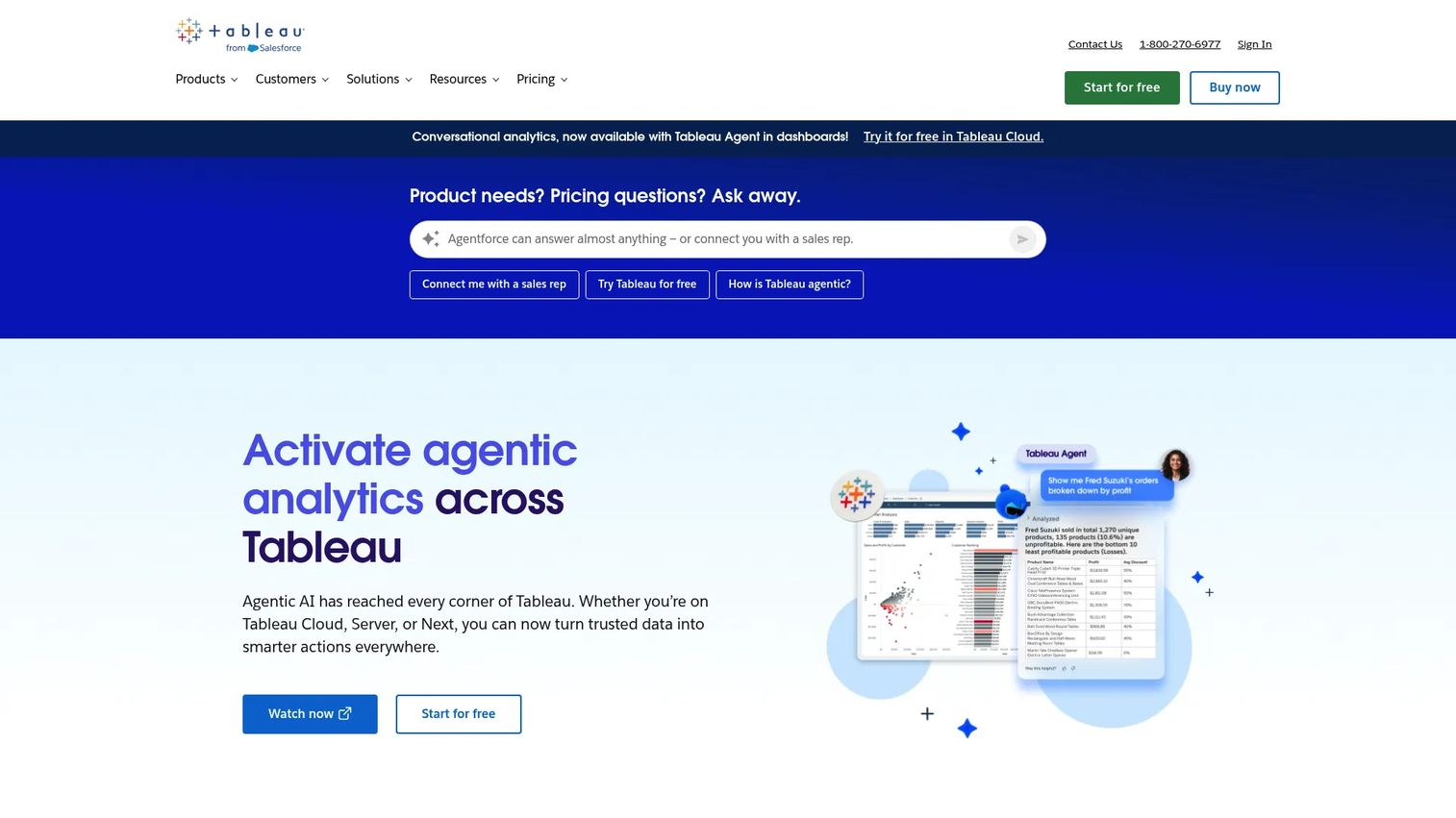
Tableau is Salesforce's visual analytics platform, built for exploration and presentation quality. Drag-and-drop analytics let you build dashboards and stories that hold up in front of an executive audience. The connector ecosystem is broad, and AI-assisted features like Tableau Agent speed up analysis.
Product managers reach for Tableau when the output has to look sharp and the analysis has to go deep. Exploratory work feels fluid, and story points help you walk a stakeholder through a finding step by step rather than dumping a dashboard on them.
Best for: Teams that value presentation polish and deep visual exploration.
Key features
- Drag-and-drop visual analytics
- Interactive dashboards and story points
- Broad connector ecosystem
- Tableau Prep for data shaping
- AI-assisted analytics with smart recommendations
Why choose Tableau
Choose it when visual quality and exploratory depth matter more than being locked into one vendor stack. When many people publish dashboards, pairing it with clear governance keeps metrics consistent across the org.
Pricing
Tableau Standard starts at $15 per user per month, and Enterprise at $35 per user per month, both billed annually. Cloud+ and the Tableau+ Bundle are priced by sales, and a free Tableau Desktop edition exists.
Tableau holds a 4.4 out of 5 rating on G2.
3. Looker
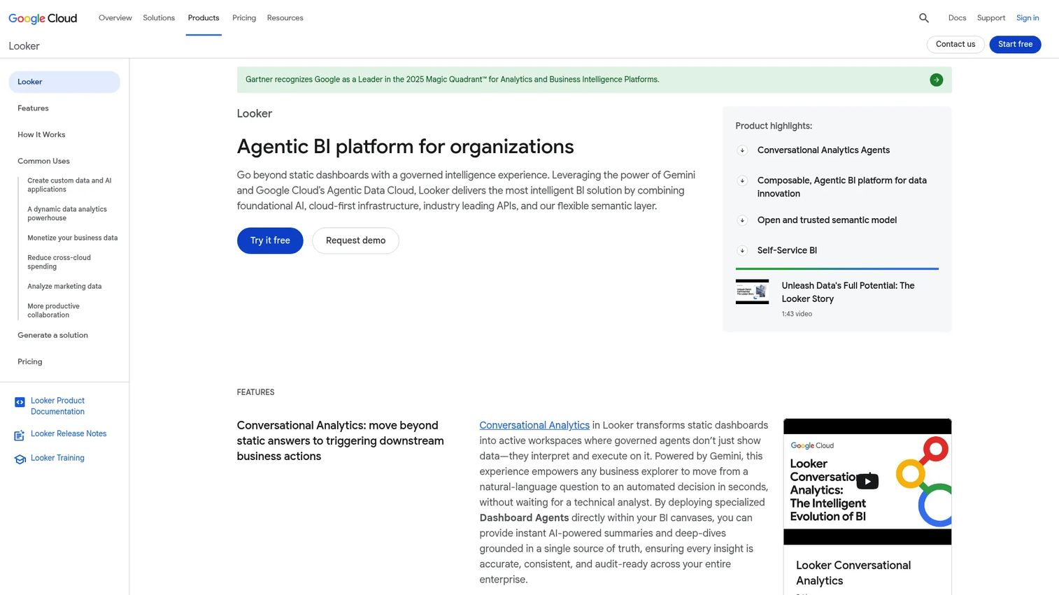
Looker is a BI and embedded analytics platform built around a governed semantic layer. Its modeling language, LookML, lets you define a metric once so everyone downstream pulls the same number. That matters when "active user" means three different things in three different dashboards.
Looker is warehouse-first, so it queries your source of truth directly rather than copying data around. For a product manager, that translates to trustworthy metrics across product and business teams, plus embedded analytics you can push into your own product for customers.
Best for: Teams where one consistent definition of a metric matters more than ad hoc charting.
Key features
- Semantic modeling with LookML
- Governed, consistent metrics
- Self-serve exploration via Explores
- Warehouse-first architecture
- Embedded analytics via SDK and API
Why choose Looker
It is the pick when trust in the number outranks flexibility of the chart. This is less about pretty visuals and more about consistent interpretation that survives across teams and quarters.
Pricing
Looker uses quote-based pricing across its Standard, Enterprise, and Embed editions, each on an annual commitment. You contact sales for the platform and user figures that fit your deployment.
Looker holds a 4.4 out of 5 rating on G2.
4. Microsoft Fabric
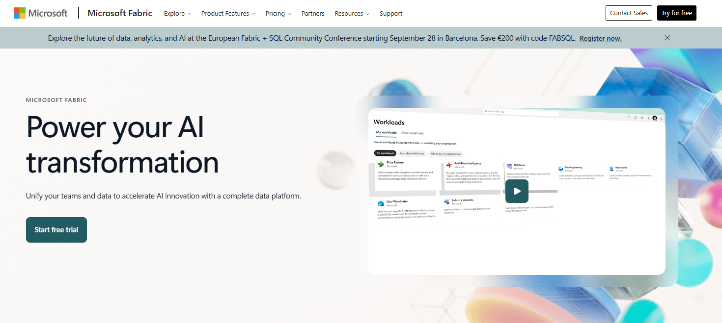
Microsoft Fabric is Microsoft's AI-powered analytics platform that unifies data movement, storage, engineering, and BI in one SaaS environment. Instead of stitching separate tools together, you get OneLake storage and Fabric workloads under a single roof, with Power BI built in for the interpretation layer.
The appeal for product teams is fewer disconnected pieces as the stack grows. When you need data engineering, warehousing, and dashboards to stay connected, Fabric keeps interpretation close to where the data actually lives, with governance and scale built for larger orgs.
Best for: Organizations that want data engineering, warehousing, and BI in one governed platform.
Key features
- Unified compute capacity across workloads
- OneLake storage with shared data access
- Data engineering and warehousing
- Native Power BI integration
- Governance and scale controls
Why choose Microsoft Fabric
Pick it when you want to consolidate the analytics pipeline instead of managing many tools that barely talk. It fits organizations already invested in Microsoft infrastructure, where the integration path is shortest.
Pricing
Fabric capacity is available as pay-as-you-go or reservation, billed by capacity rather than per seat. A free trial is offered, and specific SKU rates depend on the capacity you provision.
Microsoft Fabric holds a 4.7 out of 5 rating on G2.
5. IBM Cognos Analytics
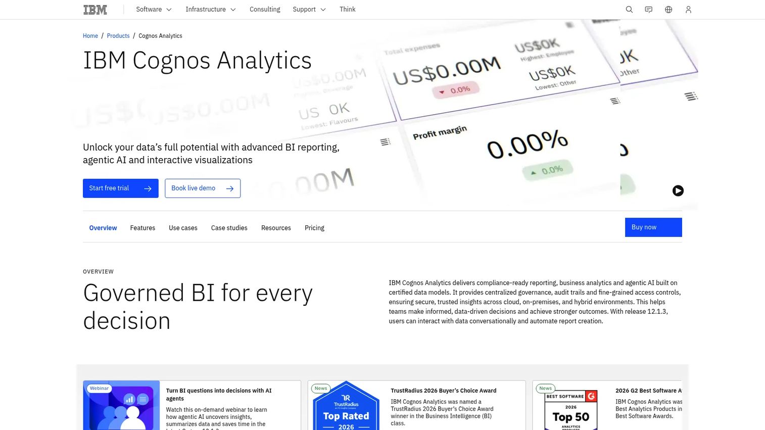
IBM Cognos Analytics is IBM's BI platform built for reporting, dashboards, and governed data exploration at enterprise scale. It handles scheduled report delivery, standardized outputs, and administration controls that large or regulated organizations tend to require.
Product managers in structured environments choose Cognos when consistency and compliance matter more than free-form charting. Scheduled distribution, an AI Assistant for natural-language query, and predictive forecasting cover recurring reporting and formal distribution without one-off manual pulls.
Best for: Enterprises that need governed BI, reporting, and dashboards across complex data.
Key features
- Business reporting with scheduled delivery
- Dashboards and visualizations
- Data exploration and predictive forecasting
- AI Assistant for natural-language query
- Enterprise governance and administration
Why choose IBM Cognos Analytics
It fits structured organizations that need controlled, repeatable reporting rather than open-ended exploration. The strength shows where administration, consistency, and compliance are non-negotiable.
Pricing
Cognos Analytics On Demand Premium starts at $44.90 per user per month. A free trial is available, and other deployment options run through a request-a-quote path.
IBM Cognos Analytics holds a 4.1 out of 5 rating on G2.
6. Qlik Sense
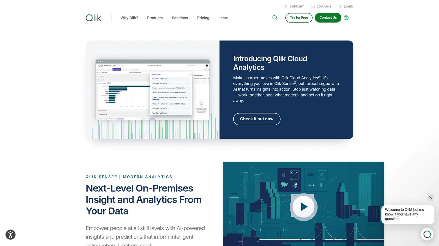
Qlik Sense is an analytics platform built on an associative engine that surfaces relationships traditional filter-first dashboards can miss. Instead of only showing what matches your filter, it also shows what is unrelated, which often reveals a gap you did not think to query.
For product managers who explore without a fixed question, that matters. You move across dimensions and let the data suggest the next turn. Search and conversational analytics, alerting, automation, and built-in data prep round out self-service discovery for business users.
Best for: Organizations that need interactive analytics and guided discovery with strong governance.
Key features
- Associative engine for data discovery
- Self-service visualization and dashboards
- Search and conversational analytics
- Alerting, automation, and reporting
- Data prep and connectivity
Why choose Qlik Sense
It works well when users need to explore patterns without knowing the exact question upfront. The associative model rewards curiosity, which suits early discovery across many dimensions.
Pricing
Qlik Sense client-managed pricing runs through sales rather than a public list price. You contact Qlik to size a plan for your deployment and user count.
A verified current G2 score was not available at the time of writing.
7. Domo
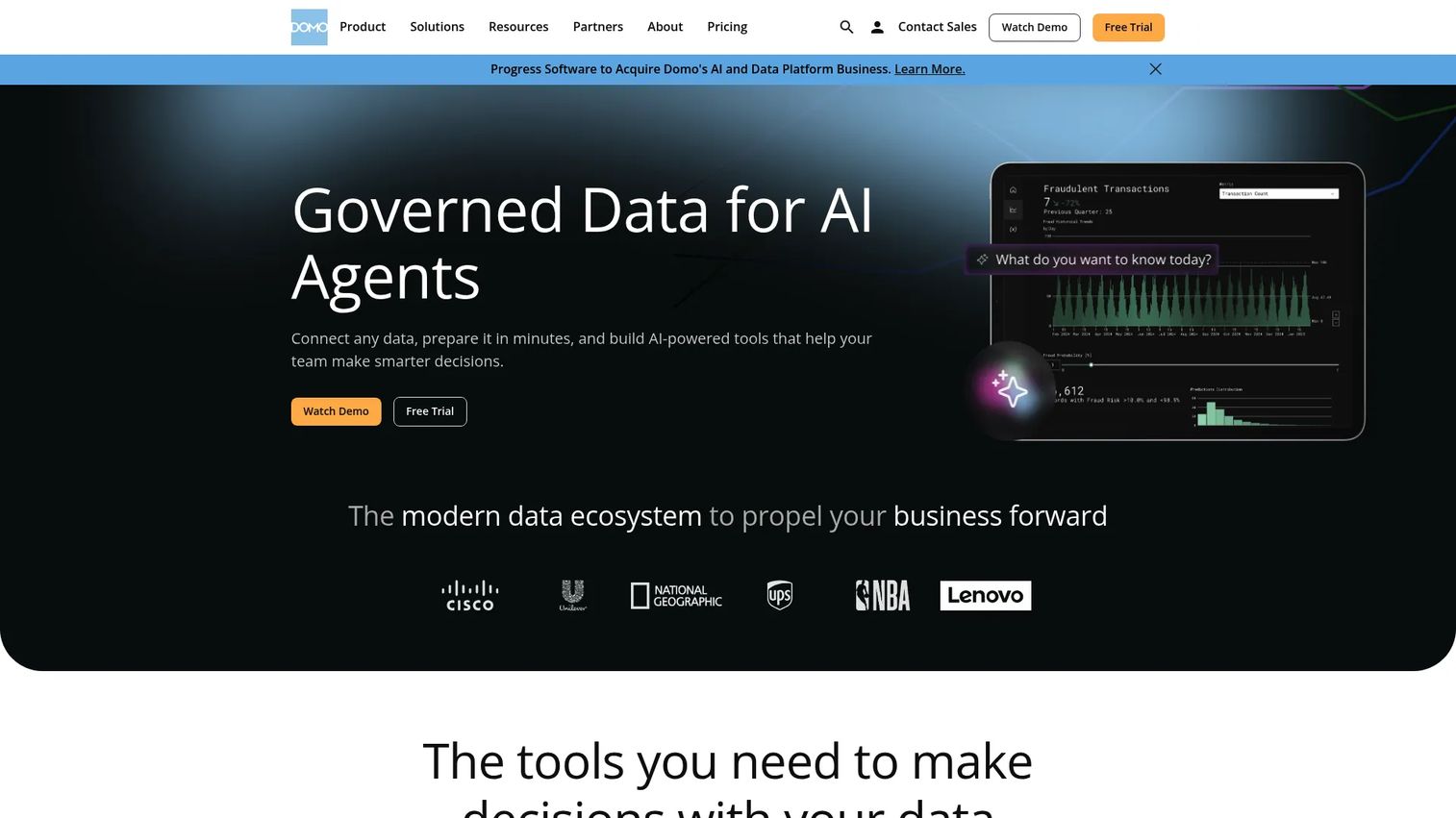
Domo is a cloud-native data and AI platform built for connecting, analyzing, and automating business data across teams. Its strength is operational visibility: live shared dashboards that keep marketing, sales, and ops looking at the same current numbers.
Product managers use Domo when the main job is alignment. Governed shared datasets, a wide set of connectors, plus alerts and workflow automation keep everyone on one operating picture. It leans toward operational reporting and cross-team accessibility rather than deep statistical modeling.
Best for: Organizations that need governed operational dashboards with usage-based pricing.
Key features
- Operational dashboards with live data
- Governed shared datasets
- Wide connector library
- Alerts and workflow automation
- Business-user-friendly views
Why choose Domo
Choose it when keeping teams aligned around current numbers is the priority. It is less about statistical depth and more about a shared, always-current operational view across departments.
Pricing
Domo uses a credit-based consumption model rather than fixed public tiers, so cost tracks usage. A free trial is offered, and you contact sales to size a plan.
Domo holds a 4.3 out of 5 rating on G2.
Considerations
Before you commit, run your shortlist through this checklist. The wrong pick becomes a maintenance burden, not a decision engine.
What data do you need to connect?
Map your sources first: cloud warehouses, production databases, spreadsheets, and manual imports. A tool that connects natively to your warehouse saves a pipeline project. If half your data lives in ad hoc CSV exports, prioritize strong ingestion and shaping over exotic chart types.
How technical is your team?
Be honest about who builds and who consumes. Product managers and business users want drag-and-drop and self-service BI. Analysts want SQL analytics and modeling depth. Data engineers want warehouse-first architecture and version control. The best fit matches the skill mix you actually have, not the one you wish you had.
Do you need governed metrics or ad hoc exploration?
A semantic layer keeps "revenue" meaning one thing everywhere. Flexible charting lets anyone slice freely but invites metric drift. Decide which failure mode hurts more: inconsistent numbers across dashboards, or a bottleneck when every metric routes through one modeler.
How much prep happens before interpretation?
Data prep and cleaning is where most projects stall. Estimate the shaping, transformation, and modeling effort before anyone sees a chart. Tools with built-in prep compress that work; tools that assume clean inputs push it upstream to a pipeline you may not have yet.
Will stakeholders actually use the output?
A dashboard nobody opens is dead weight. Check sharing, exports, embedding, and recurring reporting against how your stakeholders prefer to consume. Governed access controls who sees what, which matters as soon as the audience spans plans, roles, or external customers.
Conclusion
There is no single best tool, only the best fit for your data, your team, and your governance needs.
If you already run Microsoft, Power BI is the default that gets you moving fast, and Microsoft Fabric extends that into a full analytics platform as the stack grows. For visual storytelling and exploration, Tableau leads. When one consistent definition of a metric matters most, Looker's semantic layer earns its place. IBM Cognos Analytics fits enterprise reporting and governance, Qlik Sense rewards open-ended discovery, and Domo keeps cross-team operational dashboards current.
The practical next step: start with the tool that fits your existing stack most natively, then pressure-test it against real prep work and a real stakeholder before you scale it. A short pilot on live data tells you more than any feature list.
Pick the category that matches the job, whether that is business intelligence software, statistical depth, governed reporting, or an all-in-one platform, and the shortlist gets short fast.
Start your journey with Guideflow today!
FAQs
Data analysis software focuses on running queries, calculations, and models over data. Data interpretation software adds the layer that turns those results into meaning and decisions through dashboards, visual narratives, and reporting. In practice most modern platforms do both, but interpretation emphasizes the "so what" over the raw computation.
For non-technical stakeholders, prioritize self-service BI with drag-and-drop building and easy filtering. Power BI and Domo are approachable for business users, and Tableau's visual interface suits people who think in charts. The real test is whether someone can answer their own question without pinging an analyst.
For small, one-off analysis, Excel is often plenty. It breaks down when data grows past a few sheets, when multiple people need consistent metrics, or when you need live dashboards and governed access. At that point business intelligence software pays for itself by removing manual refreshes and version chaos.
For dashboard software and recurring reporting, Power BI covers most teams affordably, especially on Microsoft. IBM Cognos Analytics is strong for scheduled enterprise reporting, and Domo excels at live operational dashboards across departments. Match the choice to whether your reporting is ad hoc or formally scheduled.
Not always. Tools like Power BI and Tableau connect directly to spreadsheets and databases, so you can start without one. Warehouse-first tools like Looker query your warehouse directly and shine once your data is centralized. As volume and source count grow, a warehouse usually becomes worth the effort.
Looker is built for this, since its LookML semantic layer defines each metric once for everyone downstream. Power BI's semantic models and IBM Cognos Analytics governance also enforce consistency well. If inconsistent numbers across dashboards is your main pain, a semantic layer is the fix.
If you need heavy statistical analysis software, dedicated tools like R, Python, or SPSS handle significance testing and complex modeling best. Among the platforms here, Qlik Sense and IBM Cognos Analytics offer forecasting and modeling for common business cases. Choose based on how deep the statistics actually go.
Pick Power BI if you are on the Microsoft stack and want broad, affordable BI. Pick Tableau if visual storytelling and exploratory analysis drive your work. Pick Looker if governed, consistent metrics and embedded analytics matter more than chart flexibility. Stack fit and governance needs usually decide it faster than features.