

How to set border style of a funnel chart in Looker Studio
Here is how to set border style of a funnel chart in looker studio
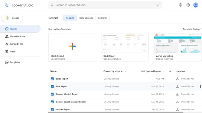
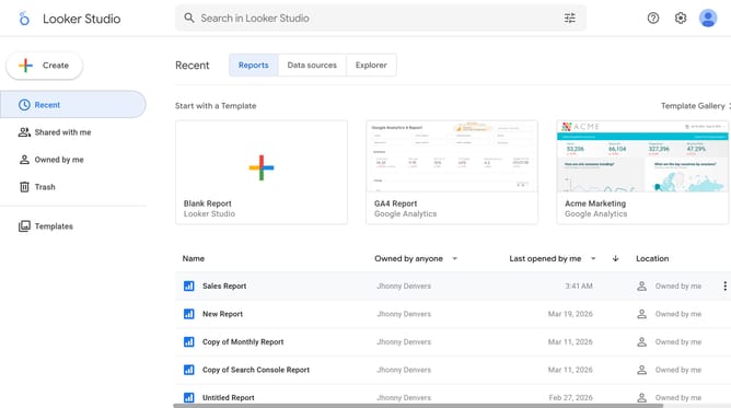
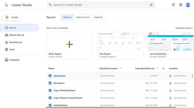
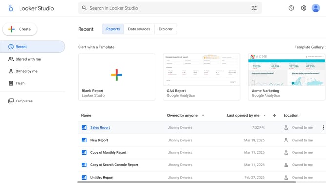
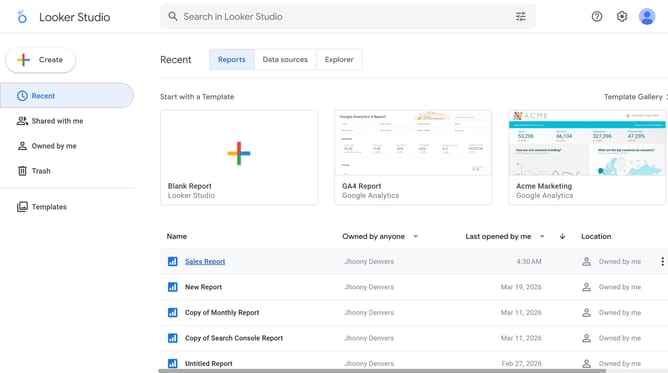
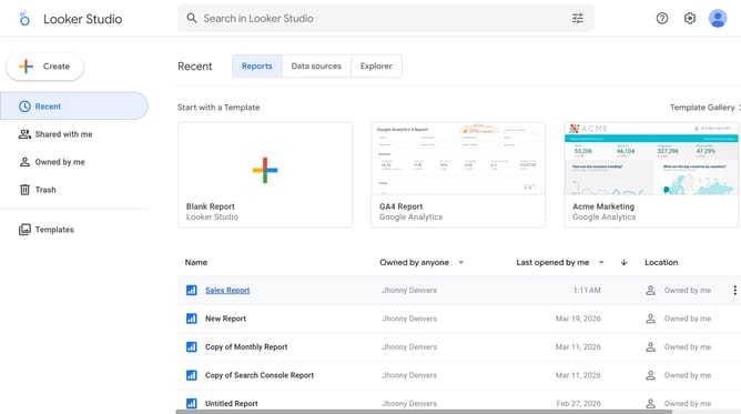
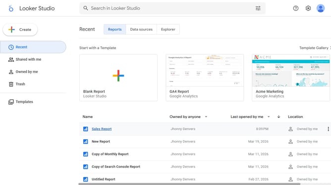
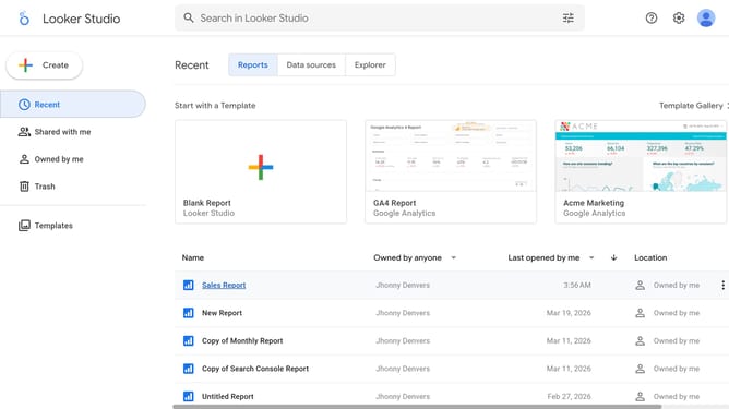
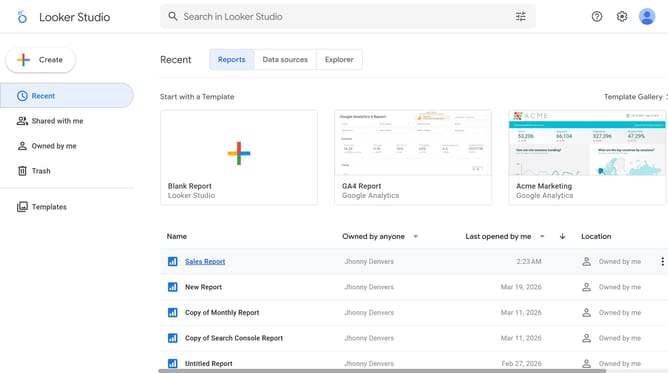
- First click on the file name from the reports list to open it
- Then click on "Edit" button in the top toolbar
- Next click on "Manage pages" option in the page navigation toolbar
- Next click on the page name that you want to manage in the right sidebar
- Next click on the "Show properties" button above the funnel chart
- Finally, click on "Border style" dropdown menu in the Style tab of the right properties panel and select your preferred border style
Why should you set border style of a funnel chart in Looker Studio
Looker Studio is a dynamic platform designed to visualize your data creatively and effectively.
Setting the border style of a funnel chart in Looker Studio helps accentuate data flow, adding clarity to transitions between funnel stages. With customizable borders, your visualizations gain a polished look, enhancing readability and audience understanding.
Ultimately, tweaking the border style enhances communication, directing focus and highlighting key data points, making your presentations not only informative but also visually appealing.
Last update