Create your own interactive guide with Guideflow
How it works
How to make grid responsive in Webflow? Follow these steps:
1. In the left sidebar menu, open the "Add Elements" panel.
2. Then scroll down or use the search bar to locate the "Grid" element.
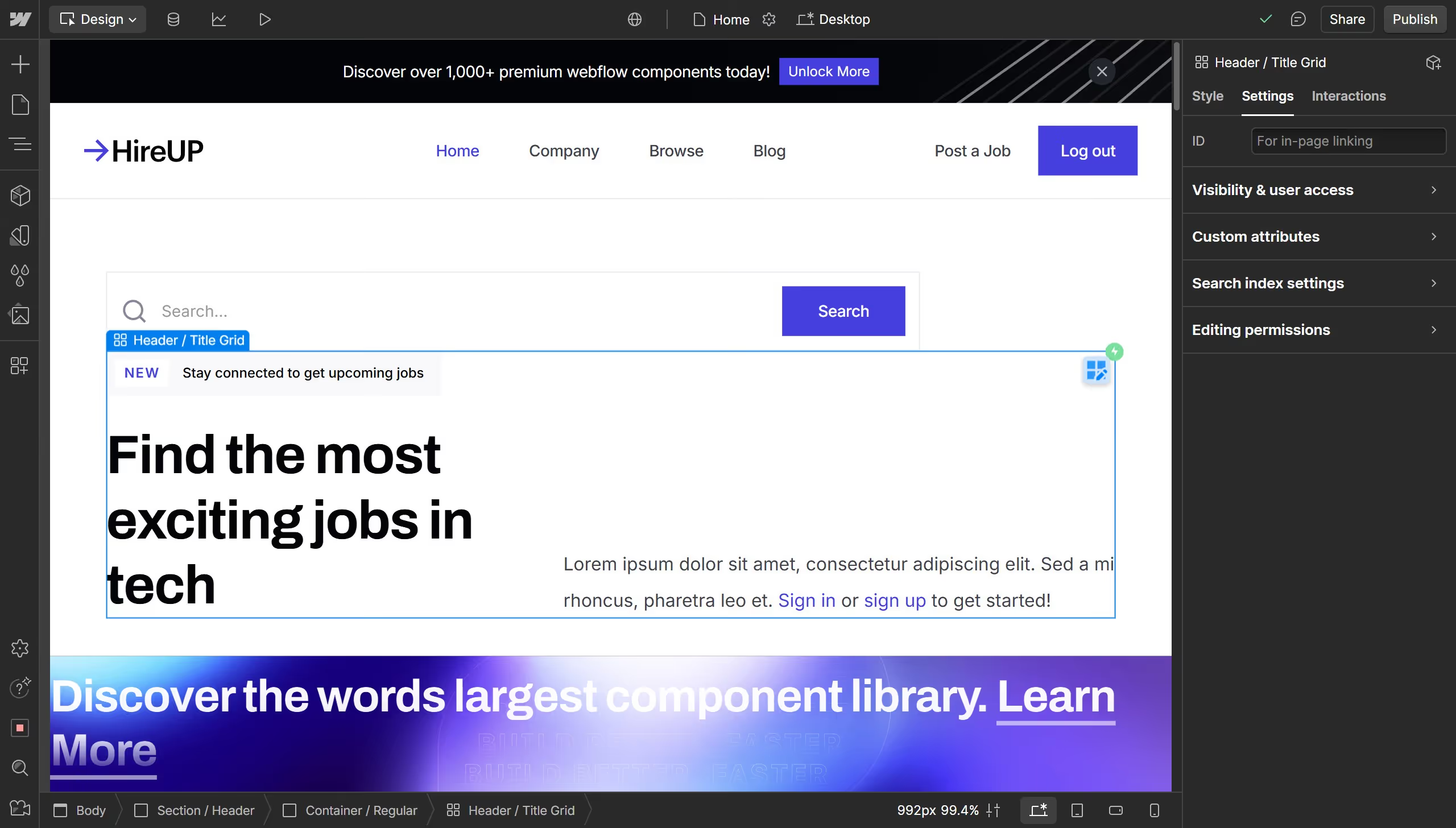
3. Drag and drop the grid to the desired position on your page.
4. Now that your grid is ready, you can add content of your choice, like images or other elements.
5. Select an image from your "assets" to start filling the grid.
6. Use the "Layout" section in the right sidebar to align the content of your grid as needed.
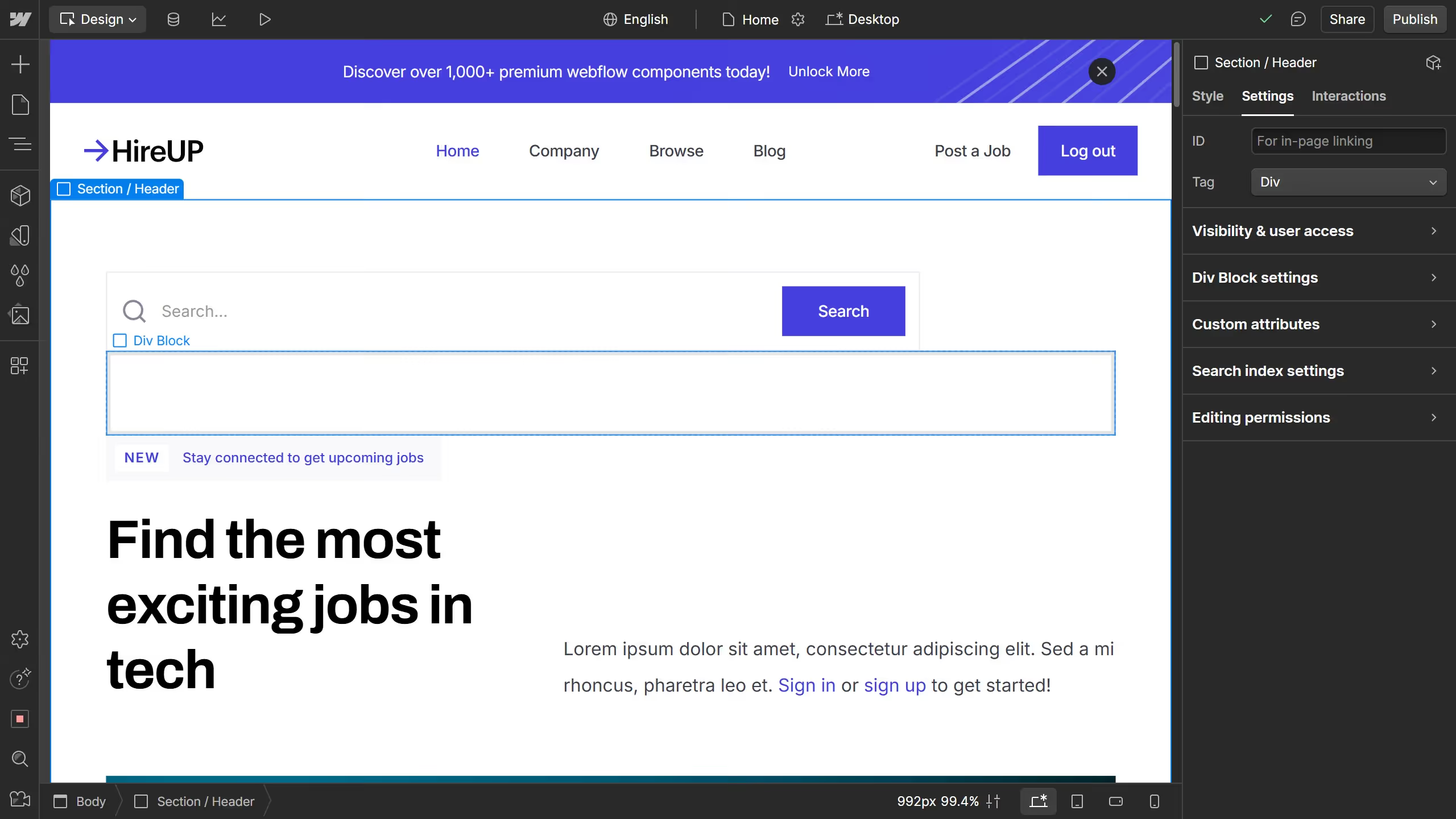
7. In the top navigation, click on empty space near "Sign in" button.
8. Next, preview your page or switch to "mobile" view using the device options at the top of the Webflow editor to test its responsiveness.
9. You can see that the default grid becomes stacked and cluttered on smaller screens.
10. To fix this, select the grid, open the "Layout" section in the designer, and find Grid.
11. Reduce the rows and columns to the lowest, which is 1, creating a single-column layout.
12. Customize the fill direction to control whether new items create rows or columns.
13. Switch back to mobile mode to ensure the grid collapses into a single column on smaller screens.
14. Now your grid is completely responsive and optimized for different screen sizes.
Why should you use this feature?
Webflow is a powerful platform designed to bring your web design vision to life without writing code.
One of its standout features is the ability to make grids responsive effortlessly. This adaptability ensures that your website looks stunning across all devices, from desktops to smartphones, enhancing user experience.
Responsive grids in Webflow adjust automatically to different screen sizes, offering seamless navigation and maintaining aesthetic integrity. By making grids responsive, you guarantee an engaging and professional look for your visitors, no matter on what device they view your site.
Built to impress
Why leading companies build with Guideflow