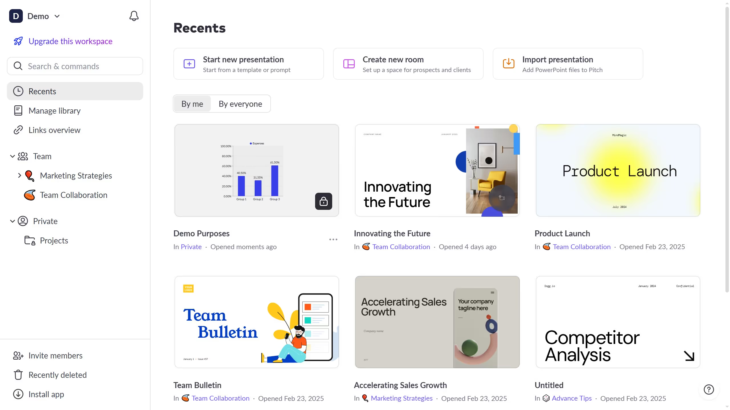
Pitch is a dynamic platform designed to elevate your presentation experience by offering efficient, creative tools.
The feature to hide the category axis in Pitch allows you to create cleaner, more focused visual presentations. Without the distraction of redundant information, your data can communicate key insights more directly.
Utilizing this feature can emphasize storytelling by reducing visual clutter. It streamlines data visualization, drawing attention to critical information seamlessly and fostering audience engagement.


