Pitch is a streamlined platform designed to empower teams by simplifying the creation and sharing of beautiful presentations.
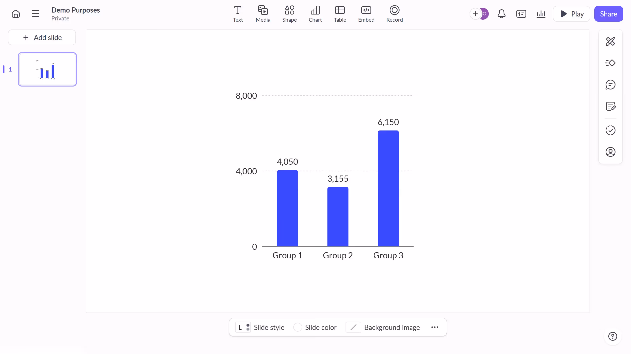
Creating a multi-line chart in Pitch enriches your presentation by allowing a comprehensive view of multiple data sets, making it easier to identify trends and correlations. This feature is particularly useful when you need to demonstrate relationships between different variables over time.
Using a multi-line chart enhances clarity and enables your audience to quickly grasp complex information, fostering better decision-making and understanding.
Additionally, it aids in presenting data-driven insights in an engaging manner, keeping the audience attentive and informed.