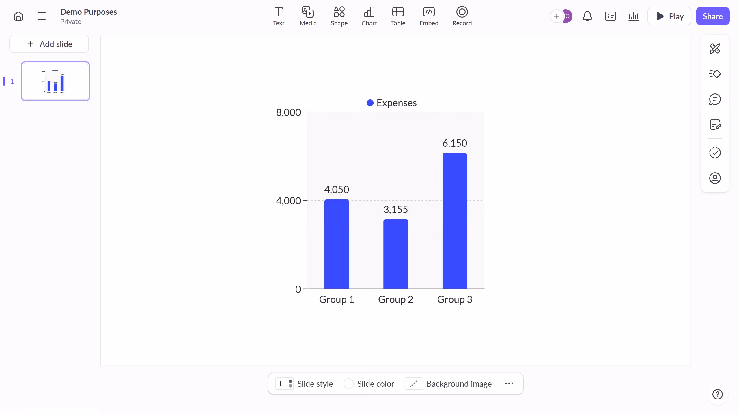
How it works
1. First click the presentation you want to open
2. Then click on the "Chart" icon in the top toolbar
3. Next select the multi-bar chart type from the "Column & bar charts" section
4. Finally customize the chart's colors, labels, and layout as needed
Create your own interactive guide with Guideflow
Why should you use this feature?
Pitch is a collaborative presentation software designed to help teams craft stunning visual stories.
Creating a multi-bar chart in Pitch is a seamless process that enhances clarity and comparison in data presentations.
With its intuitive interface, users can quickly visualize complex data sets, making insights more accessible and compelling.
This feature empowers teams to make data-driven decisions, ensuring that everyone is on the same page with an engaging and impactful presentation.
Built to impress
Why leading companies build with Guideflow


