


Your data is fine. Your chart is not.
You ran the numbers, the analysis holds, and then the visual falls apart. A spreadsheet chart that squashes your error bars. A screenshot that pixelates in the deck. A figure a reviewer sends back because the axes are unlabeled. The bottleneck was never the math. It was the tool between your data and a chart someone can actually read.
The global software market reached $730.7B in 2024, growing at an 11.3% CAGR through 2030, according to Grand View Research (2025). Plotting tools are a small, dense corner of that market, and the gap between a free grapher and a research-grade platform is wide. Pick wrong and you either overpay for stats you never touch or under-buy and hit a wall mid-project. This guide sorts the options so you screen fast and commit once.
What's inside
This guide is for anyone choosing plotting software: Researchers, analysts, students, and operators forwarding a shortlist to a technical team. We covered free, open-source, and paid tools so you can weigh cost against capability without guessing.
We ranked each tool against four criteria that actually decide the purchase:
- Plotting depth: How far past basic line and scatter charts the tool goes.
- Analysis features: Curve fitting, regression, statistics, and peak analysis built in.
- Export quality: Vector and bitmap output that survives a journal or a boardroom.
- Platform and value: Desktop, browser, cross-platform support, and price relative to what you get.
TL;DR
- Best free option: LabPlot for open-source scientific plotting, statistics, and notebook support at zero cost.
- Best scientific workhorse: GraphPad Prism for researchers who need built-in stats plus presentation-ready figures.
- Best cross-platform open-source pick: AlphaPlot for 2D and 3D graphing with scripting control.
- Best for publication workflows: OriginPro for deep analysis and journal-grade output on the desktop.
- Best simple online plotting: Desmos for fast, free, browser-based graphs with a near-zero learning curve.
- Two brand-name mismatches: PLOT (construction logistics) and Plot (AI video social listening) share the keyword but do not do scientific plotting.
What is plot software?
Plot software turns raw data into visual charts, graphs, and scientific plots you can analyze, annotate, and export. It sits between your dataset and the figure that ends up in a paper, a report, or a slide, handling everything from a quick scatter to a fitted regression curve with error bars.
Most scientific graphing software covers a common set of jobs. The depth of each is where the tools separate.
- Chart creation: Line, scatter, bar, box, histogram, contour, and 3D surface plots.
- Curve fitting: Linear and nonlinear regression, peak fitting, and model comparison.
- Data import and export: CSV, ASCII, Excel, and direct database or notebook connections.
- Statistics: Descriptive stats, hypothesis tests, ANOVA, and distribution analysis.
- Annotation: Labels, legends, callouts, and math notation on the figure itself.
- Publication export: Vector formats (SVG, PDF, EPS) and high-resolution bitmaps for print.
The category splits along two lines. Free and open-source plotting software (LabPlot, AlphaPlot) gives you scientific data analysis software capability at no license cost, which suits students, labs on tight budgets, and anyone who wants to inspect the code. Paid tools (OriginPro, GraphPad Prism) bundle deeper statistics, validated methods, and support, which matters when a figure has to survive peer review or an audit. Browser-based tools like Desmos serve fast, casual graphing where speed beats rigor.
The right pick depends on the kind of plotting you actually do, not the longest feature list. A biologist running dose-response curves needs different software than a founder pasting a retention chart into a board deck.
When to use plot software
Visualize experimental data
Reach for a plotting tool when a spreadsheet chart stops telling the truth. Line charts with error bars, scatter plots with grouped series, and box plots for distributions all need software that respects the underlying data. Research and lab workflows depend on this daily. The moment you have replicates, uncertainty, or multiple conditions, a purpose-built grapher beats a generic one.
Fit curves and test relationships
Use plot software when the goal is analysis, not just a picture. Regression tells you whether a relationship holds. Curve fitting extracts parameters from noisy data. Peak fitting separates overlapping signals in spectroscopy or chromatography. Tools with built-in statistics let you run the test and plot the result in one place, instead of exporting numbers to a second app.
Publish figures or share results
Turn to dedicated software when the output has to look professional. A journal wants vector figures at a set resolution. A report needs clean axes and consistent fonts. A board update needs a chart that reads in three seconds. Export quality is where free tools and paid tools often diverge, so match the tool to where the figure will live.
Comparison table
This table lets you screen all seven tools in one pass. Scan the "best for" and pricing columns first, then read the two item sections that fit your situation. Pricing and ratings below were verified against vendor pages and G2 listings at the time of writing.
| # | Product | Best for | Key differentiator | Pricing | G2 rating |
|---|---|---|---|---|---|
| 1 | LabPlot | Free scientific plotting and analysis | Open-source graphing with notebook support | Free | Not listed |
| 2 | AlphaPlot | Open-source 2D/3D graphing with scripting | GPL-licensed plotting with automation | Free | Not listed |
| 3 | OriginPro | Publication-grade desktop analysis | Deep curve fitting and signal processing | From $310/year | 4.7/5 |
| 4 | GraphPad Prism | Research stats plus graphs | Statistics built for biomedical work | From $50/month | 4.6/5 |
| 5 | Desmos | Fast browser-based graphing | Free interactive math and graphing | Free | 4.4/5 |
| 6 | PLOT | Construction logistics (not plotting) | Jobsite delivery and procurement scheduling | Free module plus custom | Not listed |
| 7 | Plot | AI video social listening (not plotting) | Social video intelligence and UGC tracking | From $10/month | 4.8/5 |
Best plot software for 2026
1. LabPlot
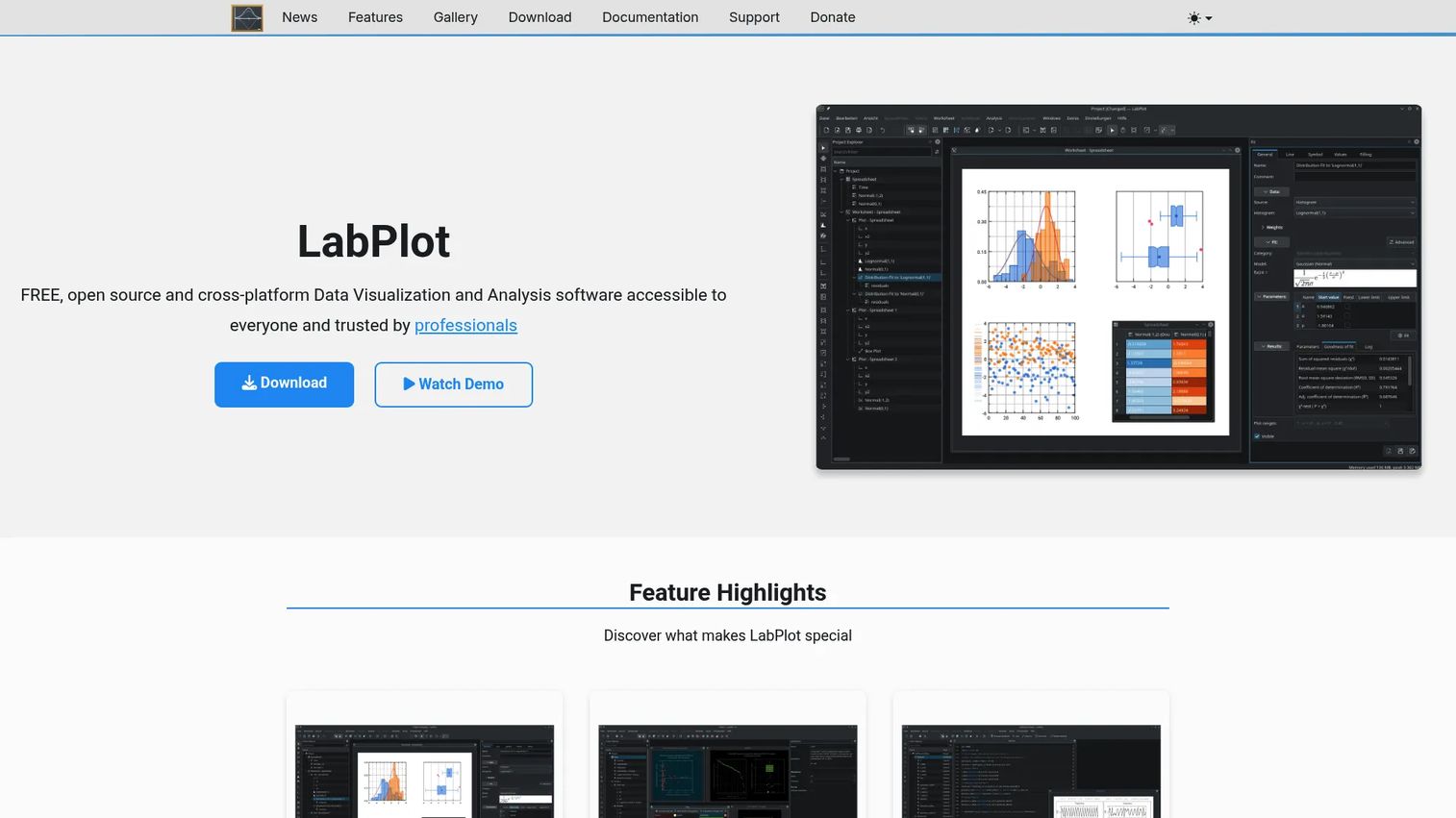
LabPlot is free, open-source, cross-platform software for data visualization and analysis, maintained by the KDE community. It handles interactive 2D plotting, statistics, regression, and curve fitting, then pairs that with computational notebooks that run Python, R, Julia, and other languages. For a lab that wants scientific data analysis software without a license line on the budget, it covers a lot of ground.
Best for: Researchers and students who want full scientific plotting and analysis at zero cost.
Key features
- Interactive 2D plotting and data visualization
- Statistics, regression, curve fitting, and peak fitting
- Computational notebooks: Python, R, Julia
- Cross-platform: Windows, macOS, Linux
- Open-source under a free license
Why choose LabPlot: Choose it when budget is tight and you still need real analysis, not a toy grapher. The open-source model also means you can inspect and extend it, which matters for reproducible research.
LabPlot pricing: LabPlot is free to download and use, funded by community donations. There is no paid tier.
LabPlot does not carry a verified G2 rating, which reflects its open-source, community-driven distribution rather than a commercial listing.
2. AlphaPlot
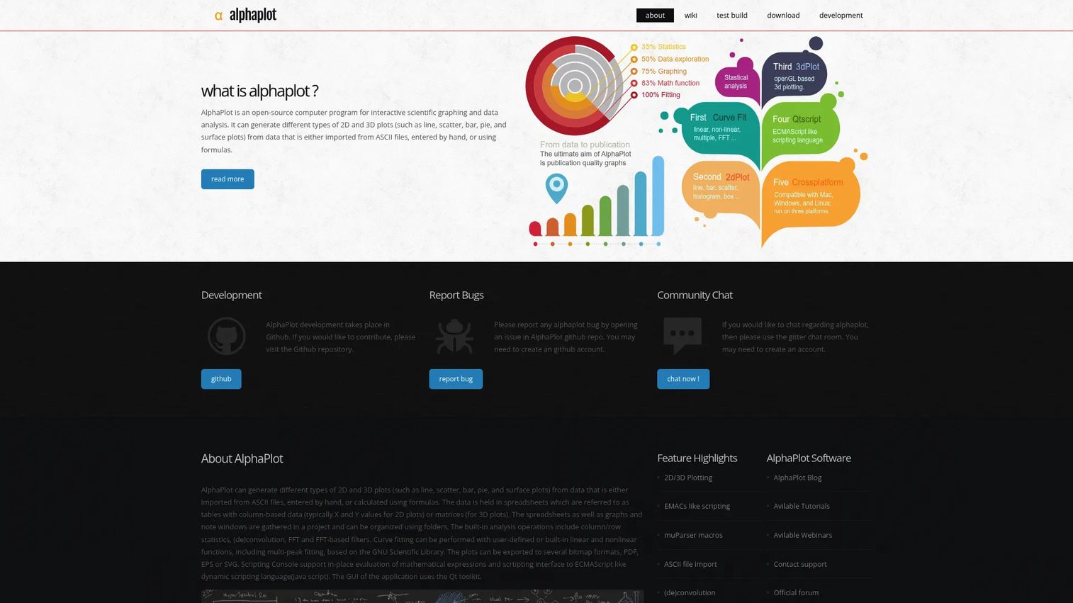
AlphaPlot is open-source, cross-platform software for 2D and 3D plotting, data analysis, and graph visualization. It imports ASCII files, runs FFT and convolution, and handles multi-peak fitting. Because it is GPL-licensed with scripting support, technical users who want to automate repetitive plotting reach for it over point-and-click-only tools.
Best for: Researchers and technical users who want free scientific graphing with scripting control.
Key features
- 2D and 3D plotting
- ASCII file import
- FFT, convolution, multi-peak fitting
- Scripting for automation
- GPL-licensed, cross-platform
Why choose AlphaPlot: Pick it when you want repeatable plots generated from scripts rather than rebuilt by hand each run. It suits users comfortable enough with code to trade a polished UI for automation.
AlphaPlot pricing: AlphaPlot is free and open source under the GPL. No paid plan exists.
No verified G2 rating exists for AlphaPlot, consistent with its distribution through an open-source project page rather than a commercial marketplace.
3. OriginPro
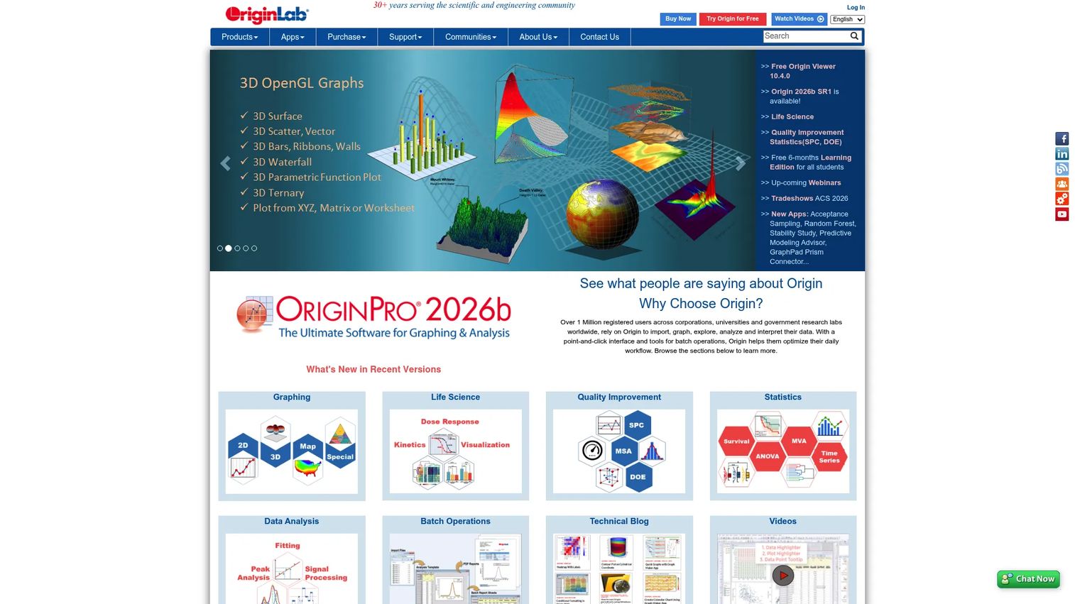
OriginPro is scientific data analysis and graphing software that extends the base Origin product with heavier analysis tools. It delivers publication-quality graphing, advanced curve fitting, statistics, and signal and image handling. Analysts and engineers who outgrow free tools and need validated, repeatable analysis on the desktop tend to land here.
Best for: Researchers and engineers who need robust scientific graphing plus deep data analysis.
Key features
- Publication-quality graphing
- Advanced curve fitting and statistics
- Signal processing and image handling
- Batch analysis and templates
- Broad import and export formats
Why choose OriginPro: Choose it when free tools stop covering your analysis and you need depth in curve fitting or signal processing. The trade-off is a desktop license cost that casual users will not justify.
OriginPro pricing: OriginPro 2026b starts at $310 per year for an annual subscription, with a 3-year option at $837 and a node-locked download at $980. A 10-seat annual plan runs $2,480. Pricing shown reflects the academic store.
On G2, OriginPro holds a 4.7 out of 5 rating.
4. GraphPad Prism
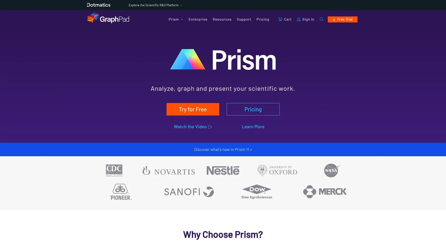
GraphPad Prism is scientific graphing and statistical analysis software built for research, especially biomedical and life-sciences work. It combines statistical analysis, data visualization, and curve fitting so you run the test and produce the figure in one place. For teams that need graphs and stats without stitching two tools together, it is a common default.
Best for: Researchers who need publication-ready graphs plus built-in statistical analysis.
Key features
- Comprehensive statistical analysis
- Graphing and data visualization
- Curve fitting and regression
- Guided analysis workflows
- Publication-ready figure export
Why choose GraphPad Prism: Choose it when statistics and plotting have to live in the same tool and correctness matters for peer review. It is purpose-built for research teams rather than general charting.
GraphPad Prism pricing: Prism starts at $50 per month, with an annual academic plan at $260 and annual corporate at $520. Perpetual licenses run $1,600 (academic) and $3,200 (corporate). A free trial is available; there is no free tier.
Prism carries a 4.6 out of 5 rating on G2.
5. Desmos
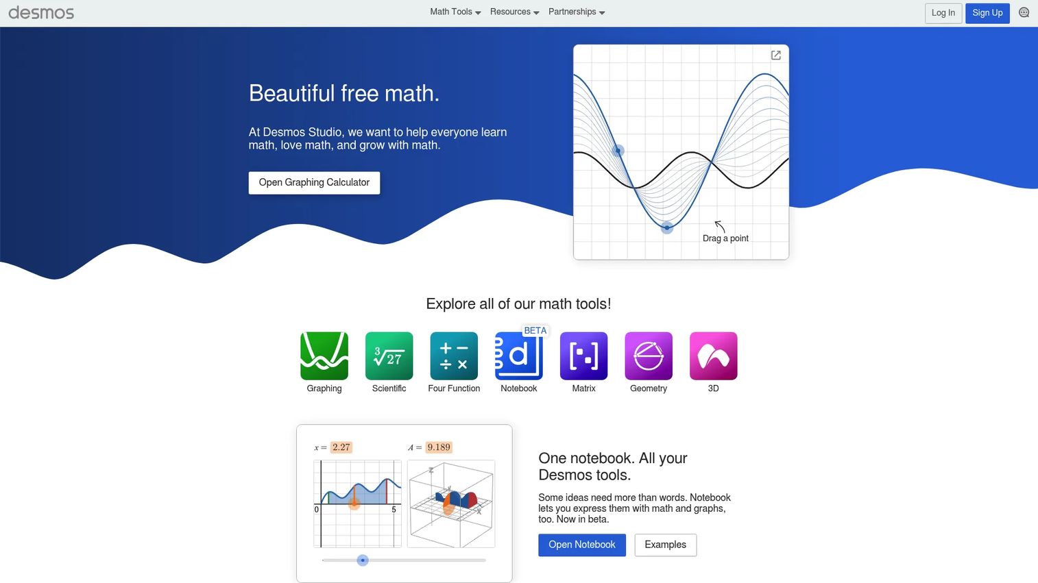
Desmos is a free math platform with graphing, geometry, scientific, 3D, and notebook tools that run in the browser. It loads fast, needs no install, and lets you plot functions and data in seconds. Students, teachers, and anyone who wants a quick, accessible graph reach for it before opening a heavier desktop tool.
Best for: Students, teachers, and anyone needing fast, free interactive graphing in a browser.
Key features
- Browser-based graphing calculator
- Geometry and 3D tools
- Notebook for math work
- No install required
- Free to use
Why choose Desmos: Choose it for speed and accessibility when the task is a clean graph, not a fitted model. It trades the deep curve fitting and statistics of research tools for a near-zero learning curve.
Desmos pricing: Desmos is free for its core graphing and math tools. Enterprise API access is quoted on request.
On G2, Desmos holds a 4.4 out of 5 rating.
6. PLOT
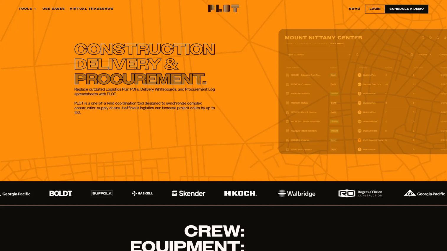
PLOT is construction logistics management software for general contractors, not a graphing tool. It synchronizes CPM schedules to material timing, runs a shared delivery calendar, and links procurement to submittals. It shares the keyword "plot" but solves jobsite coordination, so include it here only so you do not confuse it with scientific plotting software.
Best for: General contractors coordinating jobsite logistics, procurement, and delivery timing.
Key features
- CPM schedule synchronization
- Shared delivery calendar
- Procurement scheduling
- Submittal and schedule links
- Delivery logistics coordination
Why choose PLOT: Choose it only if your problem is construction delivery scheduling, not data visualization. For anyone searching plotting software, this is a name clash rather than a candidate.
PLOT pricing: The Logistics module is free to use. Deliveries and Lead Times are custom-priced on contract value, with a bundled option offered at a discount.
No verified G2 rating was available for PLOT at the time of writing.
7. Plot

Plot is an AI video social listening platform, again not a graphing tool. It reads audio, visuals, and captions in social video, tracks tagged and untagged brand mentions, and supports creator sourcing and sentiment analysis. It matches the search term but serves marketing teams monitoring social video, so treat this entry as a mismatch flag.
Best for: Marketing teams tracking social video content, brand mentions, and UGC.
Key features
- AI reads audio, visuals, captions
- Tagged and untagged mention tracking
- Creator sourcing
- Custom reporting
- Sentiment and brand-safety analysis
Why choose Plot: Choose it if you need social video intelligence, not data plotting. It has no role in a scientific graphing shortlist beyond the name.
Plot pricing: Plot lists a Premium plan at $10 per month, with a free trial. The vendor's pricing page also points enterprise buyers to sales.
Plot holds a 4.8 out of 5 rating on G2.
Considerations
Before you commit, run the shortlist through five checks. This is where a screening pass saves you a wasted migration later.
Plotting depth
Confirm the tool goes past line and scatter charts if your work needs it. Contour plots, 3D surfaces, grouped box plots, and error bars separate research graphers from basic calculators. Match the depth to the plots you actually produce, not the ones you might.
Analysis features
Check what statistics and fitting ship in the box. Curve fitting, regression, peak analysis, and hypothesis tests matter if you analyze inside the tool. GraphPad Prism and OriginPro lead here; free tools like LabPlot cover the core well.
Export and publication quality
Verify the output formats against where the figure lands. Journals want vector files (SVG, PDF, EPS); decks and reports need clean high-resolution bitmaps. A tool that only exports low-res PNG will bottleneck a publication workflow.
Platform and workflow fit
Decide between desktop and browser before price. Desktop tools (OriginPro, Prism) run heavier analysis locally; browser tools (Desmos) win on speed and access. Cross-platform open-source options (LabPlot, AlphaPlot) fit mixed Windows, macOS, and Linux teams.
Price versus capability
Weigh cost against the analysis you will use. Free and open-source tools remove the license question entirely. Paid tools earn their price when validated stats, support, and depth reduce risk on work that has to hold up.
Conclusion
Match the tool to the plotting you actually do, not the longest feature list.
Choose LabPlot if you want free, open-source scientific plotting with real analysis and notebook support behind it. Choose AlphaPlot if you want the same open-source freedom with scripting control for automated, repeatable plots. Both cost nothing and run across platforms.
Choose OriginPro or GraphPad Prism when the analysis gets heavy and the figure has to survive peer review. Prism leans toward research statistics paired with graphs; OriginPro leans toward deep curve fitting and signal processing on the desktop. Both cost money, and both earn it when correctness and depth matter.
Choose Desmos when you want a fast, free browser graph and speed beats rigor. Skip PLOT and Plot entirely for this job; they share the name but solve construction logistics and social video, not data plotting.
Your next step is simple. Pick the two tools from your quadrant, free versus paid, and test them on one real dataset this week. A first win on live data tells you more than any spec sheet.
Start your journey with Guideflow today!
FAQs
LabPlot is the strongest free plot software for scientific work, combining 2D plotting, statistics, curve fitting, and computational notebooks at no cost. AlphaPlot is a close second if you want scripting and 3D graphing. Both are open-source and run on Windows, macOS, and Linux.
Desmos is the easiest to start with because it runs in the browser, needs no install, and plots functions and data in seconds. It suits beginners and quick graphing tasks. For beginners who need statistics too, GraphPad Prism offers guided analysis workflows.
Researchers commonly use GraphPad Prism and OriginPro for scientific graphing and analysis. Prism is popular in biomedical and life-sciences work for combining statistics with figures. OriginPro suits engineers and analysts who need advanced curve fitting and signal processing.
Yes. GraphPad Prism and OriginPro both include comprehensive statistics, regression, and curve fitting alongside graphing. Free open-source tools like LabPlot also handle regression, curve fitting, and peak fitting. Basic browser tools like Desmos focus on graphing rather than deep statistical analysis.
LabPlot and AlphaPlot are the leading open-source plot software options. LabPlot offers a broader analysis suite with notebook support for Python, R, and Julia. AlphaPlot focuses on 2D and 3D plotting with scripting and multi-peak fitting.
OriginPro and GraphPad Prism both export publication-quality figures suited to journals and reports. Look for vector formats like SVG, PDF, and EPS, which scale without pixelation. LabPlot also exports high-quality graphics for research use at no cost.
Browser tools like Desmos are excellent for fast, accessible graphing and teaching. For serious scientific work with heavy statistics, large datasets, or validated curve fitting, desktop tools like OriginPro or GraphPad Prism are the safer choice. Match the tool to the rigor the output demands.