


New users sign up, land on a blank dashboard, and stall. They do not know what to click first. Your docs sit in a separate tab that nobody opens. Your CS team fields the same five "how do I" questions all week. And every UI change quietly breaks whatever onboarding you shipped last quarter.
That gap between signup and first value is expensive. The global in-app guidance software market hit $3.2 billion in 2025 and is projected to reach $10.8 billion by 2034, a 17.8% CAGR, according to MarketIntelo (2025). Teams are pouring money into this problem because static help content does not move activation.
In-app tutorial software closes that gap by putting guidance inside the product, at the moment the user needs it. But the category is a taxonomy, not a single thing. Walkthroughs, tooltips, checklists, and smart tips each solve a different slice of the onboarding problem. Choosing well means matching the format to the job, not the vendor to the hype. If your job is showing a product experience rather than nudging inside one, an interactive demo built with a tool like Guideflow covers that surface, and you can capture a flow, personalize it, and analyze engagement without engineering time.
What's inside
This guide is for product managers, onboarding owners, and SaaS operators comparing in app tutorial software for 2026. It covers the four core formats you will actually evaluate, a side-by-side comparison table, and a PM-focused buyer's checklist.
We selected and ranked formats based on:
- Segmentation: can you target by persona, role, plan, or lifecycle stage
- Trigger control: event-based and behavior-based logic, not just first-run
- Analytics: completion, drop-off, and activation impact you can measure
- Maintenance: how much it costs to keep current as the product changes
TL;DR
- Best for feature adoption: Walkthroughs, because guided step sequences push users through the exact flow you want adopted.
- Best for lightweight implementation: Tooltips, the simplest format to add contextual help without a big build.
- Best for analytics and experimentation: Smart tips, since behavior-triggered logic pairs naturally with event tracking and A/B tests.
- Best for teams fighting onboarding rot: Checklists, which stay accurate longer because they track milestones, not fragile UI positions.
What is in app tutorial software
In app tutorial software is embedded, in-product guidance that helps users complete tasks, discover features, and reach first value without leaving the interface. It replaces the "read the docs, watch a video, book a call" loop with contextual help delivered inside the app itself.
The category is really a set of formats. Each does a different job, and most mature onboarding stacks combine several:
- Walkthroughs: guided, step-by-step sequences that lead a user through a multi-step task or feature
- Tooltips: small contextual pop-ups that explain a single UI element on hover, click, or focus
- Checklists: milestone lists that track progress toward activation across multiple sessions
- Smart tips: behavior-triggered messages that appear based on what a user does or fails to do
The distinction that matters most: some formats interrupt (walkthroughs), some wait to be invited (checklists), and some react to behavior (smart tips). Good in app onboarding software gives you control over which, when, and for whom. This is where in app guidance overlaps with adjacent formats like the interactive demo, the sandbox, and the demo center, each of which lets users experience a product through capture-based flows rather than live in-app overlays.
When to use in app tutorial software
Onboard new users without live calls
Most trial users will not book a call. They want to reach a first success moment on their own, at their own pace. An in app walkthrough gets them from signup to that moment without waiting on CS. This is the core self-serve onboarding job, and it directly moves activation rate and time to first value.
Introduce new features without rework
Your UI changes. Launches need adoption. When you ship a feature, in-product guidance points existing users to it in context, right where they already work. Smart tips and tooltips work well here because they attach to the new element and trigger on the relevant screen, not on a separate announcement email nobody reads.
Reduce support tickets for repetitive questions
If your CS queue is full of the same "where is X" and "how do I Y" questions, that is a self-serve gap. In app guidance lets users answer those questions inside the product, which drives support deflection. Fewer repetitive tickets means agents spend time on real problems instead of re-explaining the same step.
Comparison table
Here is how the four formats compare on the criteria PMs actually weigh. Ratings and pricing reflect verified vendor and G2 data where a canonical product exists for the format; several of these are format categories rather than single products, so pricing is shown per representative tool.
| # | Product | Best for | Key differentiator | Pricing | G2 rating |
|---|---|---|---|---|---|
| 1 | Walkthroughs | Guided step-based feature adoption | Sequenced, task-completion learning | Free plan; team plans from $10/mo per user | Not listed |
| 2 | Tooltips | Low-friction contextual help | In-browser editor across many formats | PRO $249/mo; Enterprise custom | Not listed |
| 3 | User checklists | Milestone-driven activation | Cross-session progress visibility | Free plan; Pro from 5 €/mo | 4.7/5 |
| 4 | Smart tips | Behavior-triggered personalization | Event-based, context-aware logic | Free informational resource | Not listed |
Best 4 in app tutorial software for 2026
1. Walkthroughs
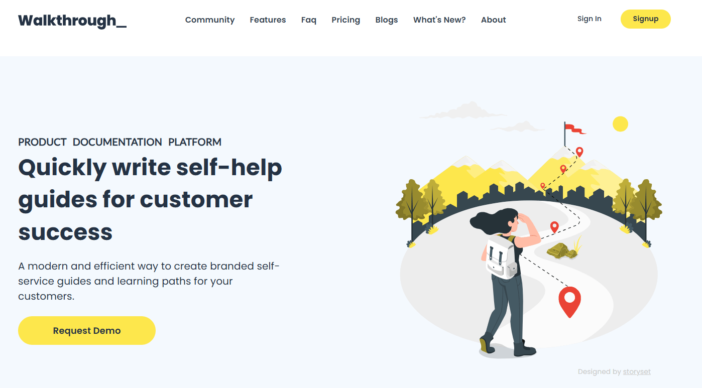
Walkthroughs are guided, step-by-step sequences that lead a user through a specific multi-step task inside your product. Instead of explaining a flow in a doc, a walkthrough shows it in the live UI, advancing the user one action at a time until the task is done. Tools built around walkthroughs, like Walkthrough, let teams publish branded, self-service guides that read like a hands-on lesson rather than a page of text.
For a PM, walkthroughs earn their place when you have a critical activation path that users keep abandoning. A structured sequence removes the "what next" hesitation that kills completion. They are the strongest single format for feature adoption because they do not just describe the flow, they push the user through it.
Best for: Product teams driving adoption of a specific, multi-step workflow that users struggle to complete alone.
Key strengths
- WYSIWYG editor for rich interactive walkthroughs
- Public and private sharing with custom subdomains
- SEO-optimized guides for discoverability
- Privacy-friendly analytics and GitHub versioning
Why choose walkthroughs: Choose walkthroughs over tooltip-only guidance when the job is completion of a real task, not just labeling the UI. They fit teams that want users to finish a flow, not browse hints. Lighter formats layer on top once the core path is solid.
Walkthroughs pricing: Walkthrough offers a free plan with up to 10 public walkthroughs, the WYSIWYG editor, aggregate metrics, and SEO optimizations. The Team plan is $10/mo per user and adds unlimited walkthroughs, a custom subdomain, custom branding, team collaboration, detailed insights, and GitHub backup.
2. Tooltips
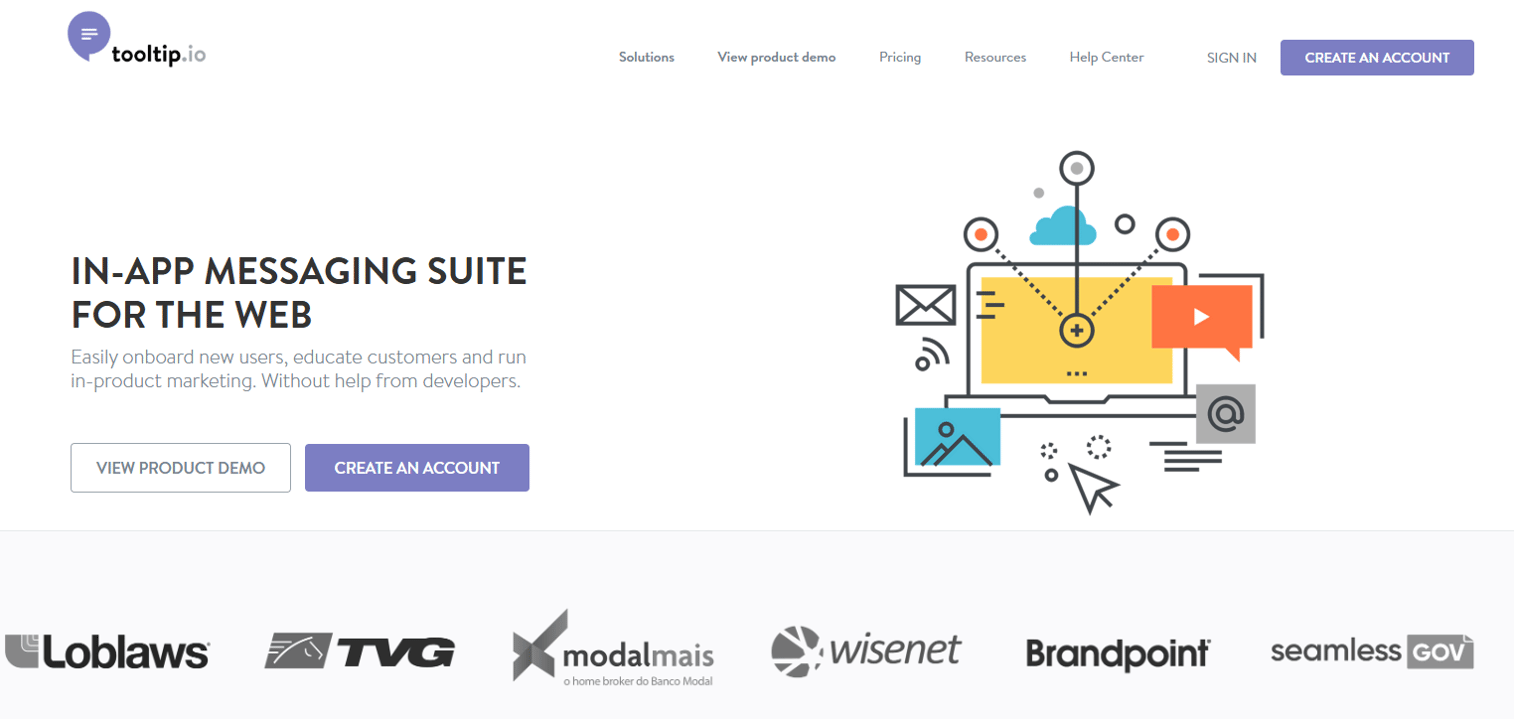
Tooltips are small contextual pop-ups that explain a single UI element when a user hovers, clicks, or focuses on it. They are the lightest-touch format in the category, and the fastest to ship. A tool like Tooltips provides an in-browser editor to attach messages, hints, and micro-guidance to specific elements without heavy developer involvement.
The value of tooltips is progressive disclosure. You reveal help exactly where confusion happens, and nowhere else. For PMs, this keeps the interface clean while still answering the question a user has at the moment they have it. Tooltips shine at labeling non-obvious controls, clarifying jargon, and nudging users toward a next action.
Best for: Teams that want contextual, low-friction assistance layered onto specific UI elements without a large build.
Key strengths
- In-browser campaign editor
- Multiple formats: tooltips, popups, bars, banners, slideouts
- Triggers and segmentation
- Analytics and export
Why choose tooltips: Tooltips are the right start when confusion is localized to specific controls rather than a whole flow. They pair well with walkthroughs: walkthroughs complete tasks, and tooltips answer the small in-the-moment questions those larger formats leave open.
Tooltips pricing: Tooltips (tooltip.io) offers a 14-day free trial. The PRO plan is $249/month. Enterprise pricing is available through sales.
3. User checklists
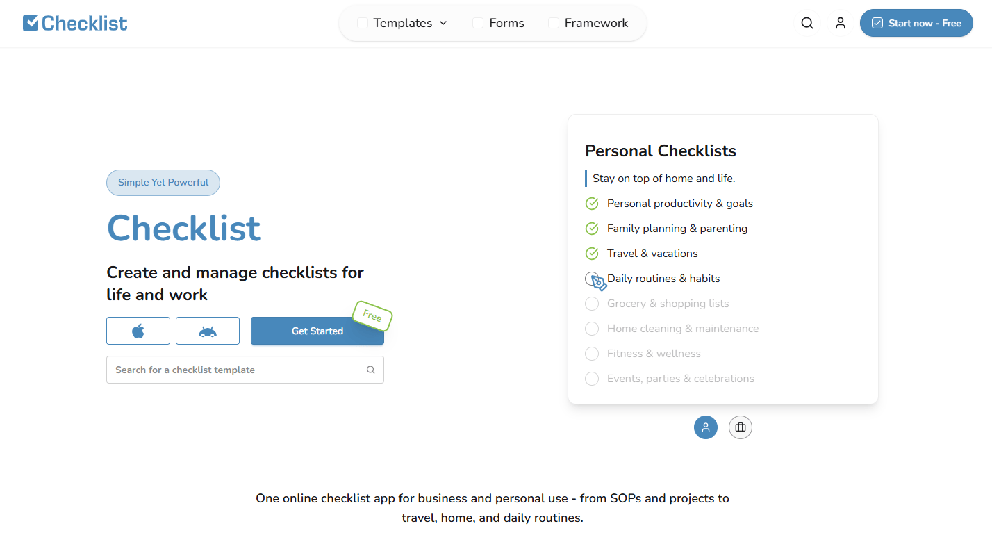
Checklists work because they turn a fuzzy goal ("get set up") into a visible list of concrete steps. Each completed item gives the user a small win and a clear next action. That progress bar is a commitment device: people want to finish what they started. A tool like Checklist provides reusable checklists, templates, and shared workflows teams can adapt to onboarding.
For activation, checklists are hard to beat because they span sessions. A user does not have to finish everything in one sitting. They come back, see three of five done, and complete the rest. For PMs, this is also the most maintenance-friendly format: a checklist tracks milestones, not fragile UI coordinates, so it survives UI changes better than position-anchored formats.
Best for: Teams driving activation across multi-step, multi-session setup where progress visibility keeps users moving.
Key strengths
- Reusable templates
- Team collaboration
- Reminders
- Cross-session progress tracking
Why choose user checklists: Choose checklists when activation is a journey, not a single moment. They fit products with a real setup arc, where each milestone matters. After launch, measure completion rate per step to find exactly where users stall.
User checklists pricing: Checklist (checklist.com) offers a free plan, a Pro plan at 5 €/month, and Enterprise pricing on request. It holds a 4.7/5 rating on G2.
4. Smart tips
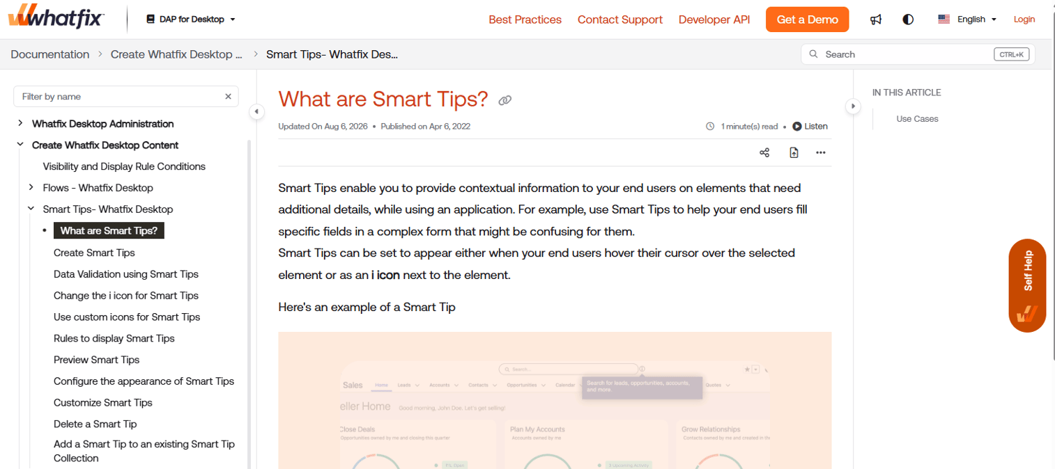
Smart tips are behavior-triggered messages that appear based on what a user does, or fails to do, inside the product. Instead of firing on a schedule, they fire on an event: a user lands on a screen, skips a step, or repeats an action that signals confusion. That context awareness is what makes them "smart." Resources like Smart tips illustrate the tips-and-tricks pattern of surfacing the right hint at the right moment.
For PMs who think in segments and events, smart tips are the most natural fit for experimentation. Because they are event-based, they slot cleanly into an analytics stack: define the trigger, ship the message, measure the lift. They also personalize well, since the same event can carry different content by role, plan, or lifecycle stage.
Best for: Teams that want context-aware, personalized nudges triggered by real user behavior rather than fixed timing.
Key strengths
- Behavior and event-based triggers
- Context-aware messaging
- Segmentation by role, plan, or stage
- Fits A/B testing and experimentation
Why choose smart tips: Choose smart tips when timing is everything and generic nudges fall flat. They fit data-driven teams that want to trigger on behavior and measure impact. Their event-based logic makes them a strong host for onboarding experiments.
Smart tips pricing: Smart tips as a format are typically delivered inside broader in-app engagement platforms, so cost follows the platform that provides the behavior-triggering engine.
Considerations
Before you commit to any in app tutorial software, run it through this checklist. Feature count is not the decision. Fit to your onboarding job is.
Can you segment by persona, role, or lifecycle stage?
Admins and end users need different paths. Trial users need different nudges than paying customers. If a tool cannot target by segment, you end up showing everyone the same generic flow, which underperforms for every persona. Strong segmentation is the difference between guidance that feels personal and guidance that feels like clutter.
How much engineering will it take to keep this current?
Onboarding rot is real. Every UI change risks breaking a flow anchored to a button that moved. Ask how the tool anchors its steps, how it handles UI changes, and who on your team owns updates. Formats that track milestones tend to survive release cadence better than formats that track exact positions.
What can you measure?
You need completion, drop-off by step, and ideally activation lift and support deflection. If a tool only tells you how many people saw a flow, that is not enough. Look for step-level drop-off so you can find the exact point where users stall and fix it.
Does it fit your analytics and experimentation stack?
Event tracking, A/B testing, and clean integration with your data stack let you prove impact instead of guessing. Check whether the tool exports events, integrates with your analytics, and supports running experiments on onboarding changes rather than shipping blind.
Will users see it as help or as clutter?
The fastest way to make guidance backfire is to fire it constantly. Look for dismissal control, frequency capping, and trigger logic that respects context. The best in app guidance shows up when needed and disappears when not.
Conclusion
The right in app tutorial software does not just explain the UI. It shortens time to first value and keeps onboarding from decaying as the product changes. That is the outcome that moves activation, retention, and support load, the metrics you actually answer for.
Pick by the job to be done, not the feature list. Walkthroughs drive task completion. Tooltips handle contextual help. Checklists carry activation across sessions. Smart tips personalize by behavior. Most strong stacks combine two or three, matched to where users stall.
If your job is showing a full product experience rather than nudging inside one, capture-based formats cover that surface. Interactive demos guide the story, sandboxes let users validate freely, demo centers organize everything, live demos add the human layer, and mobile demos meet users on any device. You can build, share, and integrate those experiences without engineering time.
Start your journey with Guideflow today!
FAQs
An in app tutorial is the broad category: any embedded guidance that helps users complete tasks or learn features. A walkthrough is one specific format inside it, a guided step-by-step sequence that leads a user through a task. Every walkthrough is an in app tutorial, but tutorials also include tooltips, checklists, and smart tips.
For first-run onboarding, walkthroughs plus checklists tend to work best together. The walkthrough guides the user through the core task, and the checklist carries them through activation milestones across multiple sessions. Add tooltips for the small in-the-moment questions that come up as users explore on their own.
Set a baseline first, then track completion rate, step-level drop-off, activation rate, and time to first value. The most useful signal is drop-off by step, because it points to the exact place users stall. Tie those numbers back to early retention and support ticket volume to prove impact against feature work.
No, they solve different problems. Tooltips answer localized questions about a single UI element, while walkthroughs guide users through a full task. They perform best together: the walkthrough drives completion, and tooltips fill in the small clarifications it leaves open.
Assign clear ownership, tie guidance updates to your release cadence, and favor formats that track milestones over exact UI positions. Keep flows short so updates are cheap. Audit periodically for steps that point to moved or renamed elements, and retire guidance for features you no longer ship.
Keep it short: three to five steps for most flows. Longer sequences see sharper drop-off and are harder to maintain as the product changes. If a task genuinely needs more, break it into a checklist of smaller flows so users can progress across sessions rather than facing one long walkthrough.