

How to underline the font of a pie chart title in Looker Studio
Here is how to underline the font of a pie chart title in looker studio
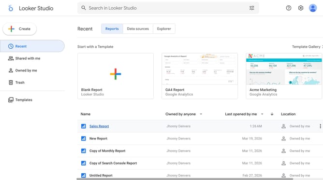
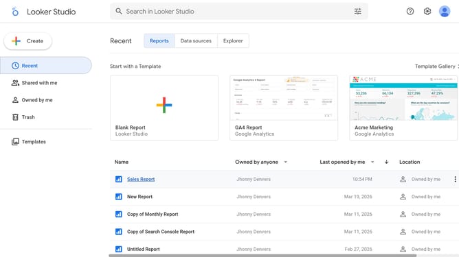
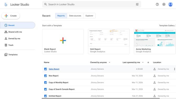
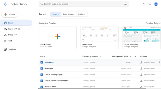
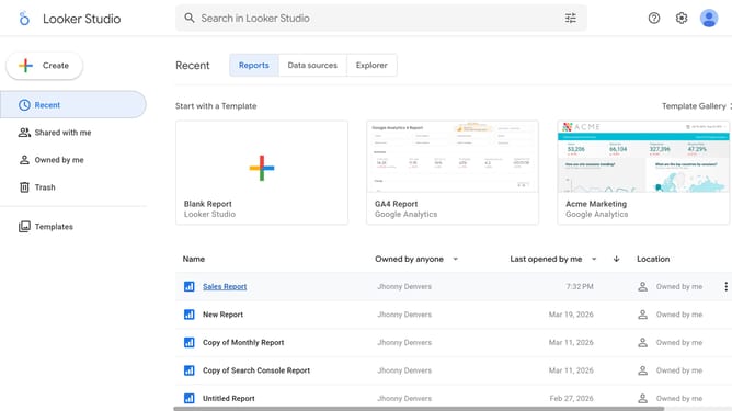
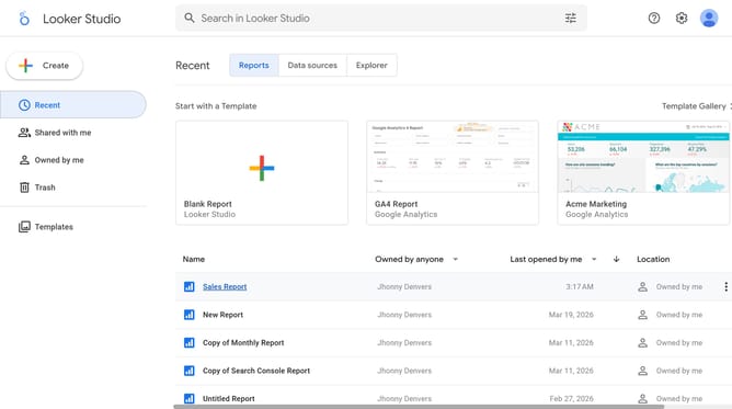
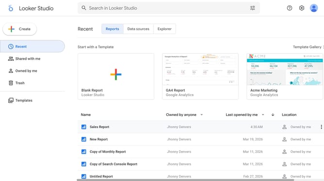
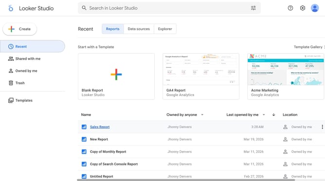
- First click on the file name from the reports list to open it
- Then click on "Edit" button in the top toolbar to enable editing mode
- Next click on "Manage pages" option in the page navigation toolbar
- Then click on the page name in the Report Pages sidebar panel to navigate to that page
- Next click on the pie chart element on the canvas to select it and show properties
- Finally click on "U" (Underline) button in the Font color formatting options within the right sidebar properties panel
Why should you underline the font of a pie chart title in Looker Studio
Looker Studio is a powerful data visualization tool designed to transform complex data into clear, interactive dashboards.
In Looker Studio, underlining the font of a pie chart title enhances visual emphasis, making your data presentations more engaging and easily interpretable.
This feature helps effectively highlight key insights or focal points, ensuring that important information is not overlooked.
Utilizing this simple style adjustment can greatly improve the readability and aesthetic appeal of your data representations.
Last update