Pitch is a dynamic presentation software designed to streamline the process of creating stunning presentations with ease and efficiency.
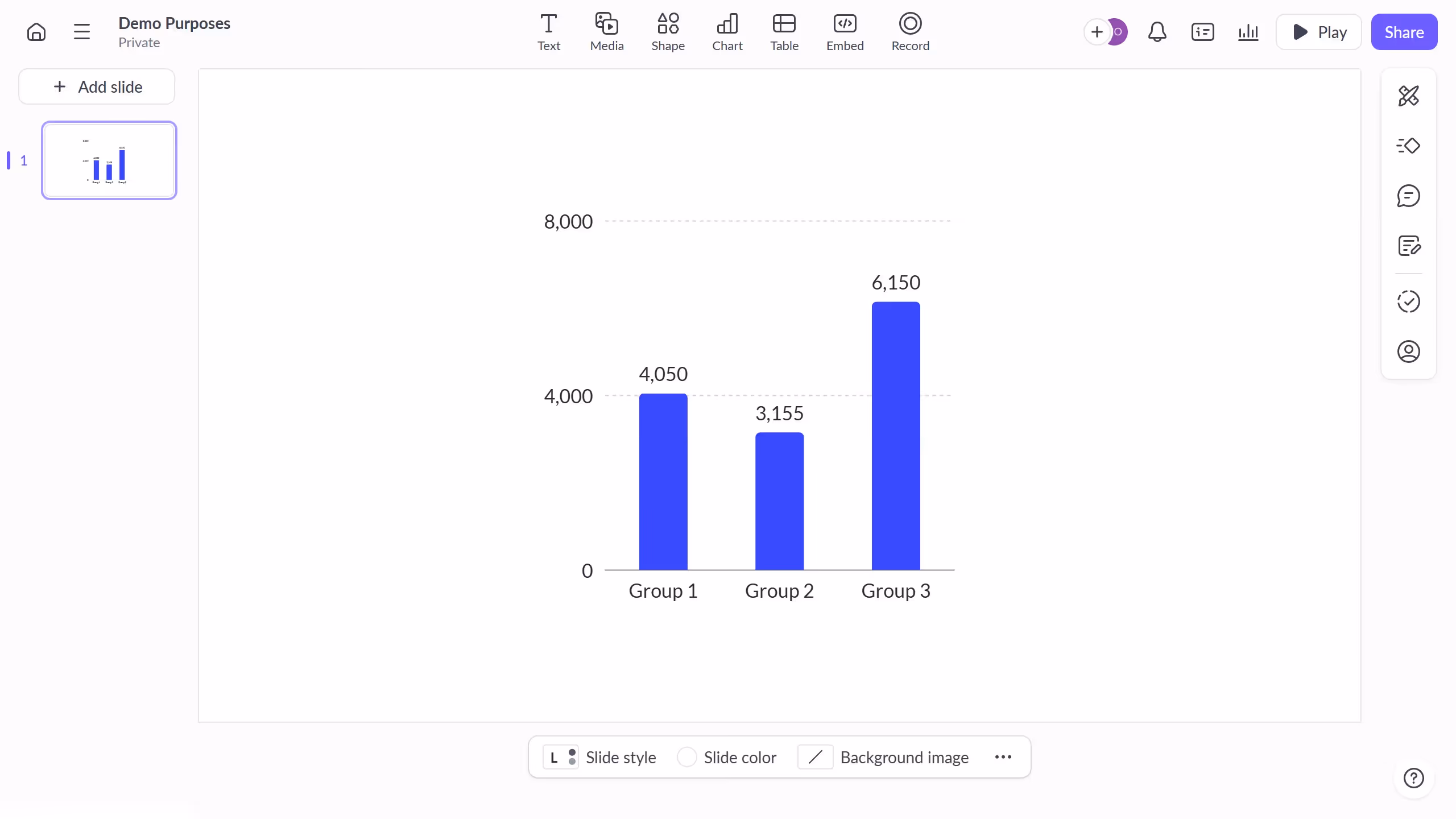
Displaying the category axis in Pitch enhances your presentation by providing clear, visual context to your data, making it easier for your audience to grasp complex information.
Utilizing the category axis not only adds structure to your charts but also elevates the professional look of your presentation.
This feature enables you to present data comprehensively, ensuring that your audience stays engaged and informed throughout your presentation.