

How to add a Chart Widget to a dashboard in Monday.com
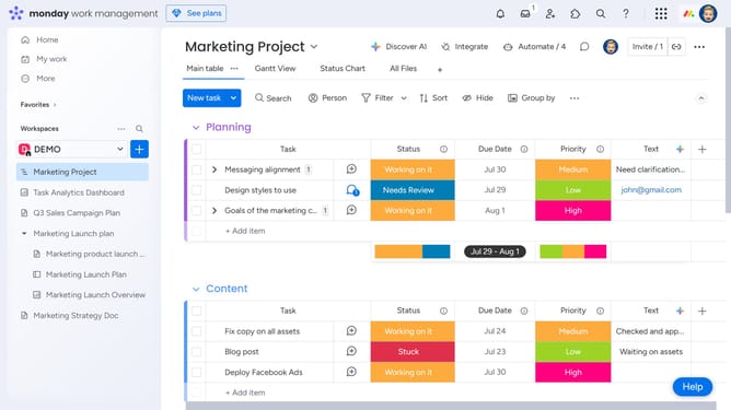
Here is how to add a chart widget to a dashboard in monday.com
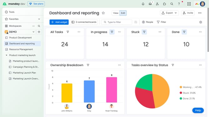
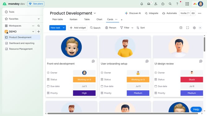
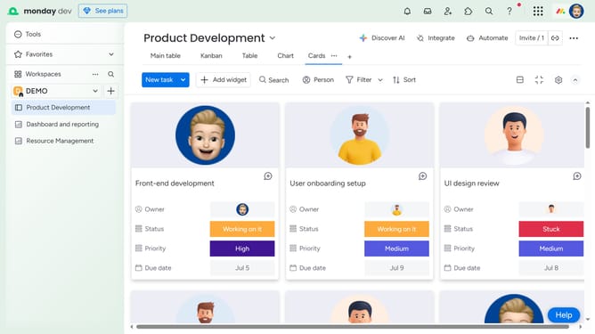
- First open the dashboard where you want to add the widget from the left sidebar
- Next click on the "Add widget" at the top left of the dashboard
- Then click on the "Chart" widget option in the widget selection menu
- The Chart Widget will now appear in your dashboard layout
- To confirgure the chart, click on the "More options" button (three dots)
- Select "Settings" from the dropdown menu
- In the widget settings panel, you can now configure the widget by selecting a chart type and customizing the data display
- Finally, once you're done, click the “X” icon at the top right to exit the settings panel
Why should you add a Chart Widget to a dashboard in Monday.com
Monday.com is a versatile work operating system designed to empower teams to manage projects and workflows with efficiency.
Adding a Chart Widget to your dashboard transforms raw data into visual insights, making complex information easy to interpret.
This feature enhances your ability to monitor trends, track progress, and make informed decisions at a glance.
The Chart Widget integrates seamlessly, providing flexibility in customizing the way you view your project's data, fostering a more intuitive understanding of team performance.
Last update