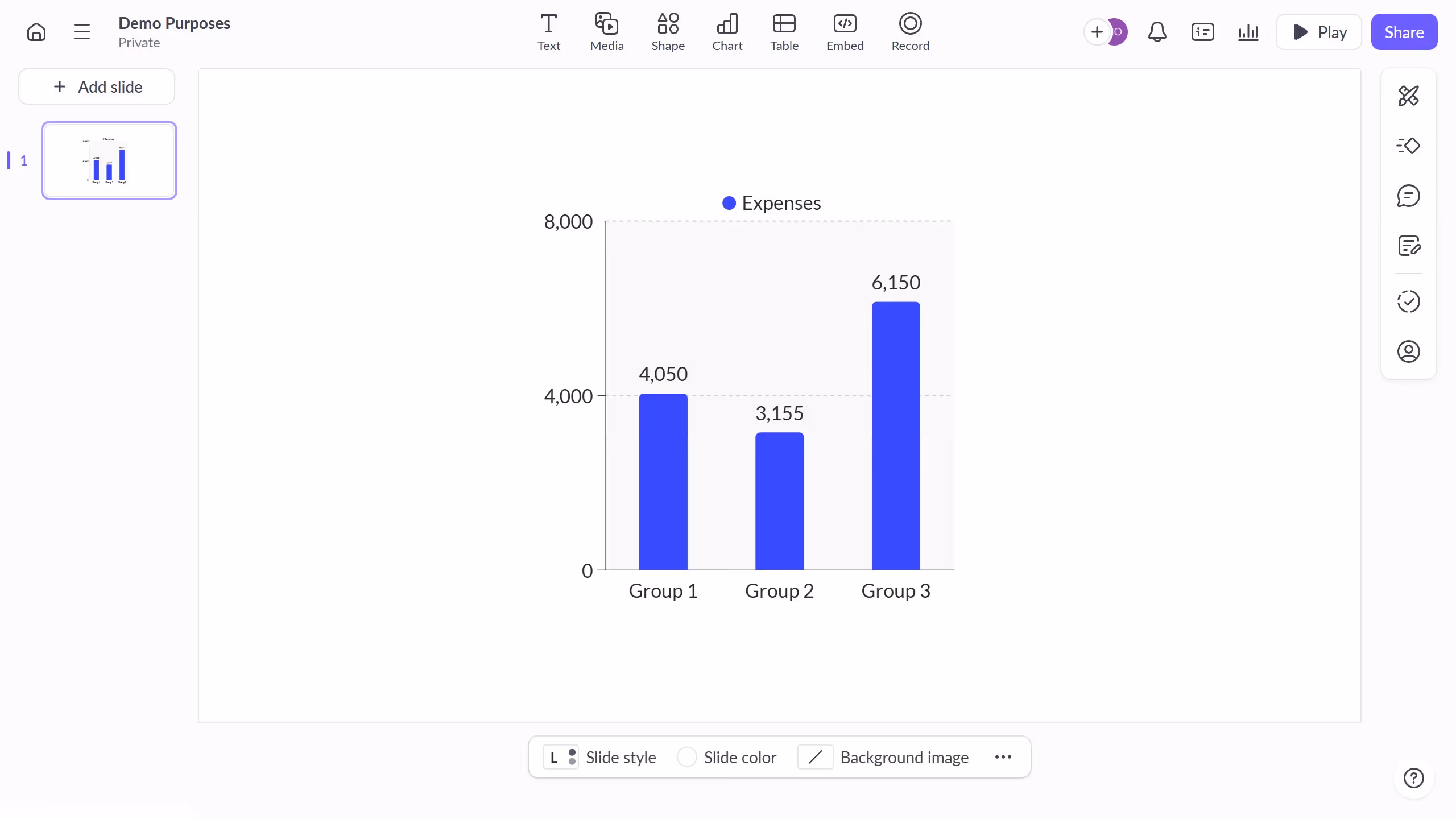
Here is how to turn on the scale axis in pitch
- First click on the chart area to begin editing it
- Then click the "..." button in the chart toolbar
- Finally toggle off the "Scale axis" option under axis settings to hide the axis

Create your own interactive guide with Guideflow
Pitch is a dynamic presentation tool designed to foster creativity and enhance collaboration.
Turning on the scale axis in Pitch can transform your data visualizations, ensuring your audience can easily interpret complex information at a glance.
This feature empowers presenters to maintain accuracy and clarity in charts, promoting effective communication of insights and trends.
By using the scale axis, teams can facilitate more informed decision-making and elevate their storytelling capabilities, making presentations more impactful.
Why leading companies build with Guideflow