Pitch is a dynamic presentation software that empowers teams to create impressive presentations effortlessly.
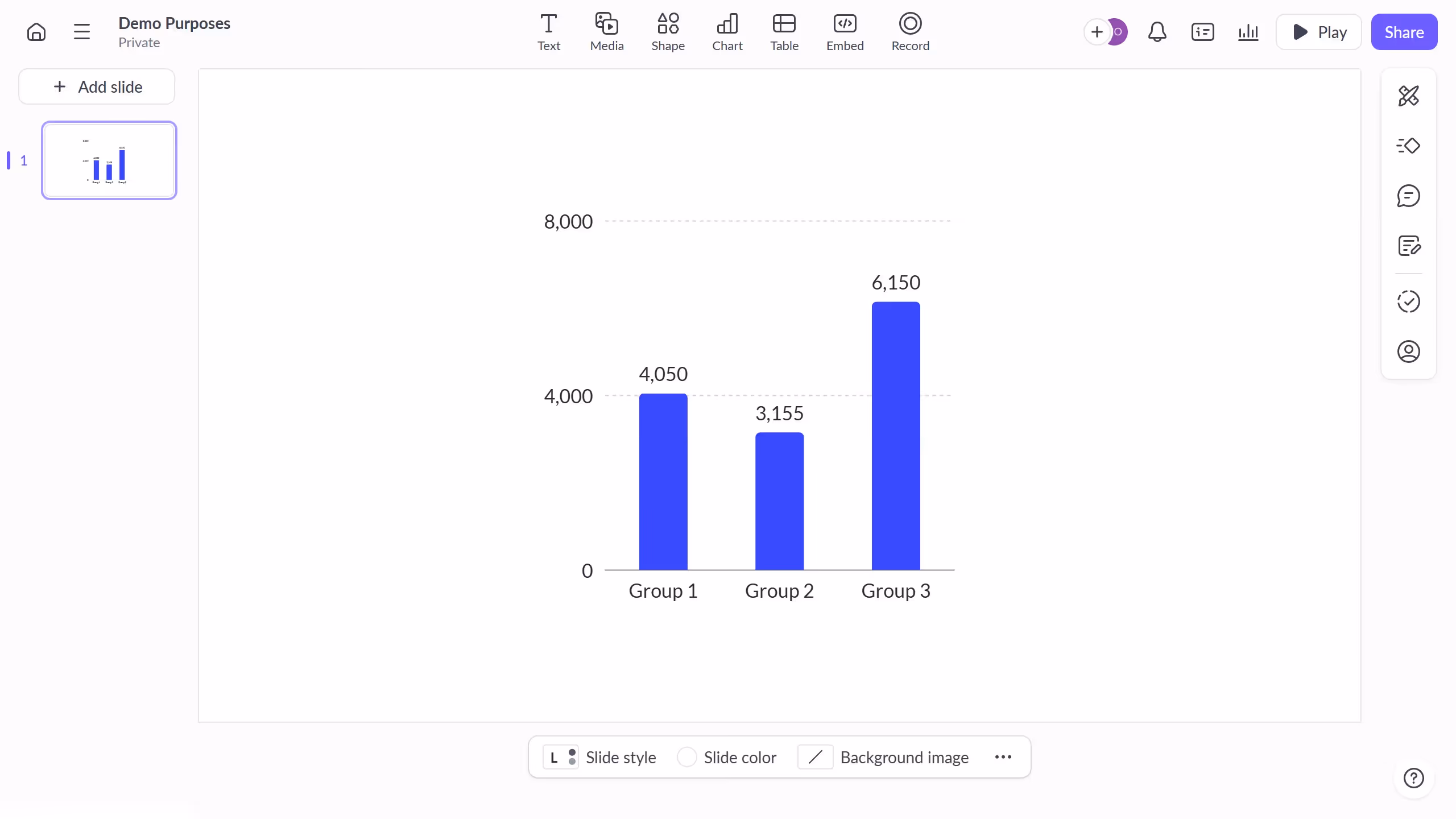
One of its standout features is the ability to change axis colors in charts. This function allows users to customize and enhance the visual appeal of their data representations. By adjusting axis colors, presentations can align seamlessly with brand identities or highlight important data trends.
Utilizing this feature not only adds visual flair but also improves audience engagement by making data more accessible and visually appealing. It's a simple yet effective way to elevate the storytelling aspect of your presentations.