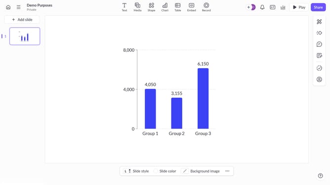


How to show the scale axis on a chart on Pitch
Here is how to show the scale axis on a chart on pitch
- First, open the presentation containing the chart you want to edit
- Select the slide containing the chart in the slide navigator
- Next, click on the chart to select it
- After that, click on the "More options" button in the toolbar that appears
- Next locate the "Scale axis" option in the right-hand panel
- Then, toggle on the switch next to "Scale axis"
- Finally, choose the color you want to apply and show tick marks if needed
Why should you show the scale axis on a chart on Pitch
Pitch is a dynamic platform designed to elevate your presentations and storytelling.
One notable feature of Pitch is its ability to display the scale axis on a chart, enhancing the clarity and accuracy of your data visualizations.
Using the scale axis helps viewers grasp numerical relationships and data trends more effectively, facilitating smarter decision-making and clearer communication.
This feature streamlines data analysis, making your presentations not only more insightful but also more engaging and impactful.
Last update