Pitch is an innovative platform designed to transform ideas into engaging presentations with ease.
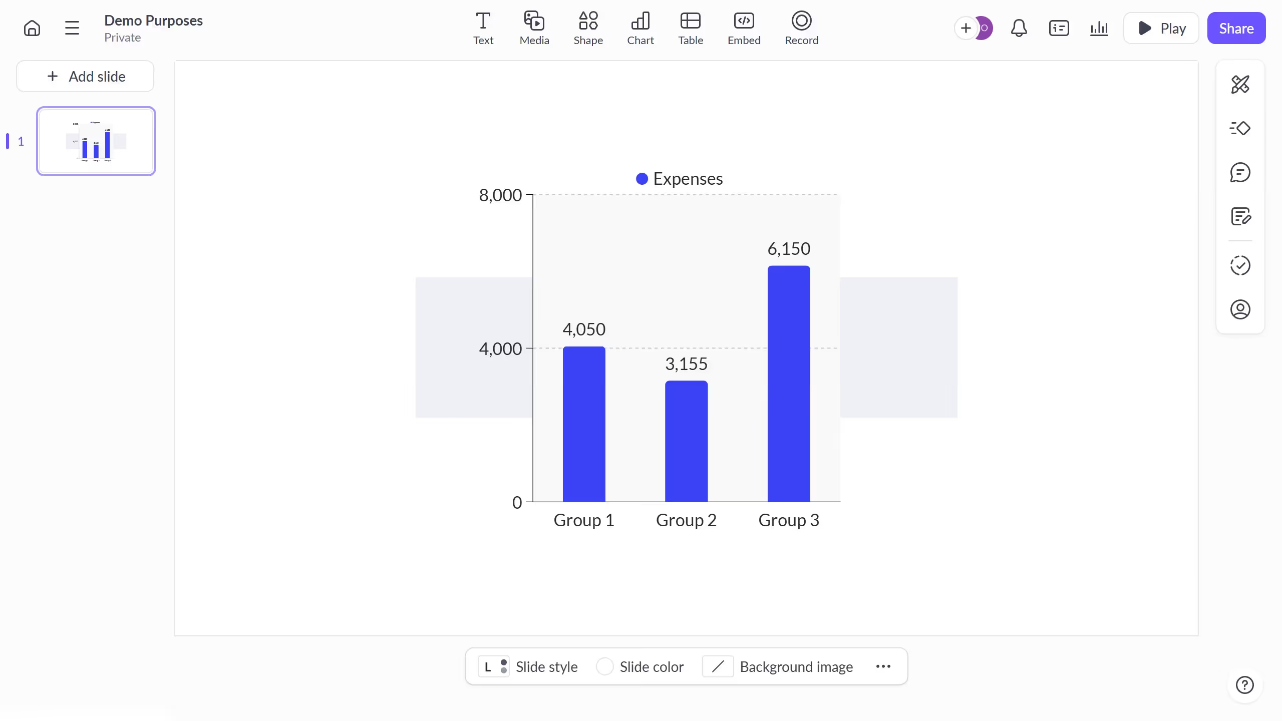
The option to hide scale labels in a chart in Pitch allows for a cleaner, more focused visual presentation. By removing these elements, charts appear less cluttered, directing the audience’s attention directly to the data itself.
This feature enhances the overall aesthetics, making the information more digestible and impactful. It's perfect for scenarios where visual simplicity and data emphasis are key for effective communication.