Pitch is a dynamic platform designed to revolutionize the way we create and share presentations with intuitive and collaborative features.
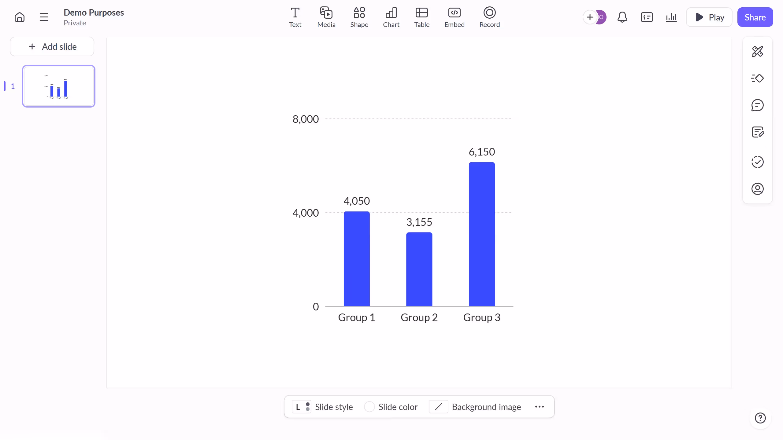
Within Pitch, creating a column chart is a seamless experience, enhancing your presentations with visual clarity. This feature allows users to transform complex data into understandable insights, making it easier to communicate ideas effectively.
Utilizing column charts in Pitch enriches your presentation by providing a visually appealing way to compare data across categories. This not only aids in audience comprehension but also adds a professional touch to your data storytelling.