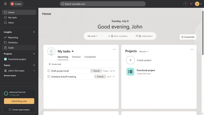


How to add line chart widget in Asana
Here is how to add line chart widget in asana
- First click on the project in the left sidebar menu
- Then click on the "Dashboard" tab in the top navigation bar
- Click on "Add widget" button in the dashboard view
- Click on the "Chart" option from the dropdown menu
- In the chart settings, click on the chart style dropdown menu
- Select "Line" option from the chart style dropdown
- Click on the X-axis dropdown menu
- From the X-axis options select the type of data you want to use for the X-axis of the chart
- Click on the Y-axis dropdown menu
- Select the type of data you want to use for the Y-axis of the chart
- Finally click the "Add" button to create the chart
Why should you add line chart widget in Asana
Asana is a versatile project management tool designed to streamline team collaboration and improve work productivity.
Integrating a line chart widget in Asana can greatly enhance data visualization capabilities within your project dashboard.
This feature allows you to transform dense data into visual insights effortlessly, making it easier to track project progress and spot trends at a glance.
Utilizing line charts in Asana not only aids in effective communication but also empowers teams to make informed decisions quickly and efficiently.
Last update