

How to show the category axis on a chart on Pitch
Here is how to show the category axis on a chart on pitch
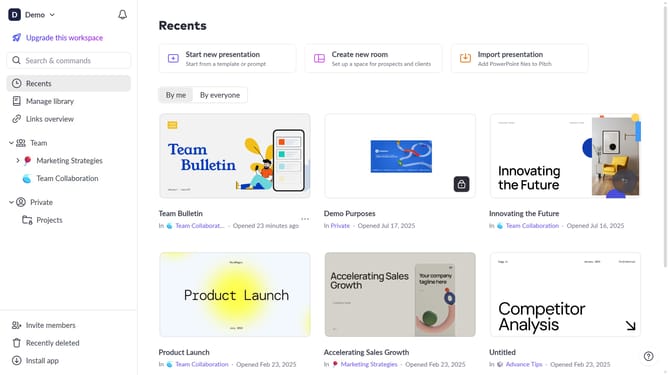
- First, open the presentation containing the chart you want to edit
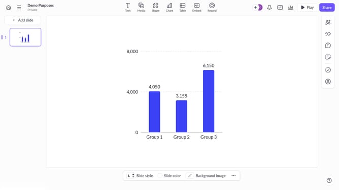
- Select the slide containing the chart in the slide navigator
- Next, click on the chart to select it
- After that, click on the "More options" button in the toolbar that appears
- Next locate the "Category axis" option in the right-hand panel
- Then, toggle on the switch next to "Category axis"
- Finally, choose the color you want to apply and show tick marks if needed
Why should you show the category axis on a chart on Pitch
Pitch is a dynamic platform designed for creating and sharing compelling presentations effortlessly.
The category axis feature on Pitch charts offers a streamlined way to represent data, illustrating relationships easily. By enabling the category axis, users can distinguish between different data series or groups at a glance.
This feature enhances clarity and understanding by organizing the data effectively, making presentations more impactful. Establishing visual hierarchies with the category axis boosts audience engagement and simplifies complex datasets.
Last update