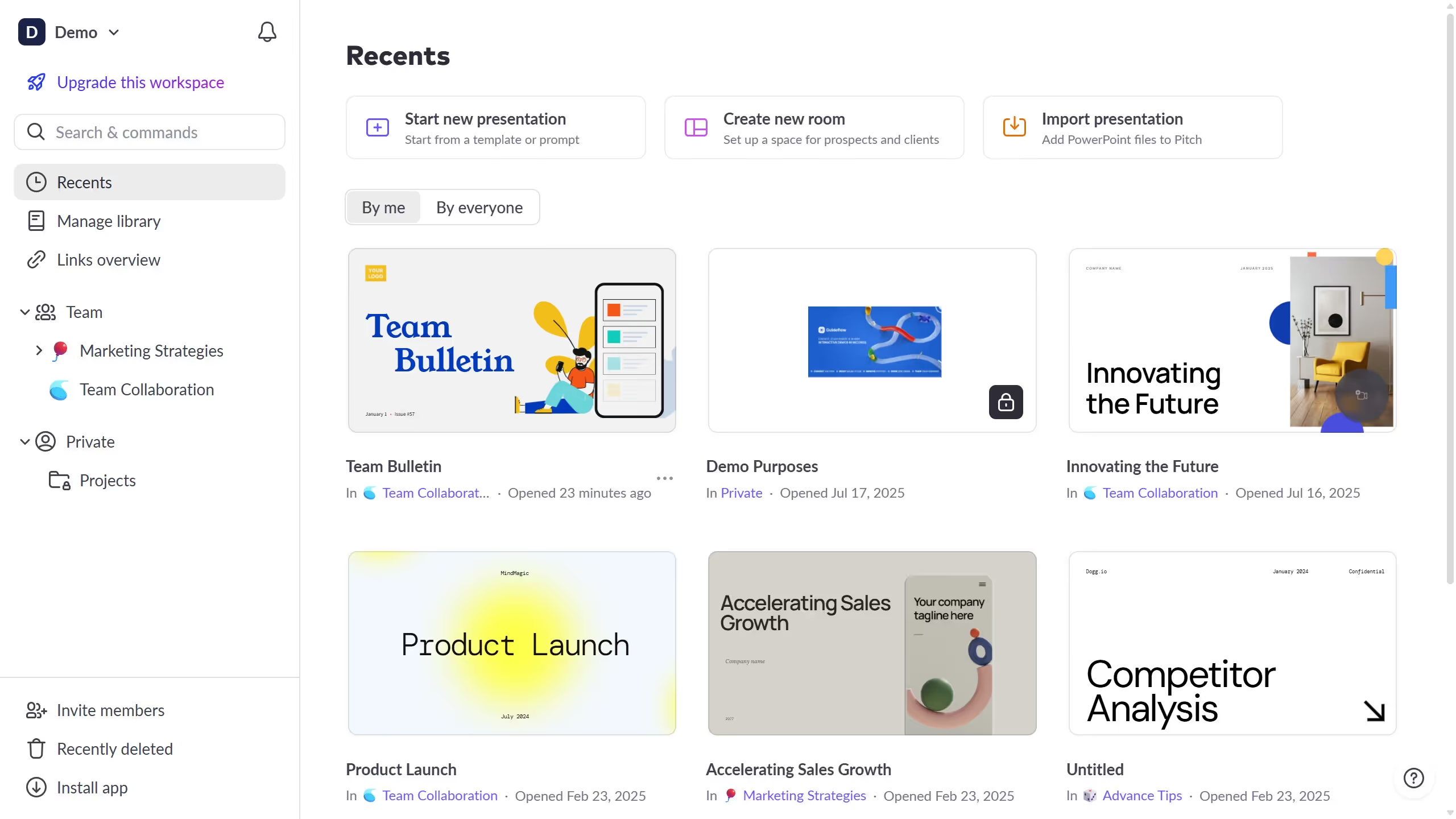
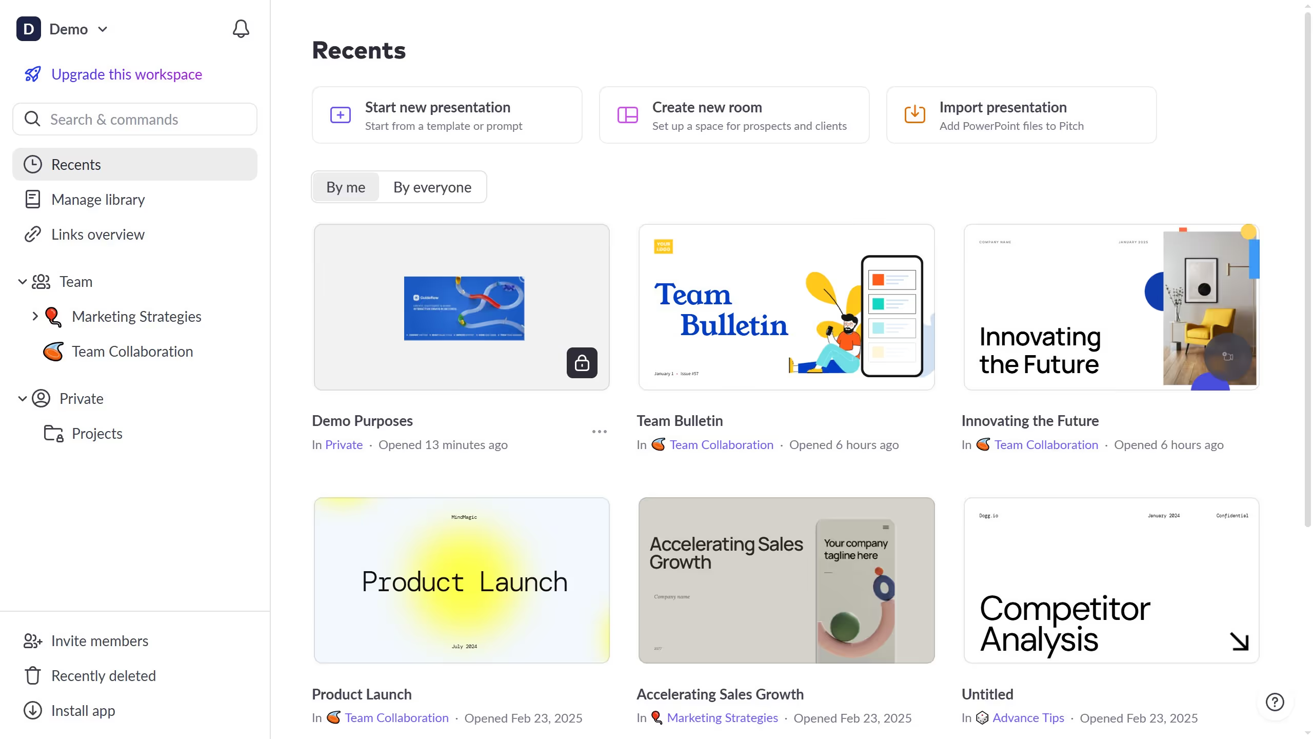
Pitch is an innovative platform designed to streamline the creation of collaborative presentations.
One of the standout features of Pitch is its ability to display value labels on columns, enhancing the clarity and impact of your data visuals.
By utilizing this feature, you can effortlessly highlight crucial data points, enabling your audience to grasp complex information at a glance.
This capability facilitates quicker decision-making and ensures that your presentation communicates its message effectively and with precision.


