Pitch is a dynamic platform designed to transform presentations with seamless design tools and collaboration features.
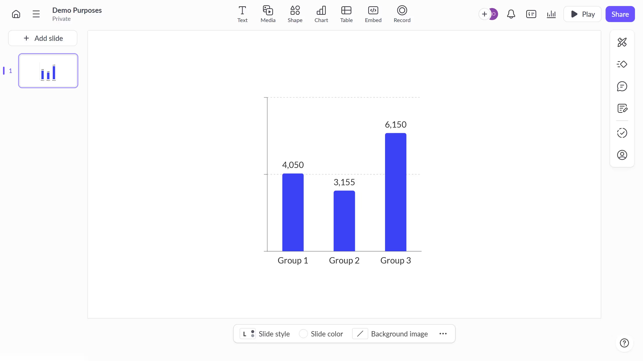
Creating a donut chart in Pitch allows users to visually represent data in a way that's both engaging and informative. This feature facilitates a clear view of proportions, making complex statistics easier to digest.
The benefits of using a donut chart include drawing audience attention and improving comprehension during presentations. They are perfect for comparing parts of a whole or showcasing percentages in a visually appealing format.
Leveraging this feature in Pitch elevates your ability to communicate data insights effectively, maintaining the audience's focus while ensuring your core message is delivered efficiently.


