Pitch
Pitch.com is a modern presentation software that combines design, collaboration, and storytelling.
Website
Industry
Collaboration
Share this article:

How to add a data series to a chart in Pitch

Here is how to add a data series to a chart in pitch

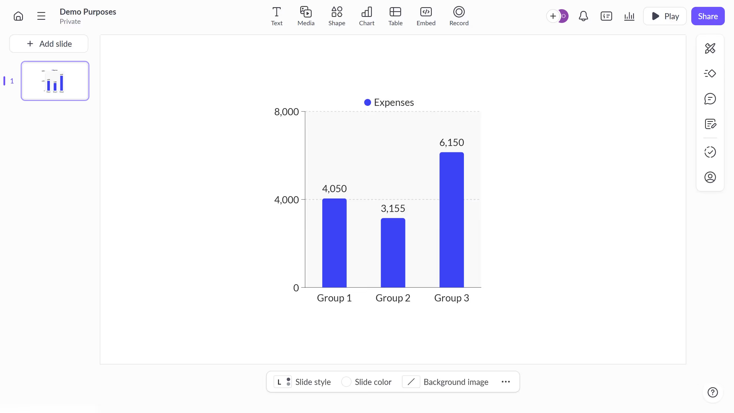
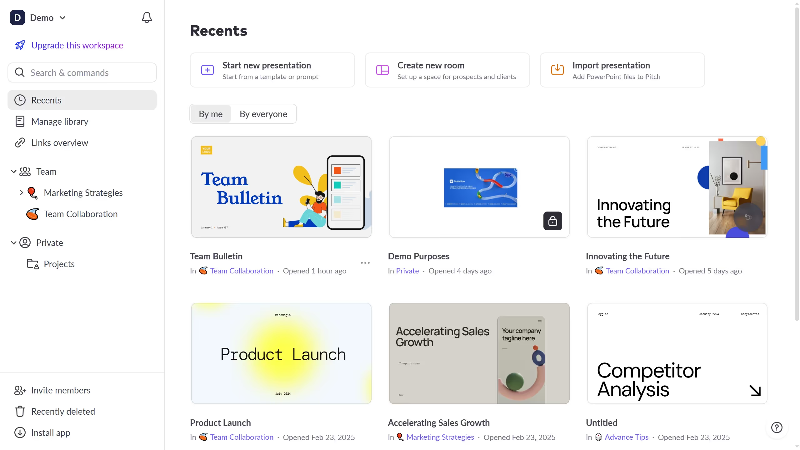
  1. First click the presentation that contains the chart you want to edit
  2. Then click the chart to open the data panel
  3. In the top toolbar click the "Edit data" button
  4. Enter a new label and corresponding values to create the new data series

Create your own interactive guide with Guideflow

Why should you add a data series to a chart in Pitch

Pitch is an innovative platform designed to transform presentations into impactful storytelling experiences.

Among its many features, the ability to add a data series to a chart empowers users to enhance their presentations with precision and clarity. This feature allows you to enrich your charts with detailed data layers, making the visuals more informative and engaging.

By incorporating additional data series, users can present a multi-dimensional perspective, offering a clearer understanding of trends and patterns. This enhances decision-making and makes your presentations more compelling.

Last update
January 6, 2026
Cursor MariaA cursor points to a button labeled "James."

Create your first demo in less than 30 seconds.