

How to change the Email Analysis chart view in Mixmax Reports
Here is how to change the email analysis chart view in mixmax reports
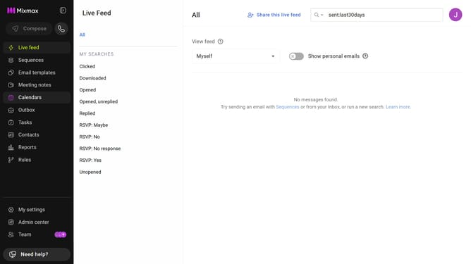
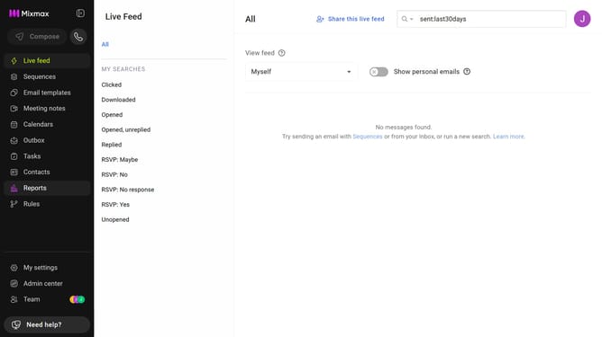
- First click on "Reports" in the sidebar menu
- Next, click on the "Dashboard" tab
- Then scroll down to the "Email Analysis" chart
- Finally, on the right side of the chart select either Line Chart or Bar Chart
Why should you change the Email Analysis chart view in Mixmax Reports
Mixmax is a powerful tool designed to supercharge your email communication and productivity.
A standout feature in Mixmax is the ability to change the Email Analysis chart view in its Reports. This feature allows you to customize how data is presented, enabling you to effortlessly interpret insights about your email performance.
By adjusting the chart view, you can quickly spot trends, measure engagement, and make informed decisions that enhance your communication strategy. This flexibility ensures that you have a clear understanding of your emails’ impact.
Last update