

How to change chart visualization in Mixmax Reports
Here is how to change chart visualization in mixmax reports
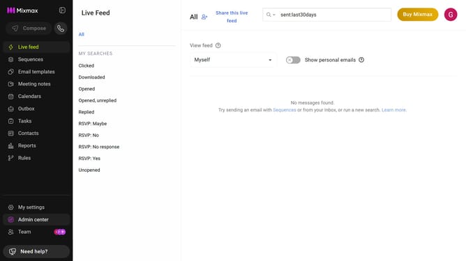
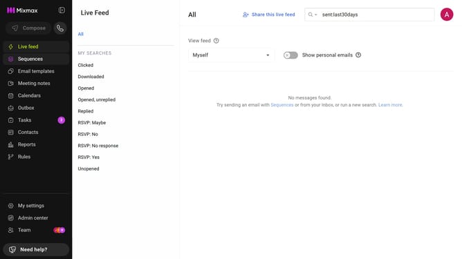
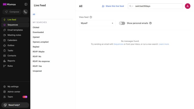
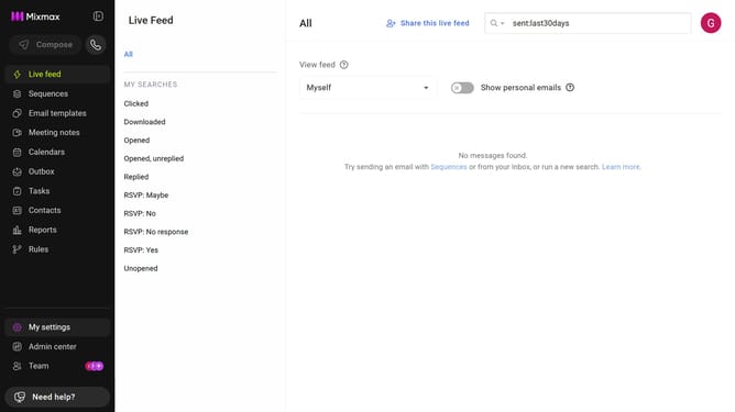
- First click on "Reports" in the sidebar menu
- Next, click on the "Dashboard" tab
- Then, find the chart you want to change
- Finally, locate the chart type option on the right side of the chart and select either Line Chart or Bar Chart
Why should you change chart visualization in Mixmax Reports
Mixmax is a dynamic tool designed to streamline email productivity and enhance communication efficiency.
The ability to change chart visualization in Mixmax Reports empowers users to tailor their data presentation, ensuring clarity and relevance.
This feature is indispensable for making complex data easily digestible, facilitating quicker insights and informed decisions.
By customizing your chart views, you can better track performance and trends, refining your strategies effectively.
Last update