Monday.com
Monday.com is a work operating system that helps teams plan, track, and deliver work with customizable workflows and collaboration features.
Website
Industry
Collaboration
Share this article:

How to choose a chart type in a Chart Widget in Monday.com

Here is how to choose a chart type in a chart widget in monday.com

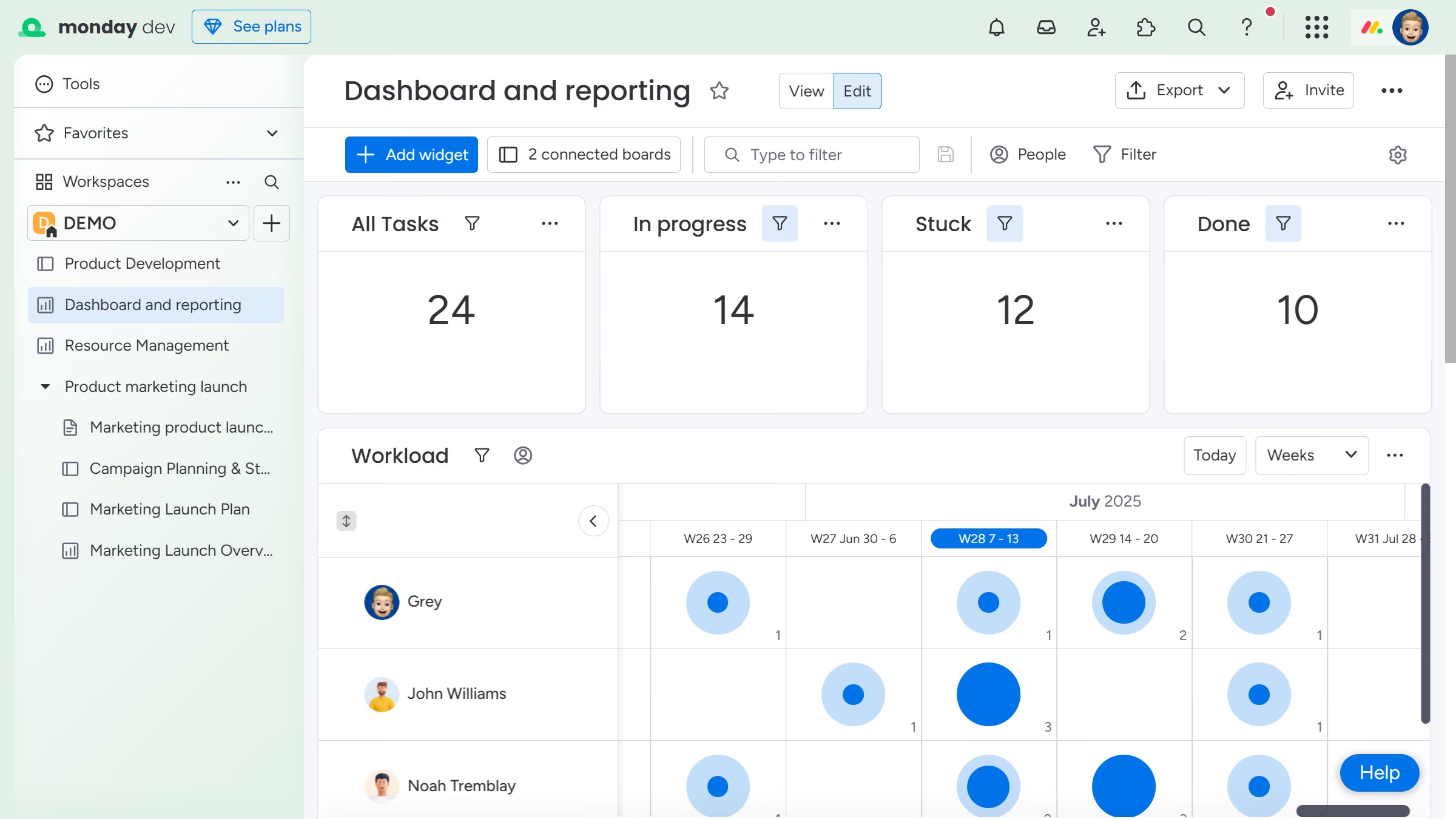
  1. First navigate to the dashboard containing your Chart Widget, or add a new Chart Widget if needed
  2. Next click on the "More options" button (three dots) in the chart widget
  3. Click on "Settings" option in the dropdown menu
  4. Then click on the "Chart type" dropdown in the widget settings panel
  5. Finally select the chart type that best fits your data visualization needs
  6. Once selected, the chart preview will update automatically to reflect your chosen type

Create your own interactive guide with Guideflow

Why should you choose a chart type in a Chart Widget in Monday.com

Monday.com is a versatile work operating system designed to streamline team collaboration and project management.

Choosing a chart type in a Chart Widget in Monday.com is an intuitive feature that allows users to visualize data in formats that make the most sense for their goals. With a variety of chart types at your disposal, you can tailor your data presentation to highlight trends, comparisons, or insights effectively.

Using the right chart type not only enhances data comprehension but also drives informed decision-making and boosts team productivity.

Last update
July 14, 2026
Cursor MariaA cursor points to a button labeled "James."

Loo oma esimene demo vähem kui 30 sekundiga.